January’s Top 5 Projects 2013
Opinion by Richard Baird Posted 1 February 2013

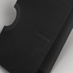
According to Studio Hi Ho, the branding and communications partnership responsible for this project, Milieu Property is a Melbourne-based ‘boutique developer with an emphasis on creating spaces of influence’. The moniker ‘Milieu’ immediately positions the brand at the cerebral end of the property development spectrum. Indeed, for those without a thesaurus brain, the highfalutin’ vocabulary is even explained on the minimal website.
Guest opinion written by Shaughn McGurk
Read the review here

Marwood is London-based tie and neckwear brand founded in 2010. Its collections, handcrafted from British lace and cloth, are sold internationally to boutique stores such as Barneys New York, Tomorrowland Tokyo, Liberty London, and through online retailer Mr.Porter. Multi-disciplinary design studio Everything In Between (EIB) recently developed a new visual identity, label and packaging solution for Marwood that shares the tactile qualities of the product – through material choice and texture – but also delivers sharp professional contrast in their use of geometric form, type and a glossy black ink treatment.
Read the review here


Bedroc is a Tennessee-based technological consultancy firm that takes complex business issues and simplifies them with technology, reducing risk, optimising efficiency, and creating revenue for its clients (ROC). The firm’s visual identity, created by multidisciplinary design agency Perky Bros, avoids the saturated, ‘accessible’ conventions of the industry in favour of a direction that visualises the bedrock/technological analogy of the name – the physical stability, sub surface and base nature of bedrock and the layered, in-depth and founding technological principles of the business – through a logo-type and collateral solution that has a structural and earthy sensibility.
Read the review here

Iannilli is a traditional Italian restaurant located in the Mexican city of Monterrey. Its visual identity, recently revised by design studio Savvy, contrasts classic and contemporary design cues to satisfy an established clientele – expecting traditional food and service – while also appealing to a younger generation.
Read the review here

Filmfaktisk is a Norwegian team of film producers – with a strong focus on locations – that produces both commercial and fictional pieces work. Their visual identity, created by Oslo-based design agency Heydays, cleverly appropriates the physical realities and limitations of sign making and turns it into a positive and distinctive asset that visualises – through a simple line detail that connects the stems and the tittles of the i’s and a stylised single colour finish to the texture and detail of on-site, sign photography – a practical but creative approach to on-location shooting. It is a very simple treatment but one that brings a proprietary quality to a familiar sans-serif typeface that cohesively binds print, film and digital touch-points.
Read the review here