Rafaela Abrahão by BR/Bauen
Opinion by Richard Baird Posted 30 April 2013

Brazilian fashion blogger Rafaela Abrahao recently commissioned design agency BR/Bauen to develop a new visual identity that would extend across her website and stationery. Drawing on Rafaela’s favourite brands, Prada, Versace and Hermes, and an interest in English nobility for inspiration, BR/Bauen developed a solution that unites the fine illustrative detail and typographical flourish of a blackletter monogram executed with a contemporary and consistent single line weight, an uppercase neoclassical Didone logo-type, duplex material textures and the finish of a foil, hand stamp and emboss. It is a combination which works well to convey the personal aspect of blogging, garment texture and a clear relationship with high fashion.
“She may be a paradox in the postmodern world. Her life has no external or luxury as a purpose, it’s born from within, only the closest would know to tell … From the inner beauty that comes and passes by refinement, class, sophistication, having an unchanging character as a law. Her beliefs dictate her choices, her strength to continue comes from something that is not explained; her motivations go through her mind in an attempt to rationalize, but her heart constantly asks for control, so many choices; so many options.
We did not work with the idea that we were developing just a visual identity project for a fashionist, we went further, and developed something that represents the deepest from Rafaela Abrahão, from her external characteristics to her preferred consumer brands, going through the pride of her family’s origins, to philosophical questions as her spiritual experiences, in this case, Christianity.” – BR/Bauen
The classic tone of a blackletter monogram – a traditional, personal mark with a wax seal quality that perhaps ties modern and historic communication – and the finer illustrative elements of two olive branches bound by a bow, a nod to Rafaela’s religious convictions, are juxtaposed alongside the more contemporary sensibilities of outlines and borders with a single, consistent stroke width. The primary mark and its three variations appear collectively cohesive and individually distinctive with a solid balance of internal space. And while the roundel, and its sans-serif typography appear like an unnecessary frame within a frame, the shared heraldic aesthetic suggests an authority through implied heritage without appearing antiquated.

The logo-type’s tall uppercase characters, contrast of light and heavy strokes and the proprietary flourishes of simple slab-serif ligatures along the baseline clearly draw on the established high fashion conventions of confidence, fine detail and a recurring neoclassicism that works well alongside the monogram. It benefits from the same number of characters and a repetition of A in both first and last name that gives it a pleasant and natural balance that has been appropriately utilised as a centre aligned device in print.

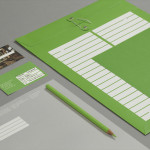
The collateral is very much about physical texture. The duplex business cards are incredibly distinctive, combining what looks like a deep blue felt or velvet with a gold ink and on the reverse, a fluorescent white with deboss surface texture and type. Details that capture elements of the luxury high fashion market, garment texture and perhaps a flashy personality. These sit alongside an ink stamp and hand applied deboss which add a more crafted dimensionality which is also reflected in the batch nature of each printed item and highlighted in the video at the foot of this article.
The result is an identity solution that appears as a fashion brand in its own right. It is layered with personal relevance which neatly utilises the premium value of combining good graphic design, unusual material choice and quality print finish but with a familiarity in the way it obviously draws from high fashion sources to deliver a very polished finish to the everyday nature of blogging.