April’s Top 5 Projects 2013
Opinion by Richard Baird Posted 1 May 2013

Highpark is a new residential project located in the middle of San Pedro Garza García and described by Face – the agency behind the development’s visual identity, print work and website – as ‘arguably one of Latin America’s most affluent municipalities’ and widely credited as an “architectural masterpiece”.
Read the review here.

Located on Hawthorn’s Glenferrie Road, Victoria, Crabapple Kitchen is a ‘high-end café/wine bar’ with an ever-changing menu of simple, rustic and seasonal Italian, French and Spanish cuisine created from local produce and served in a ‘homely and light-hearted environment’ – derived from the French and Italian countryside – made up of ‘beautiful fabrics, French pantries, hanging copper pots, comfy banquettes and an open fireplace’.
Read the review here.


Metronet is an Oslo-based consultancy that provides strategic SEO, PPC, e-commerce, social media, web analytic, design and development services to a wide range of international clients. The consultancy’s visual identity, developed by Work In Progress, mixes the established technological conventions of simple geometric forms, fine line weights, grids, a mono-spaced typeface with abstract interior artwork and a retrospective undertone to convey digital networks, creative thought and experience.
Read the review here.

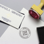
Brazilian fashion blogger Rafaela Abrahao recently commissioned design agency BR/Bauen to develop a new visual identity that would extend across her on-line presence and stationery. Drawing on her favourite brands (Prada, Versace and Hermes) and an interest in English nobility for inspiration, BR/Bauen developed a solution that unites the fine illustrative detail and the typographical flourish of a monogram with a contemporary and consistent single line weight finish, an uppercase neoclassical Didone logo-type, duplex material texture and the finish of a foil, stamp and hand emboss. A combination which works well to convey the personal aspect of blogging, garment texture and a clear relationship with high fashion.
Read the review here.

As well as providing space, Storyline – Norway’s largest film studio – offers a wide range of services which include, but are not limited to, set building, lighting, VFX, audio and video post production as well as costume and equipment rental. Developed by Work In Progress, Storyline’s visual identity brings together the classic flourish of a script, the humanist qualities of hand drawn detail, a sense of practicality in the choice of secondary typeface and interior colour, and the spacial consideration and practical effects of the photography. Bound by the energy of a bright colour palette, the identity manages to deliver a multi-faceted but cohesive solution that is distinctive and communicative.
Read the review here.