Ali Sharaf by Mash Creative
Opinion by Richard Baird Posted 6 June 2013
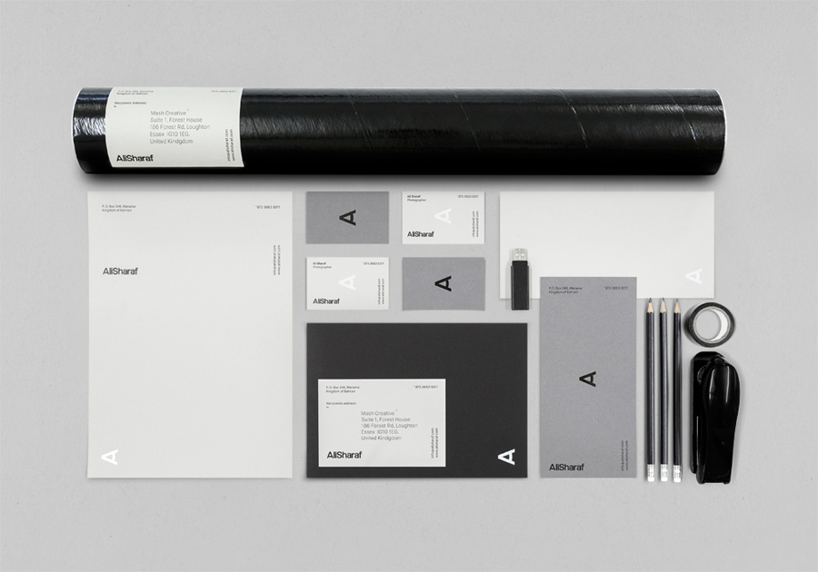
Ali Sharaf is a Bahrain-based commercial photographer who specialises in fashion, beauty and lifestyle images for the advertising and editorial markets. He describes himself as contemporary, upbeat, outspoken and edgy.
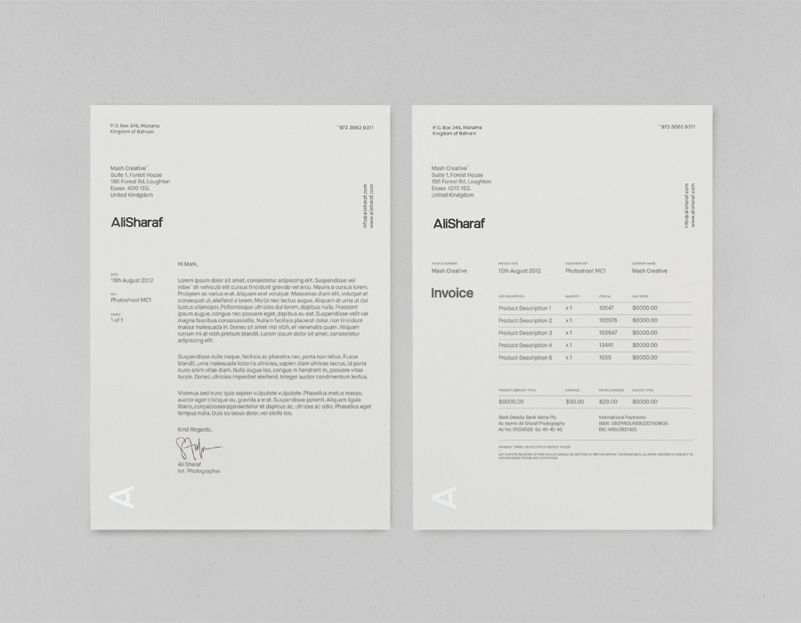
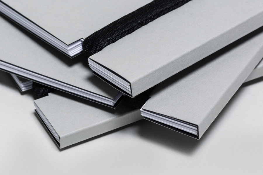
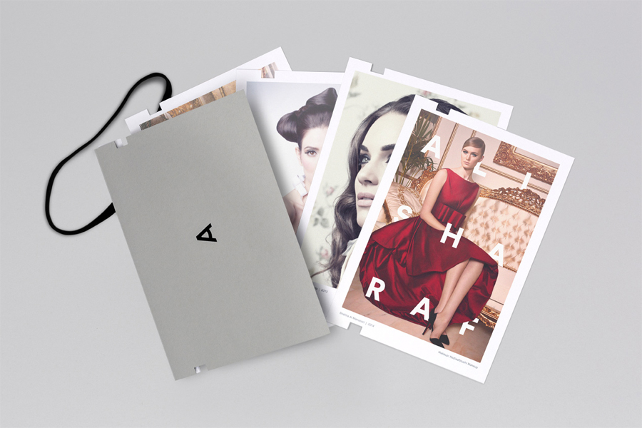
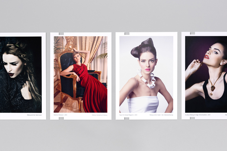
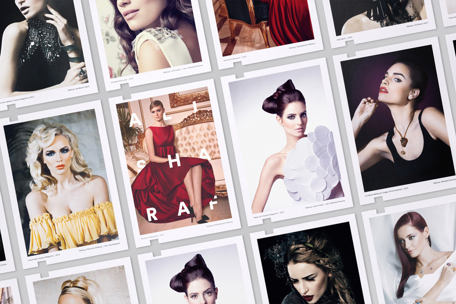
Inspired by a shared interest in Swiss modernism and adopting a less is more approach, design studio Mash Creative developed a new brand identity for Ali that combines an iconic marque, sans-serif typography, weighty material choices, foil and a limited colour palette to frame the detail of his work.
Mash’s work delivers, through abstraction and typographic near-neutrality, a contemporary design restraint that while perhaps not edgy or outspoken, balances these personality traits with a professionalism and efficiency.
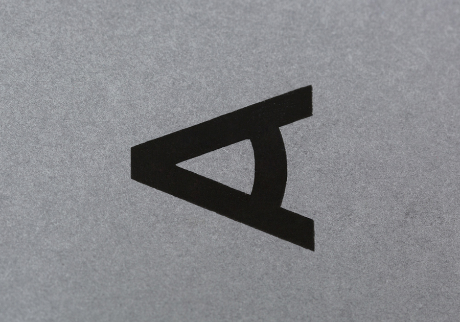
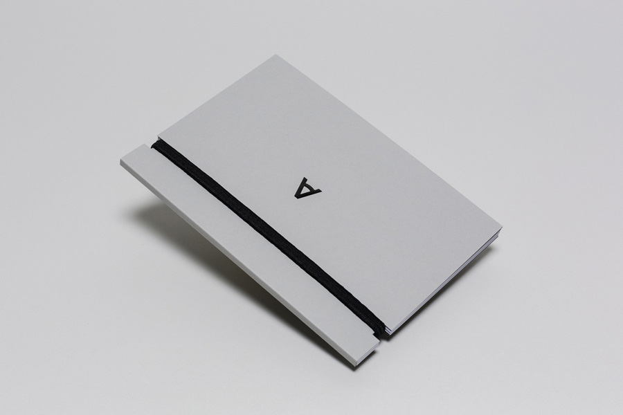
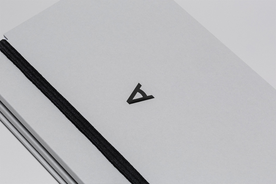
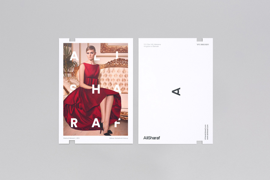
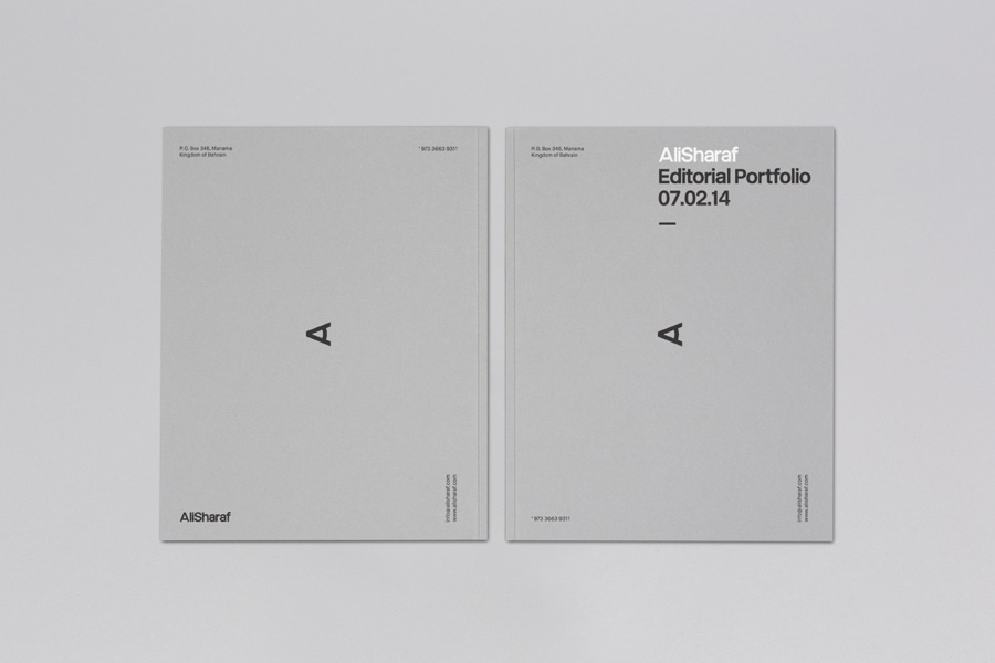
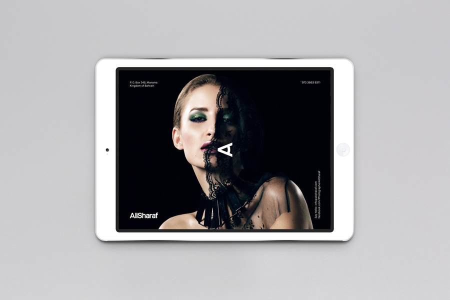
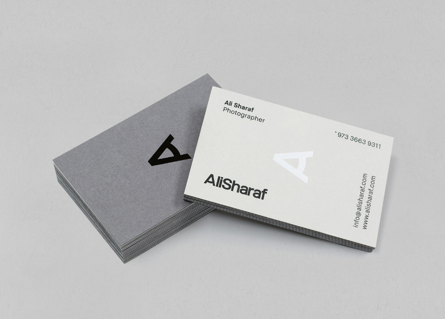
The marque’s straightforward communicative value—a union that leverages the traditional, personal associations of a craftsman’s monogram and the more recent geometric interpretation of an eye—is given a high quality dimensionality through its application as a black and white ink treatment across the urban cool of a concrete grey and the commanding weight of heavy duplex business card. The framing of the collaterals with contact information, running parallel with the edge of the sheet, is a simple but smart detail that works really well to reveal the duality, through orientation, of the mark.
The sans-serif logotype is well handled but largely neutral. I am not keen on the duplication of the marque within the logotype or the compounding of first and last name but the spacing is solid and the weight bold and confident. Similar typefaces are often used as a default but here the selection feel appropriate, sitting well within the context of material choice, print finish, layout and image.
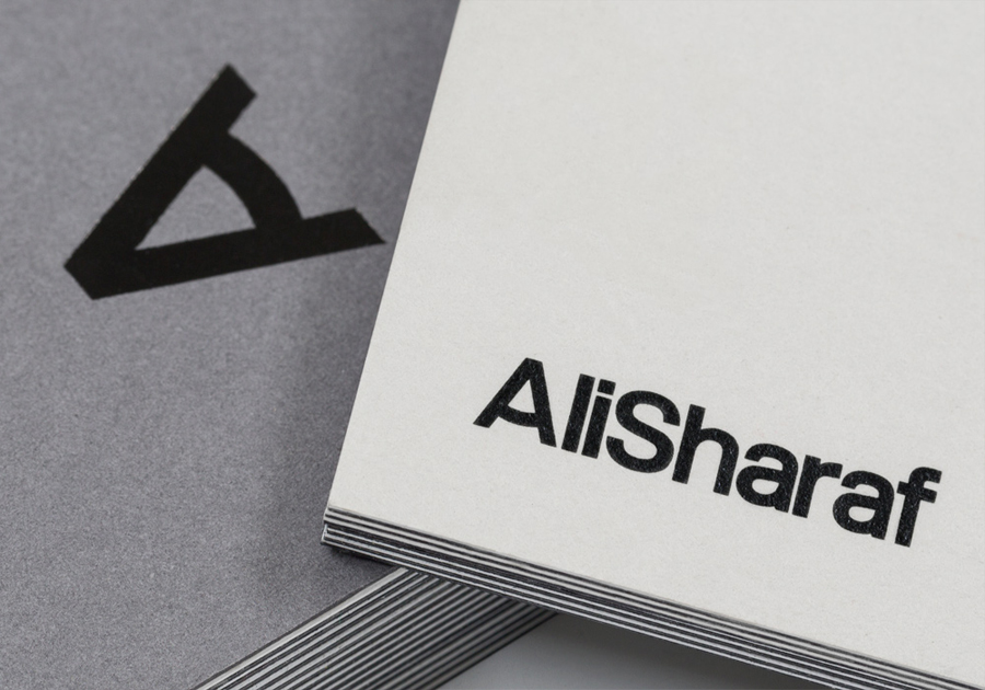
On a blog that posts international work on a near-daily basis this combination does appear familiar in print but the use of orientation to extract the two aspects of the marque adds a neat and unique distinction to the clear professional and contemporary qualities of the elements that surround it whilst sitting well over the detail of Ali’s photography.
