Kitte by Hara Design Institute
Opinion by Richard Baird Posted 25 June 2013
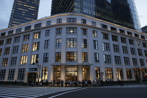
KITTE, a play on the Japanese word “kitte” literally meaning “postage stamp” in English, is a new seven-floor restaurant and retail destination located in Tokyo’s Marunouchi district that opened its doors on March 21st, 2013. Housed within JP Tower—the site of the landmark central post office building—KITTE will play an instrumental role in revamping the historic area as the first commercial facility of the now privately held Japan Post company. Guest Opinion written by Josh Nychuk
Kitte’s identity and signage system was developed by Hara Design Institute, a design think tank founded by renowned Japanese graphic designer, Kenya Hara. The Institute operates within the normal framework of a design office servicing clients alike, while placing equal importance on the Institute’s self-initiated projects. These non-commissioned projects originate from observations in society—typically produced in exhibition format—presenting their discoveries and possible solutions. The Institute’s clients include some of Japan’s most prominent organizations in the public and private sectors. With Mr Hara having been art director of Muji since 2001, and leading highly distinguished branding projects like Tsutaya Shoten bookstore Matsuya Ginza, and Umeda Hospital, the Hara Design Institute is perhaps one of the world’s most interesting companies working in design today.

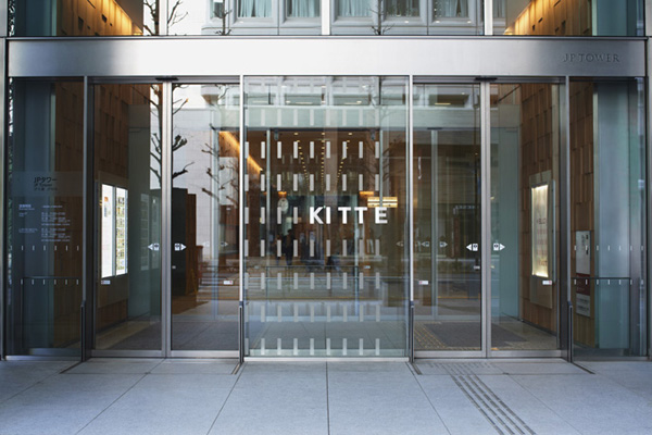
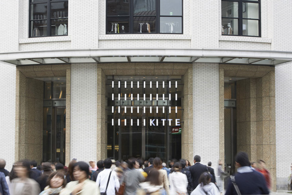
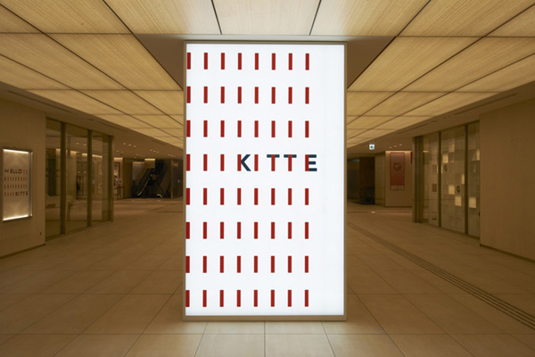
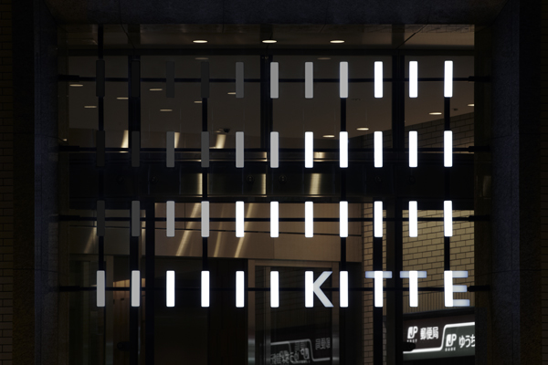
With this project the institute have given careful consideration to how the symbol, logo and sign system unify into a single memorable image. This act plays out through a contrast of ideas, old and new, that begin with a single rectangular shape. This shape is lined up at regular intervals creating an image that references the tiles of the interior walls and symbolises the historic station building. The shapes dilate into a rhythmic pattern of red that create a type of static canvas for which the logo exists in. The complementary blue/green and red colour scheme once again symbolizes the post office while its vibrancy expresses the youthfulness of the new commercial facility.
The sign system nicely demonstrates the strength and flexibility of the visual identity. Its rhythm appropriately matching the tempo of the shapes found within the building’s architecture, neither dominating nor detracting from the visual environment. Functioning as both landmark and information architecture the signage blends seamlessly into the buildings historical context, while acting as a contemporary symbol to guide the building into a new era and purpose.
