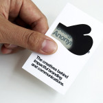
Fika by Designers Anonymous
Opinion by Richard Baird Posted 27 June 2013

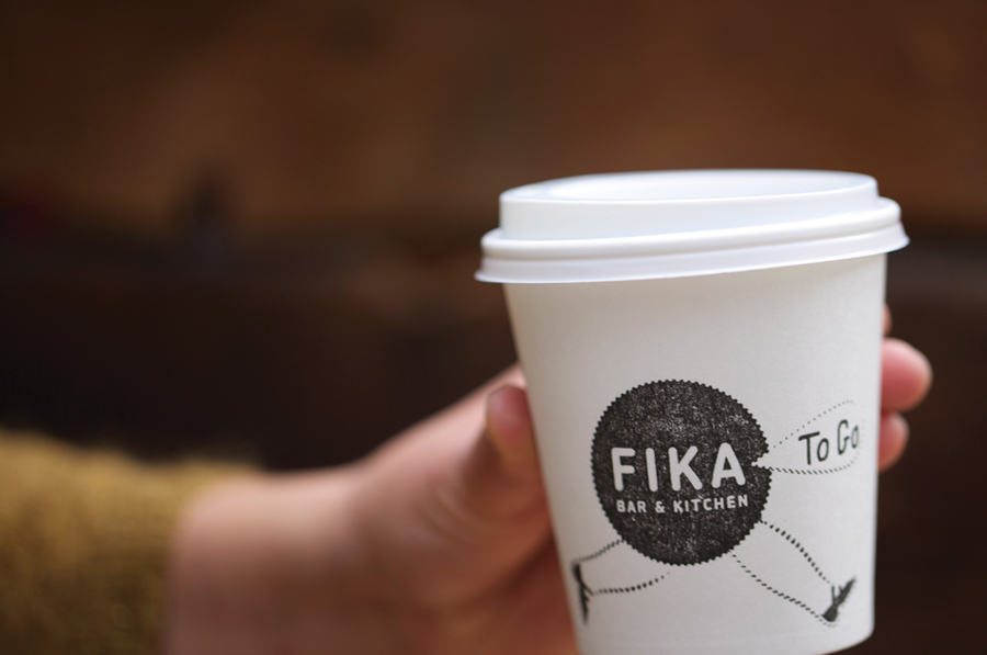
Fika is a bar and kitchen located on London’s Brick Lane with a rustic menu prepared on site and to order, all of which can be taken away. Created by Designers Anonymous, Fika’s visual identity, which extends on-line, in-print and as signage, is an illustrative and photographic mix of characters, cartoons and quirky compounded imagery bound by a consistent logo, material choice and a recurring perforated edge detail.

Built from well-spaced, uppercase and monolinear sans-serif letterforms with rounded terminals, set within a roundel with a distinctive perforated-like edge, the mark is contemporary and accessible. While this functions as a consistent visual anchor, illustration and photographic composition really give this project a distinctive, cheerful and memorable personality.


The fusion of elements such as a fish and wine bottle opener and an elephant’s head with a woman’s body cut from a vintage source, alongside hand drawn anthropomorphised food and drink characters, a horse with a carved aesthetic spiralling eyes sat on a typewriter, loose line sketches with a subtle ‘have a break’ narrative and the almost Monty Python-esque walking logo with a speech bubble, provides a rich and playful brand character that ties in well with the themes of taking time out from the everyday, sharing it with friends and joking about the hectic nature of work.

There is an undeniable breadth to the imagery which could have easily become inconsistent and appear divergent, especially in the use of both photographic and illustrative styles as separate rather than compounded elements. This, however, is neatly avoided by the shared urban grey canvas of an unbleached, recycled substrate, white and black inks, and a perforated postage stamp-like graphic device and die cut detail. This combination of image, material and distinctive edge for me neatly conveys a little of the creative and cultural multiplicity of the area and, through the theme of postal delivery, the take-away aspect of the menu.


The result is a cohesive diversity that quickly establishes a distinctive and multifaceted personality that should appeal to the creative crowed of the area. It is informal and playful with a design sophistication that keeps it from appearing childish, and a solid use of material, print and finish to bind everything together.