July’s Top 5 Projects 2013
Opinion by Richard Baird Posted 2 August 2013

Stoats is a Scottish oats company that began life in 2005 as a converted American hot dog sales stand serving porridge at summer music festivals around the UK, and now has a range of packed, ready to eat retail products that include flavoured porridge and porridge bars.
Stoats recently commissioned Leeds-based independent design studio Robot Food, as part of a complete rebranding exercise, to develop a new packaging and responsive website solution as well as uniforms, trailers, vans and marketing material that would build on the Stoats story, add vibrancy and establish a more proprietary brand image.
Read the review here.

Olive Gold is described by Anagrama, the multidisciplinary design agency behind its new packaging and visual identity, as an ‘ultra premium’ cold-pressed, extra virgin olive oil from Olivarera Italo-Mexicana that ”targets the global high-end section of its category, is marketed through word-of-mouth, luxury communication channels and is only available in a few upscale gourmet stores and luxury-chic hotels.”
Read the review here.

Hoola is a women’s specialist D plus swimwear brand launched in 2006 with the intention of creating “beautiful and supportive larger cup swimwear” as an antidote to “bras masquerading as swimwear”. Commissioned to refresh the brand’s visual identity, Two Times Elliott developed a design solution based around the theme of horizons that juxtaposes a bold single spot colour with a classic foil print finish across a white substrate.
Read the review here.

Jealous Sweets is a gelatine and gluten-free confectionery range made with natural fruit juices and no artificial flavours or colours. Design agency B&B studio were recently commissioned to develop a new visual identity and packaging solution for the range that would focus more on its premium position and purity of ingredients. Developed under the theme of ‘covetable candy’ – “a concept that we visualised using a precious jewel icon and a characterful Magpie with an eye for something special”, B&B’s solution juxtaposes classic flourishes and space with bright contemporary colour and illustrative detail.
Read the review here.

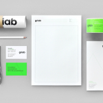
Kokoro & Moi have recently completed the brand identity for Torikorttelit, the old town district of Finland’s capital Helsinki. The identity, based around bright colours, simple geometric patterns, a stacked typographic logo and modernist inspired secondary typeface executed across a broad range of collaterals that includes street graphics and signage, in-print and on-line advertising, stationery, packaging and a variety of publications, neatly mixes the themes of past, present and future ideal for the historic location set at the heart of a growing city.
Read the review here.