Platform by Pentagram
Opinion by Richard Baird Posted 3 September 2013
Platform is a not-for-profit organisation that aims to “increase the interest and participation of underrepresented groups in the fields of technology and entrepreneurship, with a particular focus on African-Americans, Latinos and women” and “to help influence and inspire the next generation of innovators, inventors and entrepreneurs” through its website, conferences and providing “access to current leaders and role models”. Platform’s visual identity, designed by Pentagram, delivers a clear and consistent technological platform and subtle sense of educational accessiblity through the shared aesthetic of ‘digital’ type and playful iconography, a monochromatic colour palette in print and bright blocks of contemporary colour and modular structure on-line.
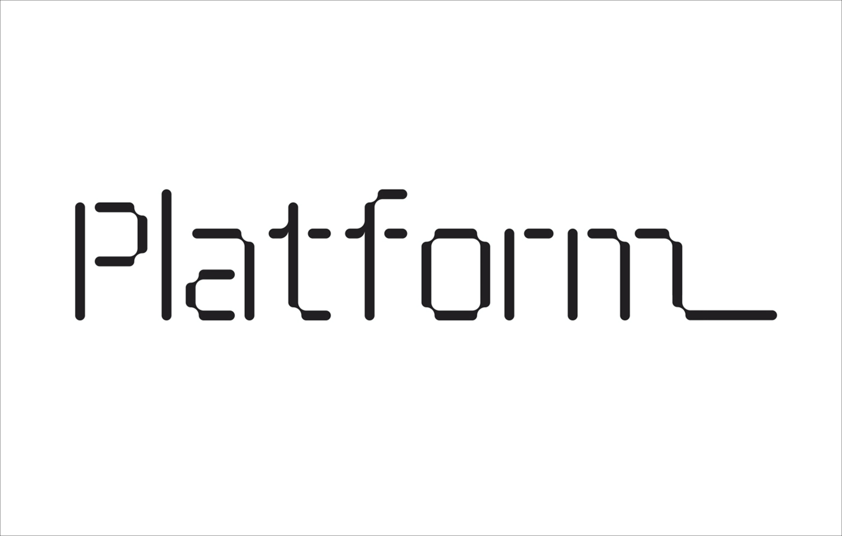
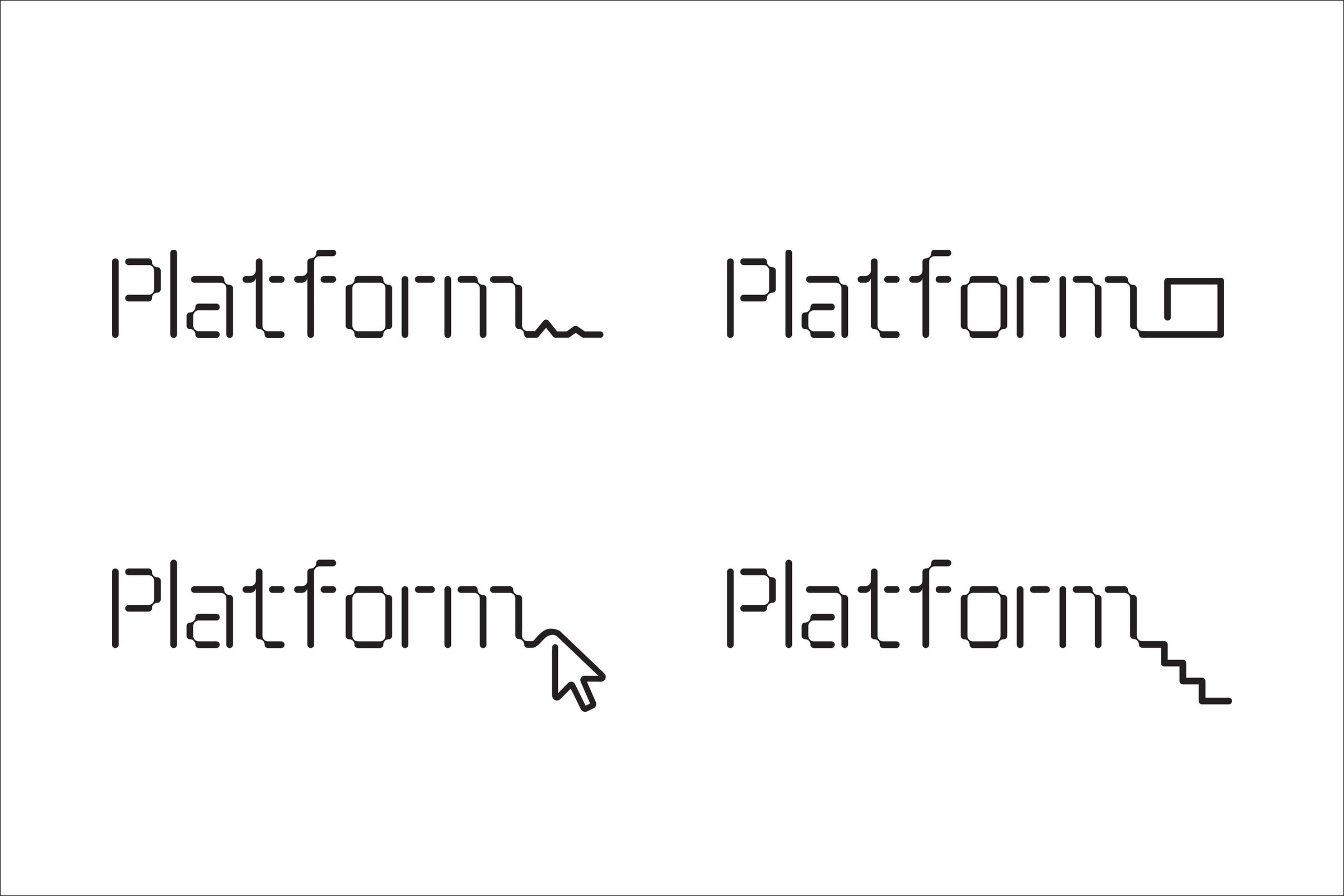
“The Platform identity establishes an iconic, memorable brand for the organization and its initiatives. The logo uses the font ThreeSix 11 (designed by Hamish Muir), chosen for its futuristic, technological look. The wordmark has been extended with a distinctive line, or platform, that can be customized for a series of transformations that capture the dynamic nature of the organization. The line can appear in an endless variety of forms and shapes: lengthening to convey the idea of connection or inclusion, or taking the shape of stairs to a stage, an arrow cursor, or the peaks and valleys of a chart. The line was animated for motion graphics projected before the Summit presentations; in environmental graphics at the conference, the line extended from the logo to travel through the event space.” – Pentagram
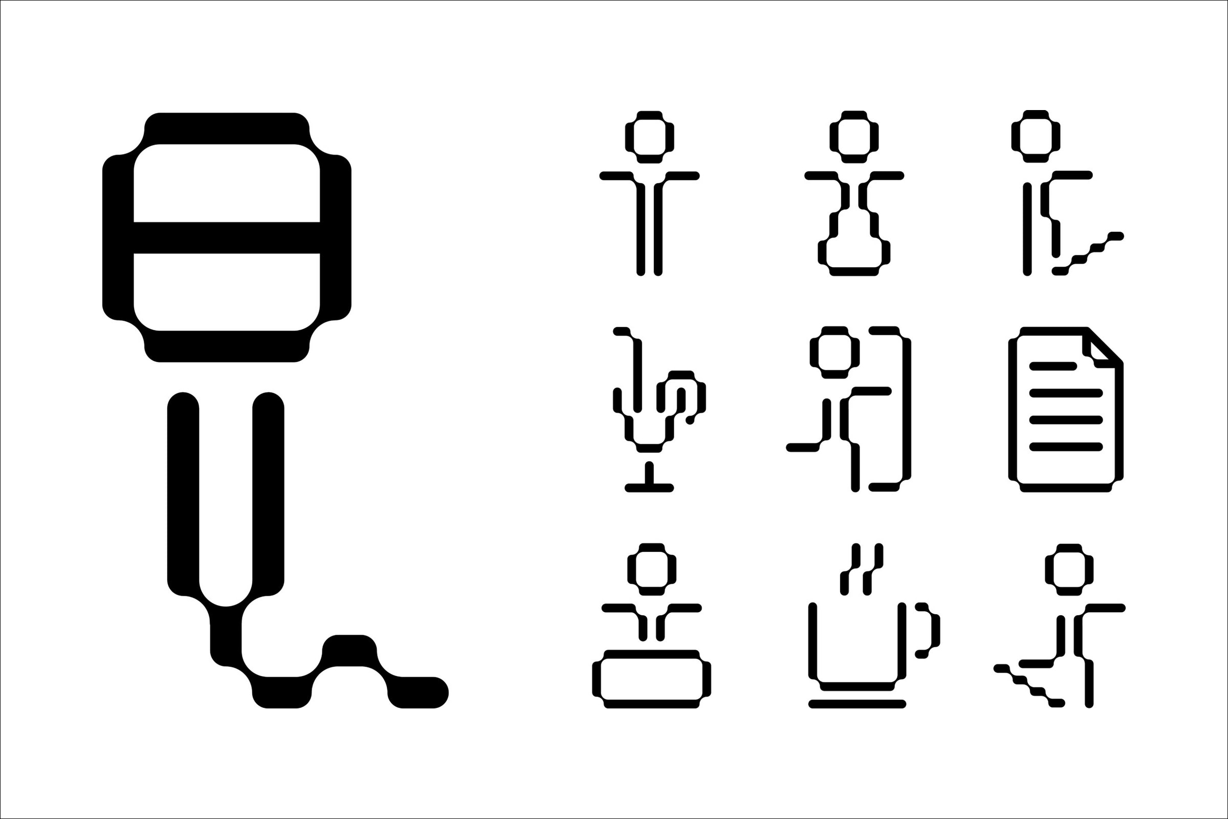
“The designers used the structure of the ThreeSix 11 font to develop a system of unique, playful icons for the Summit collateral and environmental graphics. The icons appeared in patterns on the Summit Guide and in directional signage at the conference. Each Summit will have its own graphic look that is used in conjunction with the Platform identity, and for the first conference, the materials were produced in a strong, simple black and white, with typography set in the font NewRail.” – Pentagram
There is no doubt that Pentagram has succeeded in establishing a solid technological sensibility with their work for Platform. Although I think perhaps legibility suffers slightly at the hands of cohesion/consistency, the shared aesthetic of the logotype and iconography, which balances cuts, small corner joins, rounded terminals, recurring geometry, good spacing and a single line weight of the letterforms with a more playful approach to signage, way finding and extension of the ‘m’, draws out an accessibility from what could have been a fairly cold utility to achieve a good balance of individual character and technological efficiency.
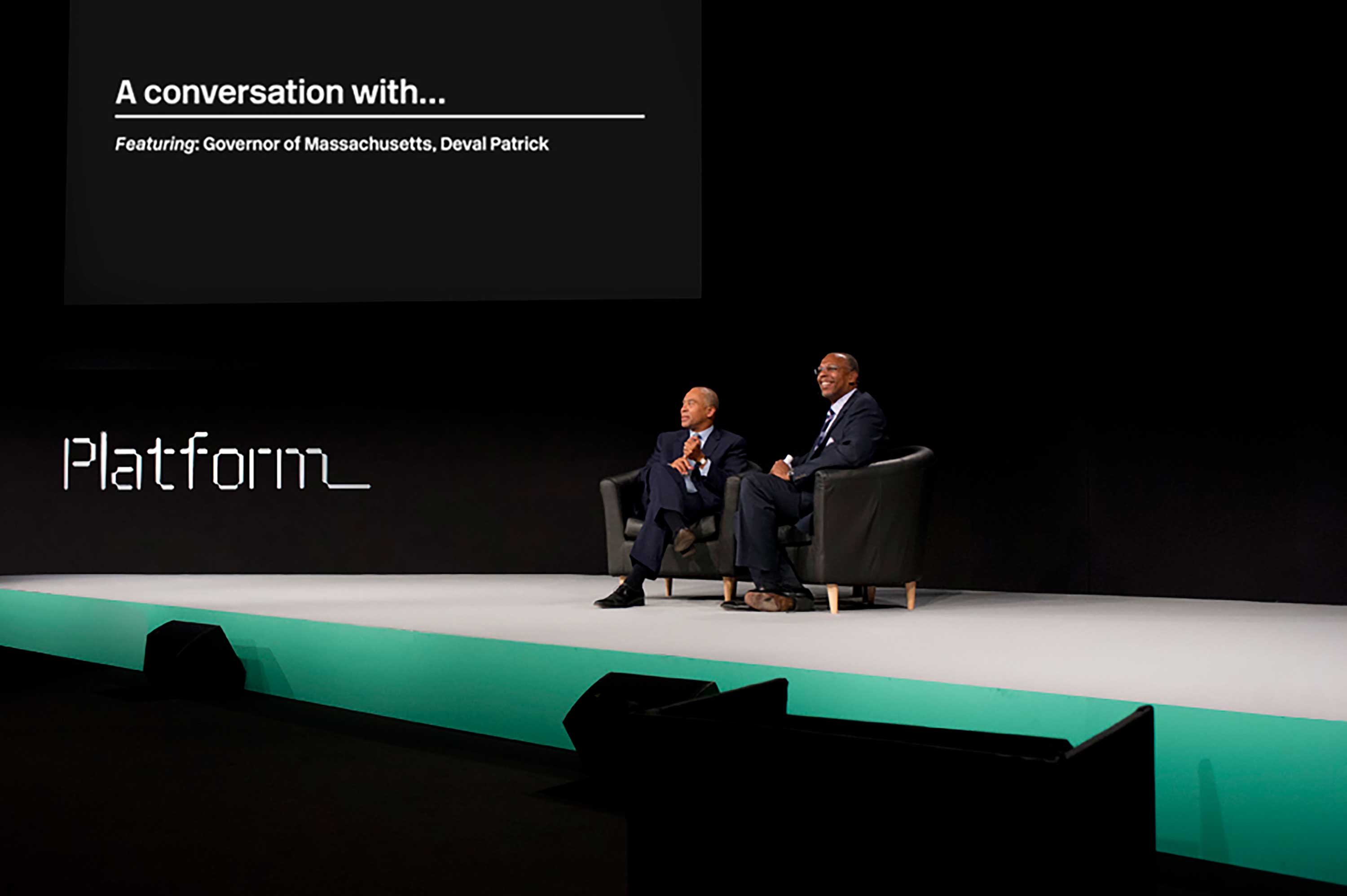
This duality also exists in print and on-line with the former taking a monochromatic approach or ‘inverted utility’ that, rather than using black ink on white paper, favours a more distinctive and on-trend white ink/foil on black paper that feels reflective of DOS, while the latter adds bright contemporary colour.

Details such as the way finding system, which sees a black floor decal emerging from signage – interestingly and practically extending the identity into three-dimensional space, the weight of a duplex business card and the surface texture of the Summit Guide add a nice sense of quality, finer tactile detail and further the sense of practicality established by the type and which extends into the modular build of the website.
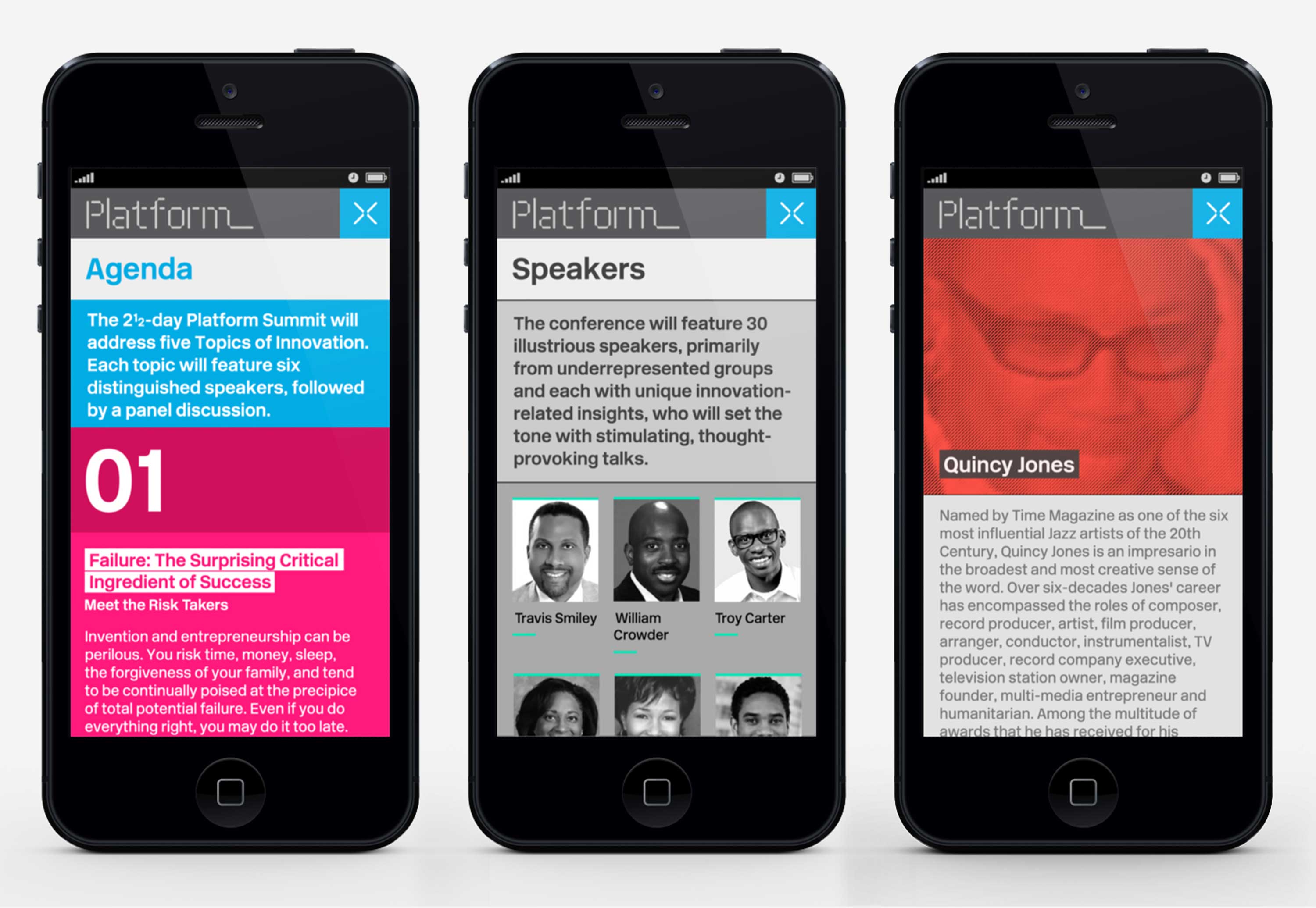
“While the Summit graphics are mostly designed in elemental black and white, the identity for Platform as a whole incorporates bright color to stand out. Bold color is a basic element of the Platform website, the chief “platform” for the organization to share its ideas through videos of the Summit talks. Optimized for mobile use, the site design echoes the segmented forms of the logo in a modular format that places content in blocks. Different categories of information appear in different colors, creating bright patterns. The site will eventually host a large library of conference videos, blog posts and other content, and the designers will also be working with Platform to incorporate statistical info and data visualizations related to the topic of entrepreneurial diversity.” – Pentagram