Interior XIII by Anagrama
Opinion by Richard Baird Posted 6 November 2013
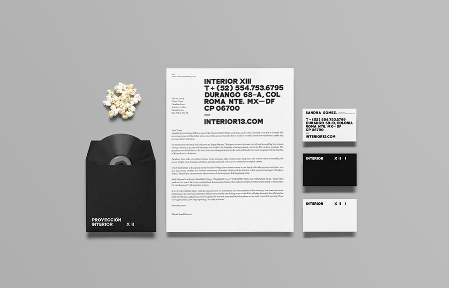
Interior 13 is a distributor of Mexican and international auteur films and promoter of independent cinema. Design agency Anagrama were recently commissioned by Interior 13 to develop a new visual identity that would be “easily relatable to the cinematographic world” as well as being “functional in terms of online promotion.”
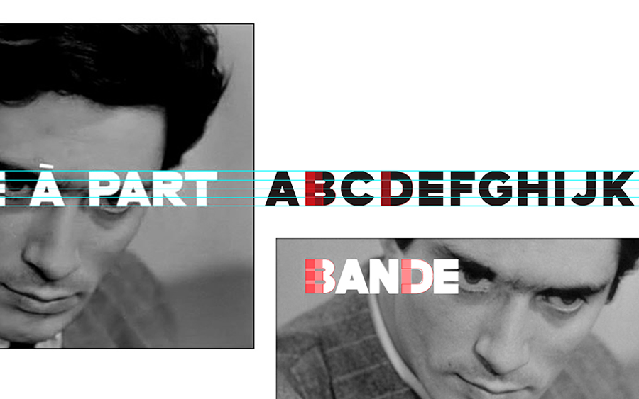
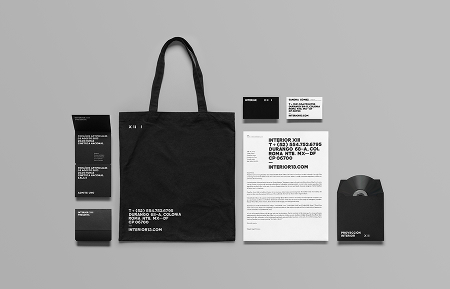
“For the logo, we created a typeface inspired in the title sequence for the 1964 French Nouvelle vague film by Luc Godard, Bande à Part. That title sequence looked very modern for its time, so we chose that typeface for its cleanliness and timelessness. The typeface was used exclusively for the logo and the most important information in the stationery, for the rest we selected Georgia. An interesting combination that keeps the custom type on center stage but lets web-safe, beautifully clear Georgia take the wheel on functionality.” – Anagrama
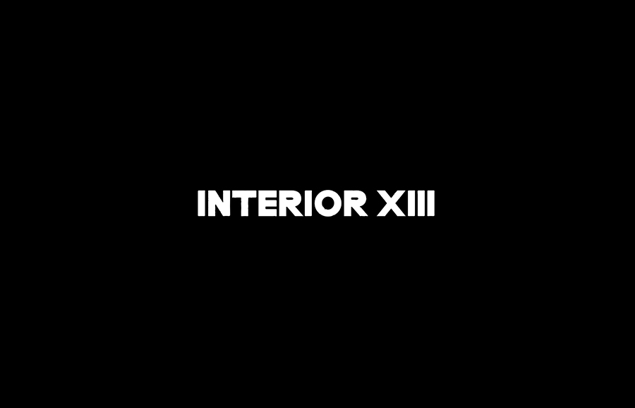
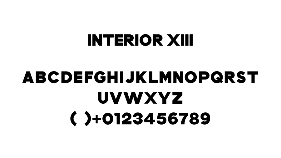
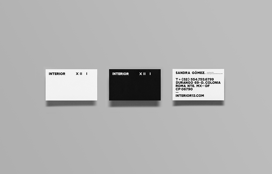
Although there are rendering issues in the vertical and horizontal strokes, very tight counters and what appears to be inconsistent line widths, the custom typography and its details are what you might expect from authentic hand drawn screen letters, imperfect but distinctive and with a considered origin. So while I would not describe the typeface as having a cleanliness it certainly has plenty of character.
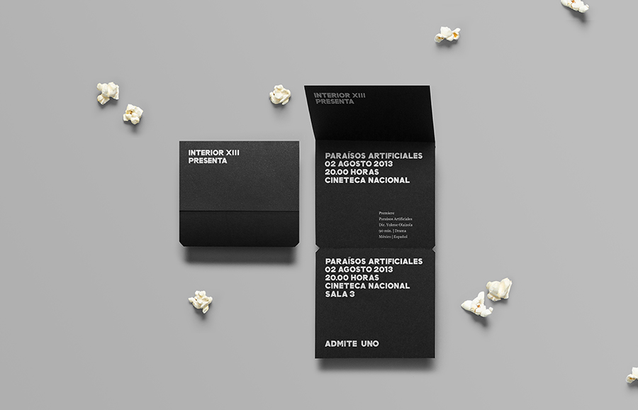
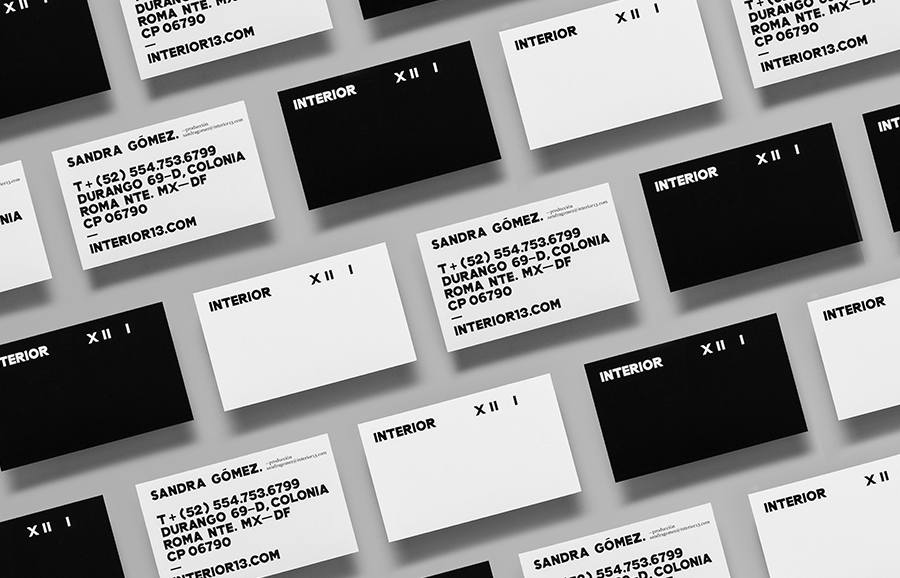
In print Anagrama have made the most of the Interior XIII typeface through contrast, mixing its oversized application with much smaller body copy – making clear its origins as a title typeface – and the high contrast of a black and white colour palette that utilises both a white ink/foil over an uncoated black substrate and a black ink over white substrate, a choice that perhaps reflects the monochromatic film stock of Bande à Part and keeps the brand identity from becoming logo-centric.

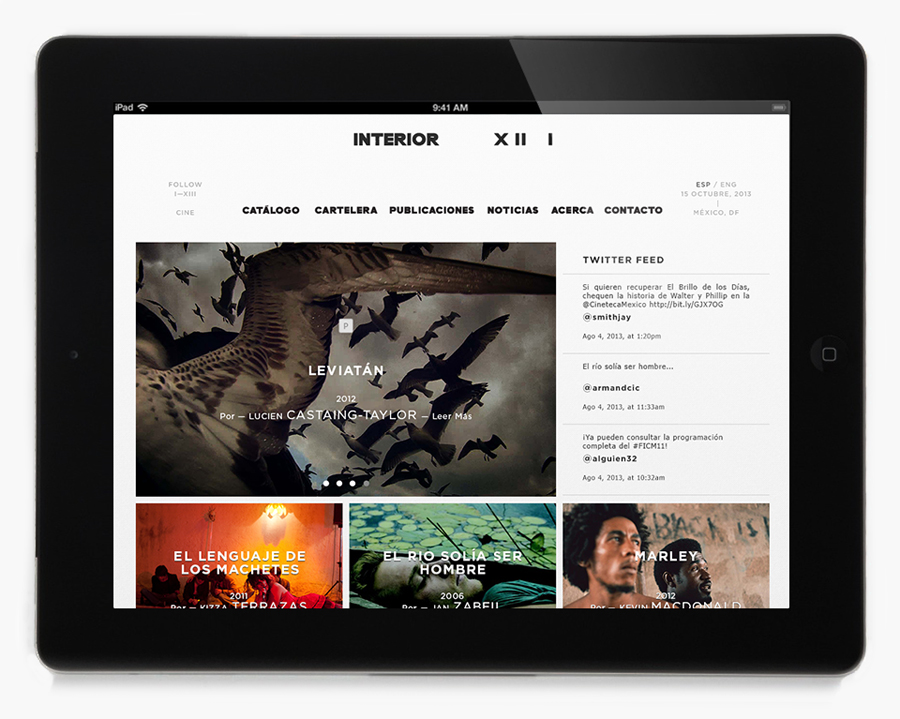
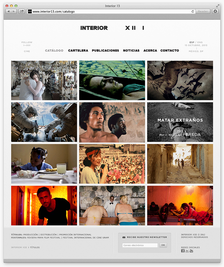
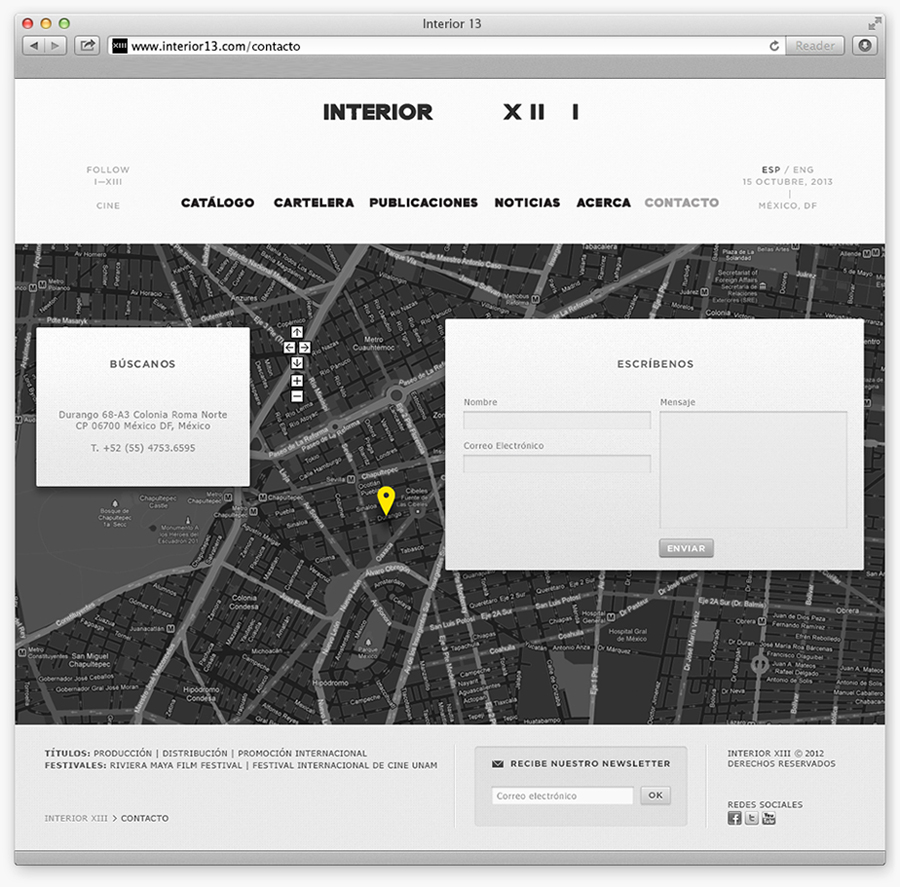
On-line the black and white of the identity is punctuated by the colour of film stills, the typeface has a bold impact and sits well over the images to develop the cinematic theme. The imperfections remain making the site appear a little unusual within the context of an internet of precision and pixel perfection, avoiding an efficiency, making it a little more personal and conveying a subtle, contemporary, retrospective appreciation.
