December’s Top 5 Projects 2013
Opinion by Richard Baird Posted 25 December 2013

This month’s highlights have included new packaging work from Believe In, Graphical House, Port Clarendon and Peter Gregson, brand identity projects by RoAndCo and For Brands, as well as a new visual identity and interior design solution by Savvy for Mexican seafood restaurant La Peñita De Jaltemba.
However, five projects really stood out for me which have made it into BP&O’s top five, a feature that brings together what I believe to be the most interesting of the month for another opportunity to be seen and shared. These include packaging work developed by Mousegraphics for Beatific, new brand identities by Heydays for Hardhaus and Goa Arkitektkontor, and a brutalist inspired visual identity, stationery and print set for Italian concrete veneer brand Cemento created by St.
Do you agree with my choices?

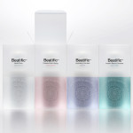
Beatific is a new skincare range from Greek private medical service provider Hygeia Group “for women who are aware of the benefits of cosmeceuticals and can appreciate the results of thorough clinical research and high end care”.
Created by Mousegraphics, the brand identity and packaging for Beatific takes the medical precision, exclusive care and expertise established by the Hygeia Group and a contemporary clinical experience and neatly conveys these through efficient sans-serif typography and the frosted panels of the structural design.
See more of this project here


Goa Arkitektkontor is an Oslo based architecture studio, established in 2012 by Johannes Ludvigsen Goa, that provides planning, regulation and architectural design services. The studio has a philosophy that sees restrictions such as economy, building regulations and social attitudes as opportunities, believes in simplicity and, a little unusually, is not afraid to be banal. These ideas are neatly resolved through a new brand identity and stationery set created by Heydays.
See more of this project here

Hardhaus is a Norwegian specialist mountain sports retailer located in the alpine municipality of Sykkylven. Based around the concept of ‘technical durability’, Heydays developed a new visual identity solution for Hardhaus that juxtaposes the utility of a heavy uppercase and stencil cut sans-serif—bold and ‘oversized’ in its execution in print— and the robust and hardy aesthetic of chipboard imagery, with the finer weight, contemporary on-trend and technological sensibilities of a very well rendered set of geometric and mono-line weight icons.
See more of this project here

Cemento is the UK distributor of an Italian concrete veneer that can be used for both wall panelling and furniture. Inspired by brutalist design, London-based design studio St developed a visual identity, brand guidelines, print and stationery for Cemento that, through geometric form, sans-serif typography, material choice, a repeating pattern and limited colour palette, establishes a ‘robust’ and distinctive solution that reflects the modular and functional nature of the product and concrete, and its more recent adoption as a material for contemporary furniture and interiors.
See more of this project here

Håndværk is a New York based clothing brand that mixes craftmanship, minimal elegance, premium materials and innovative fabrics to produce high quality everyday essentials for both men and women. Designed by Savvy, Håndværk’s new visual identity—which includes sans-serif logotype and packaging with a blind emboss detail—conveys the brand’s elegant and elemental nature with what Savvy describe as clean lines and a simple typographic approach based on “minimal scandinavian and japanese aesthetics”.
See more of this project here