Inspiral by Studio h
Opinion by Richard Baird Posted 17 January 2014

Inspiral is a UK-based organic raw food company that produces a variety snacks, cakes and drinks. To reach a broader market, move on from a ‘hippy image’ whilst retaining their ‘cool credentials’, Inspiral recently commissioned Studio h to create a new brand identity and packaging system for their Crackits and Kale Chips ranges, among others, as well as developing assets that could be easily utilised across future lines.
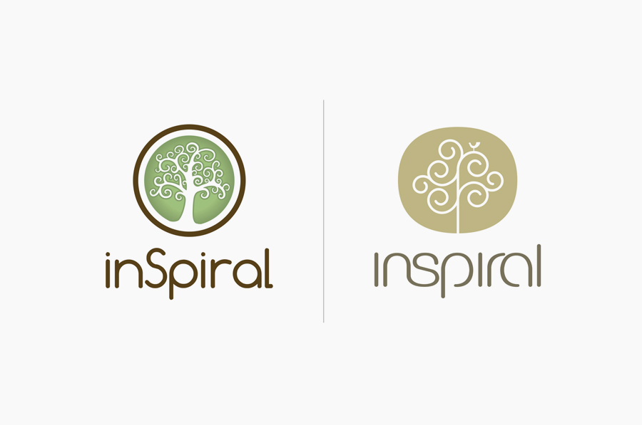
By replacing the previous logo with a new mono line weight reinterpretation of the tree and a similarly styled logotype, Studio h have delivered a far more contemporary and better resolved aesthetic whilst retaining some of its recognition.
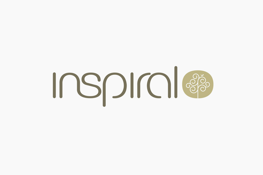
The ns ligature is perhaps a little adventurous and the ‘ra’ pair a touch tight but the execution of the logotype is by far a superior piece of typographical work with some simple details such as a slight change in weight through the curves and breaks in the p and a that help to give it a proprietary and professional finish without appearing superfluous or over-designed.
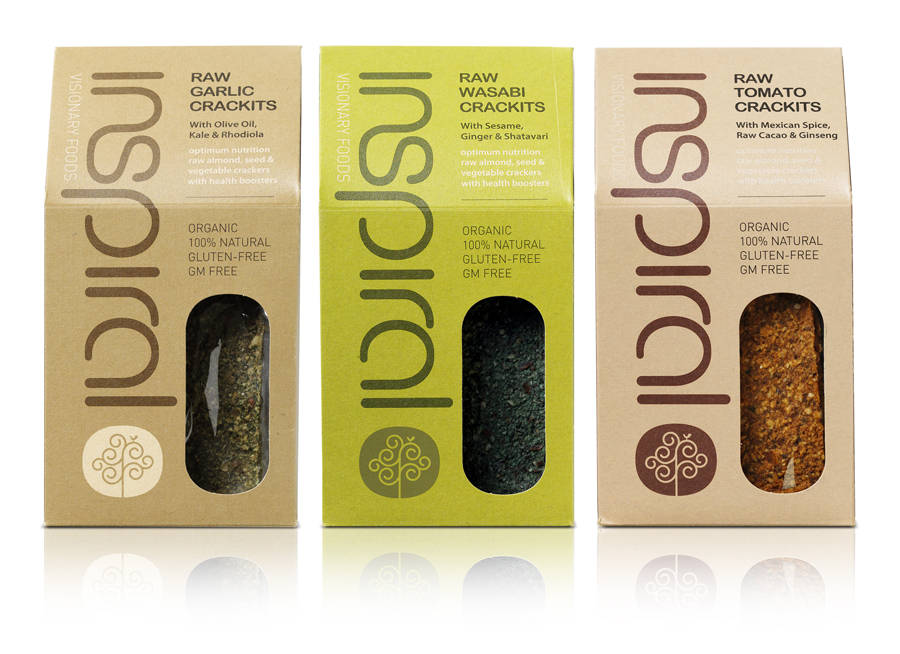
Although the earthy boards, die cut window and structural choice of the Crakits range is a solid communicative resolution of honesty and wholesomeness, it is the Kale Chips packaging that really stands out as something a little more unusual for the market.
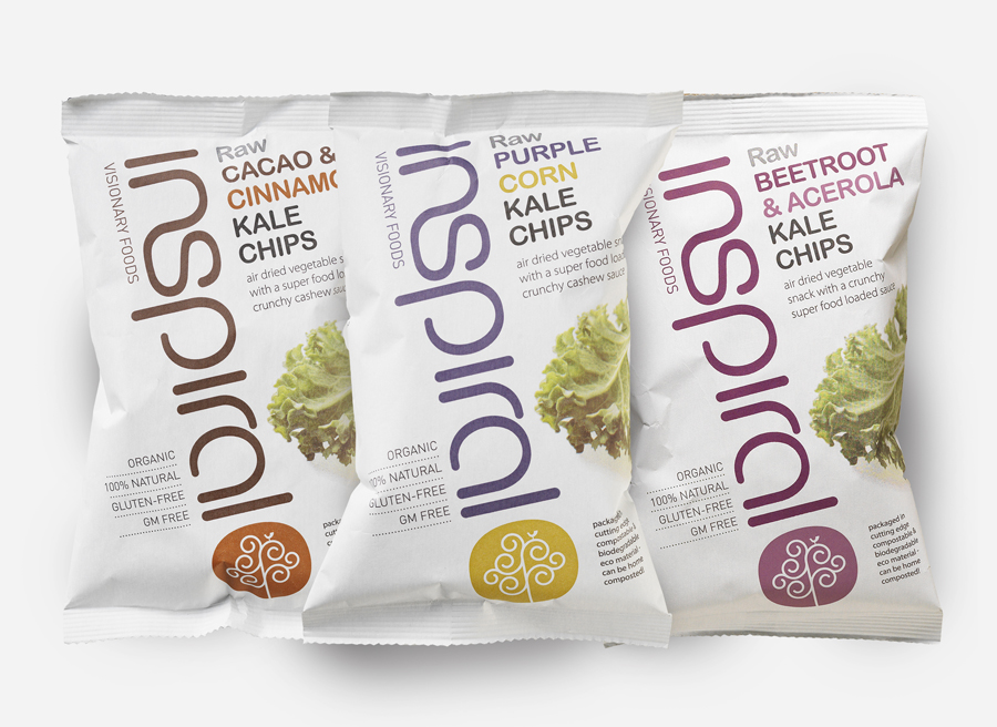
The angle of the typography is distinctive with an on-the-go sensibility, the colour palette appears light and healthy, bright but natural, enhanced by the white background, while a logo-centric layout makes the most of the well-rendered logo-type—its change in weight separating it slightly from the secondary typeface—to structure information.
A compostable pouch pack—developed in collaboration with National Flexible Packaging—develops Inspiral’s credibility as an eco brand in a clear and tangible way and provides the bag with a high quality matt texture that works well with the flat colour of the typography.
