The Best of BP&O — January 2014
Opinion by Richard Baird Posted 31 January 2014

Highlights this month have included new stationery work from Build for Generation Press which also features type work by Colorphon, an architectural brand identity designed by Spy for Haverstock, the over-sized iconography employed by Heydays for Intu, and the contrast of illustrative flourish and restraint utilised by Say What Studio for art gallery, bar and cocktail academy Apartment A.
However, there were five projects that really stood out for me that have made it into BP&O’s top five, a feature that brings together what I believe to be the most interesting of the month for another opportunity to be seen and shared.

Located in the Majorstuen district of Oslo The Norwegian Academy of Music is Norway’s largest music academy. It offers both undergraduate and post-graduate courses, has educated some of Norway’s most prolific musicians, and, according to Wikipedia, ‘attempts to lay the foundation for research within the various fields of music’.
Based around the concept of an ‘endless visual pulse’, design agency Neue developed a new generative logo system for the academy that takes the sounds of students practicing, the conversations of the cafeteria and the applause of the concert halls, and allows these to resonate through a number of graphic elements set above and below a horizontal plane forming a responsive and geometric waveform.
See more of the project here


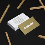
Under Your Skin is a specialist tattoo and skin care range made up of three treatments; ‘Recover’, ‘Protect’ and ‘Enhance’, developed in response to skin art’s move from sub-culture to the mainstream.
Under Your Skin’s brand identity—which included a logotype, original illustrative work and packaging design, developed by Leeds-based Robot Food—was created to appeal to a broad audience, “from the newly marked” to “the most hardcore tattoo lover”, whilst staying “true to the culture and heritage of tattooing” says lead designer Mike Johns.
See more of the project here

Brae is a restaurant, located in the Australian town of Birregurra, that describes itself as having a menu of unique and contemporary dishes built around a respect for nature and seasonality, and which is crafted from organic ingredients sourced locally and grown on its own 30 acre site. Brae’s new brand identity—which included a new logo-type, menu, stationery set and website developed by Melbourne based Studio Round—juxtaposes traditional typography and a seasonal colour palette alongside the contemporary creativity and rich natural detail of a series of still life photographs taken by Scottie Cameron.
See more of the project here

The Raiffeisen Rechenzentrum is a customised IT infrastructure service provider and subsidiary of Raiffeisen Landesbank with a modern, ‘high availability’ and maximum security data centre located in Austria. Design agency Moodley recently developed RRZ’s brand identity—which included a logo, business cards, brochure and website—based around a single sans-serif, a contrast of humanistic and technological imagery and a white, black and bright yellow colour palette.
See more of the project here

Puebla 109 is a three floor 20th century townhouse, located in the Roma Norte colonia of Mexico City, “where art, design and gastronomy converge” in the form of an evolving space utilised as a place to work in the morning, as a restaurant to eat lunch in the afternoon and as a bar to have cocktails in the evening.
Puebla 109’s new brand identity—which includes a number of different logos, packaging and print, stationery and menus created by design studio Savvy—establishes a strong, on-trend and crafted sensibility through hand drawn typography, uncoated materials, stamp-based print finishes and punched tape label detail.
See more of the project here