The Best of BP&O — April 2014
Opinion by Richard Baird Posted 29 April 2014
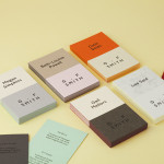
April was a solid month for new work, highlights included packaging work by B&B Studio for gourmet popcorn brand Propercorn, Bureau Hardy Seiler’s work for Freies Theater Hannover and BVD’s visual identity for Swedish industrial designer Nina Jobs. However, there were five projects that really stood out for me this month which have made it into BP&O’s top five, a feature that brings together what I believe to be the most interesting for another opportunity to be seen and shared.

Roberto Revilla designed by Friends
Roberto Revilla, working with his wife Carolina, provides luxury yet accessible custom tailoring services nationally and internationally from his premises not far from London’s Saville Row. As well as tailoring, Roberto also retails a range of high quality accessories online.
In response to a growing global client base and a desire to position the company alongside the “giants of luxury tailoring” such as Tom Ford, Armani, Canali and Zegna, Roberto worked with Friends to develop a new brand identity. Influenced by established fashion brands and global trends, Roberto’s own likes and dislikes, and unusually, the feedback of 4o of his clients, Friends delivered a solution that reflects a philosophy of accessible luxury, personable service and material craft delivered through logotype, monogram, stationery, stitched labels, suit bags and website design.
See more of the project here


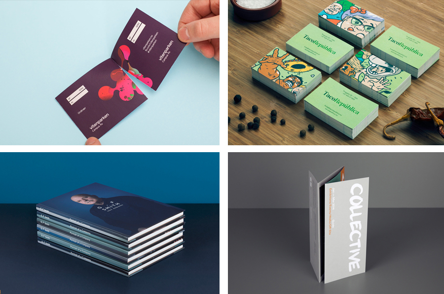
Vitenparken designed by Bielke+Yang
Vitenparken is a science centre committed to facilitating and improving the dialogue between the bioscience research community and the general public. The centre contains an exhibit hall, cafe, dairy museum and meeting facilities set within the Campus Ås grounds of the Norwegian University of Life Sciences. As well as the science centre these grounds are home to over a 1000 scientists, a university with eight departments and 4500 students, and a number of parks.
Formerly the Norwegian Agriculture Museum, Vitenparken commissioned design studio Bielke+Yang to help them transition from museum to science centre through the creation of a new brand identity that included naming, logo, print and website design. By appropriating the practical aesthetic of science (sans-serif typography, black ink and white paper), and juxtaposing this alongside the bright contemporary energy of MVM‘s illustrative work, Bielke+Yang’s solution establishes a common yet compelling scientific accessibility.
See more of the project here

Collective Gallery designed by Graphical House
Collective is a contemporary visual arts organisation founded in 1984 to help new and emerging artists exhibit their work in Scotland’s capital city Edinburgh. The organisation delivers a diverse programme of new exhibitions and commissions, and is described as being “fundamental to the cultural vitality of the country”. Following a move to The City Observatory, Glasgow based design studio Graphical House worked with Collective to develop a new brand identity that would challenge the ‘white space’ gallery convention and give them a contemporary voice within Edinburgh.
See more of the project here

Taco República designed by Bielke+Yang
Taco República is described by Bielke+Yang, the design studio behind its visual identity, as Norway’s very first genuine taqueria. Wanting to avoid some of the Mexican restaurant clichés, Bielke+Yang juxtaposed classic typography and a guacamole based color scheme with a colourful and contemporary illustrative panel created by Uglylogo, which offers a humorous take on the “enthusiasm and craziness” of the local community prior to opening, to convey traditional quality and a contemporary experience.
See more of the project here
G . F Smith designed by Made Thought
G . F Smith is an independent British paper merchant with a heritage dating back to 1885 and a loyal staff, some of whom have provided over 20 years of loyal service. Made Thought, the design studio behind the visual identity for G . F Smith’s distinctive Colorplan range, were recently commissioned to develop a new brand identity for the company that would better reflect the legacy, stature and future ambitions of the company. This included a new logo and logotype, sample and heritage booklets, stationery, pin badges and website.
This review was written by Maisie Benson, a final year graphic design student studying at Falmouth university. Maisie has secured placements at renowned studios jkr, Smith & Milton and B&B Studio, and has a keen interest in brand identity and packaging design.
See more of the project here