Penson Group by She Was Only
Opinion by Richard Baird Posted 5 May 2014

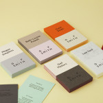
Penson is an award-winning interior design firm that help businesses to achieve their “cultural and commercial ambitions” by replacing dull and inefficient spaces with those that are beautiful and intelligent. Penson’s new visual identity, developed by London based design studio She Was Only to coincide with the firm’s 10th anniversary, delivers what the studio describe as a “clean and confident solution”, consistently executed, that better reflects the firm’s high quality projects. This extended across business cards, website and signage.

“A strict black and white colour palette, bold logotype and elegant type hierarchy resulted in a sophisticated, stylish new identity. With all aspects considered right down to the texture and finish of the paper stock, Penson now stand proudly apart from their competition. The website brief was clear; sleek and simple. Through considered use of smooth transitions and touch optimised navigation, we delivered a user experience which allows for an easy journey through an impressive portfolio of work.”– She Was Only
The custom logotype, based on the humanist sans-serif Johnston, is well drawn and spaced, its uppercase characters, absent contrast and geometric forms effectively convey functionality and efficiency alongside a limited colour palette. While there are many sans-serif typefaces available with similar communicative value, perhaps a little less profile and more individual character, the influence of Johnston on the logotype—a typeface tied to the history of London Transport and designed with simplicity, usability and modernity in mind—resonates well with the values and location of Penson.


Subtle features such as triplex Colorplan board with what looks like a Buckram surface emboss, black block foil print finish, good quality exterior and interior signage, the use of Hoefler & Co’s display serif Chronicle on-line and a mix of white on black and black on white text, surround the logotype with detail and variation that keep the project from becoming largely logo-centric.


Between the bold forms and familiar communicative clarity of the logotype, the texture of the card, frosting of glass and the accessibility of the website the new identity manages, with few assets, to resolve efficiency, interior detail and a intelligent technological dimensionality.
Design: She Was Only
Opinion: Richard Baird
Fonts Used: Johnston & Chronicle