Los Italianos by Huaman
Opinion by Richard Baird Posted 29 May 2014
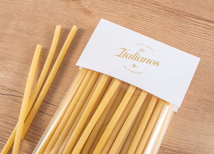
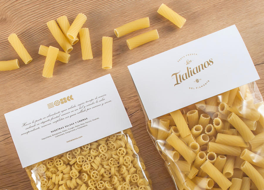
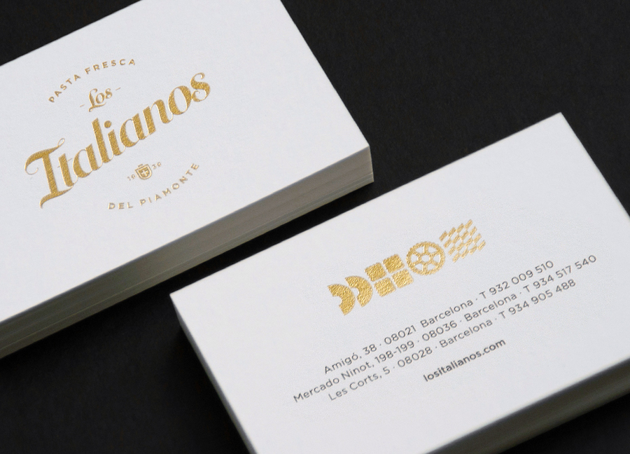
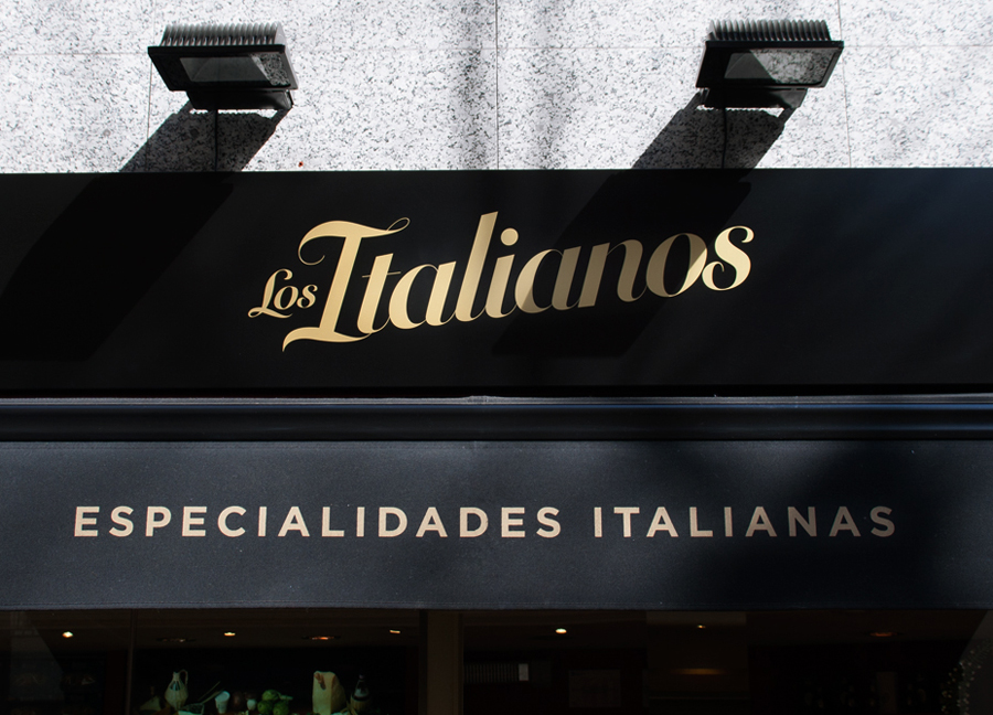
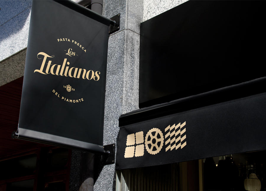
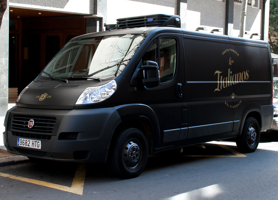
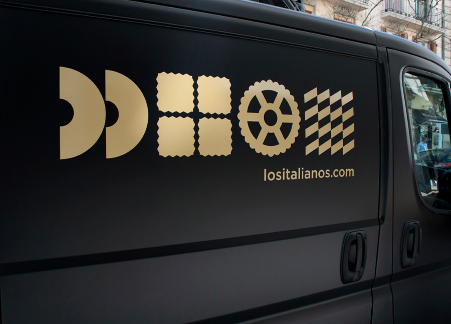
Los Italianos is a traditional Italian food producer and retailer with three locations across Barcelona but with its roots in the Piemonte region of Italy and a significant history that dates back to 1939. Los Italianos recently commissioned Spanish design studio Huaman to develop a new brand identity that would better position them within the gourmet category, introduce an elegance and modernity whilst retaining a sense of heritage. This was achieved through the simple leveraging of familiar, high quality and traditional design cues of a script, shield and foil, and fusing these with the contemporary distinction of bold geometric shapes informed by the diversity of Italian pastas. These were applied to business cards, packaging and signage.
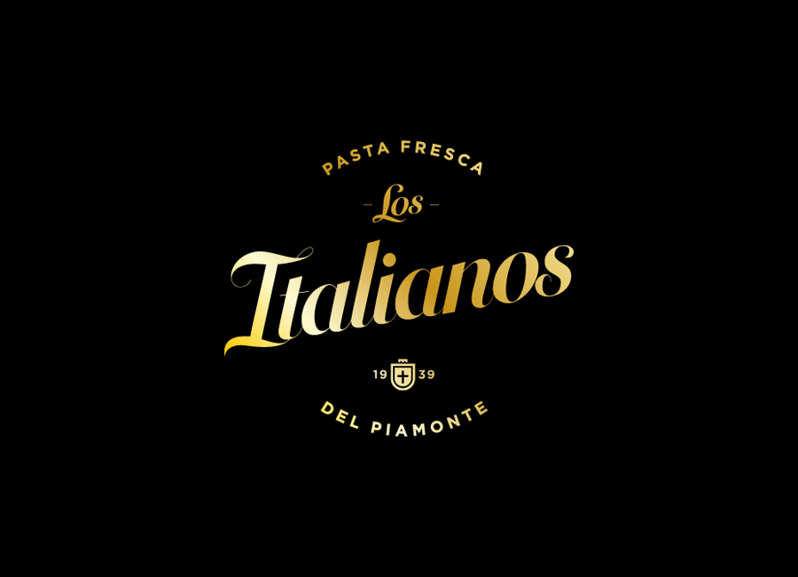
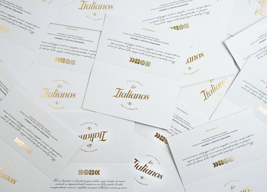
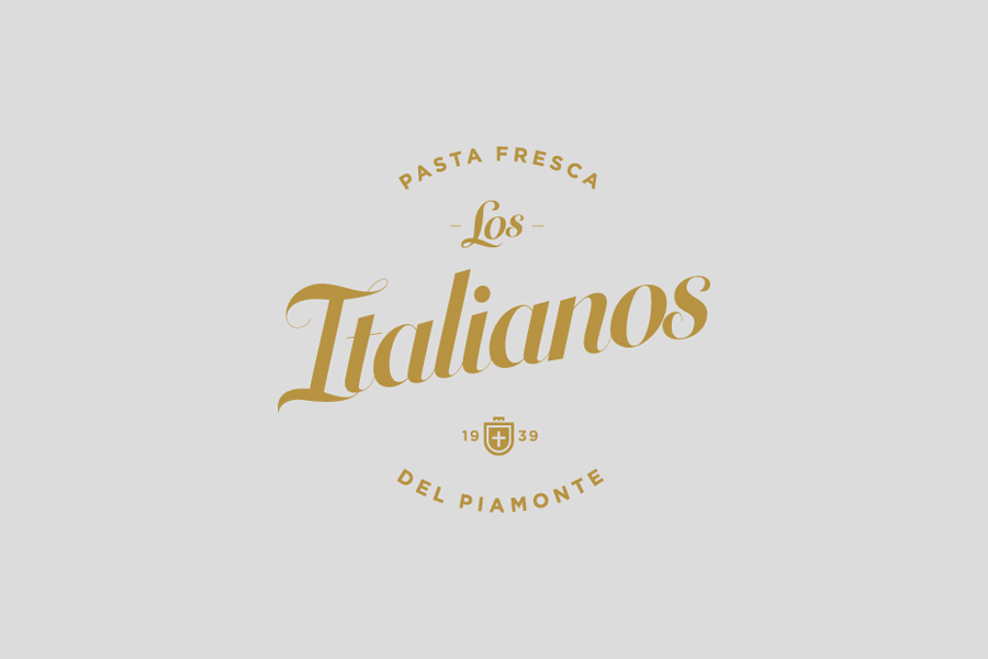
The logo utilises a common but effective set of components to establish the values of high quality, craft and experience. These include curved baselines, script, shield and a clear focus on provence, knowledge through age, and freshness. It is unmistakably traditional in its influences and appropriately utilises a long serving aesthetic that lends itself well to the conveyance of information but with modern consideration given to the use of space layout, the typesetting of characters and the rendering of the script. The script is particularly well handled, with enough loops, ligatures, swashes and flourishes and a high stroke contrast and calligraphic influence to appear proprietary, crafted and reflective of the age of the business.
These communicative details are drawn out across the packaging with the introduction of a dynamic italic, no doubt delivering a fuller narrative with regards to heritage and the craft of pasta making, the high quality associated with a gold foil and a professional kitchen white.
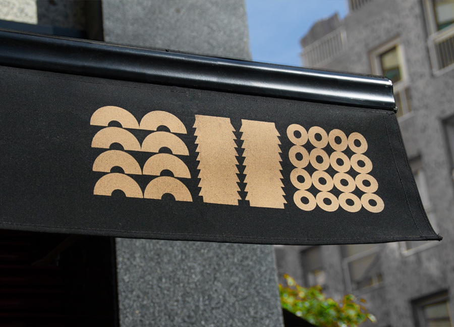
The icons, informed by the vast variety of Italian pastas, reduced down to flat geometric forms and set within a grid, is the highlight of the project, managing a contemporary playfulness without appearing childish or undermining the authentic heritage the logotype intends to establish but with a similar communicative clarity. More from Huaman on BP&O.
Design: Huaman. Opinion: Richard Baird.
