The Best of BP&O — May 2014
Opinion by Richard Baird Posted 30 May 2014
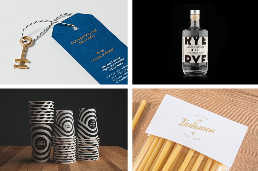
This month’s highlights included a new brand identity solution by Band for The Franklin Boutique Hotel, Moffitt.Moffitt’s work for online linen retailer In Bed and Mucho’s visual identity for business leadership consultant Coma. However, there were five projects that really stood out for me this month which have made it into BP&O’s top five, a feature that brings together what I believe to be the most interesting for another opportunity to be seen and shared.
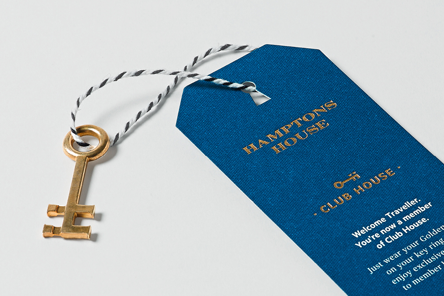
Hamptons House is a Sydney based curator and retailer of furniture and homeware that celebrate the unexpected and draw influence from renowned New York holiday destination The Hamptons. Design studio Moffitt.Moffitt were recently engaged by the retailer to develop a new visual identity—which went on to include logo and logotype design, illustration, shopping bags, packaging, swing tags, stationery and membership key—that would reinforce the brand’s sophisticated proposition as well as conveying some of its eccentricity.
See more of the project here
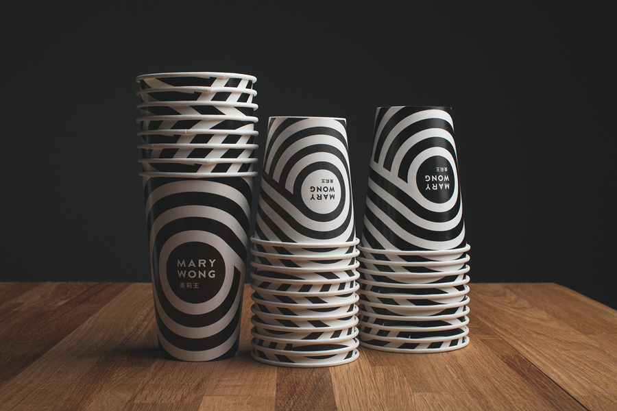
Mary Wong is a fast-food chain, with locations throughout the Russian city of Rostov-on-Don, that prepares Chinese noodles with both Asian and American influences. Mary Wong’s brand identity, a combination of bilingual typography, logotype, black noodle boxes with bright spot colour stickers, t-shirts and environmental design developed by Moscow based studio Made By Fork, was inspired by Tokyo and New York nightscapes and reflect the chain’s fusion of east and west.
See more of the project here
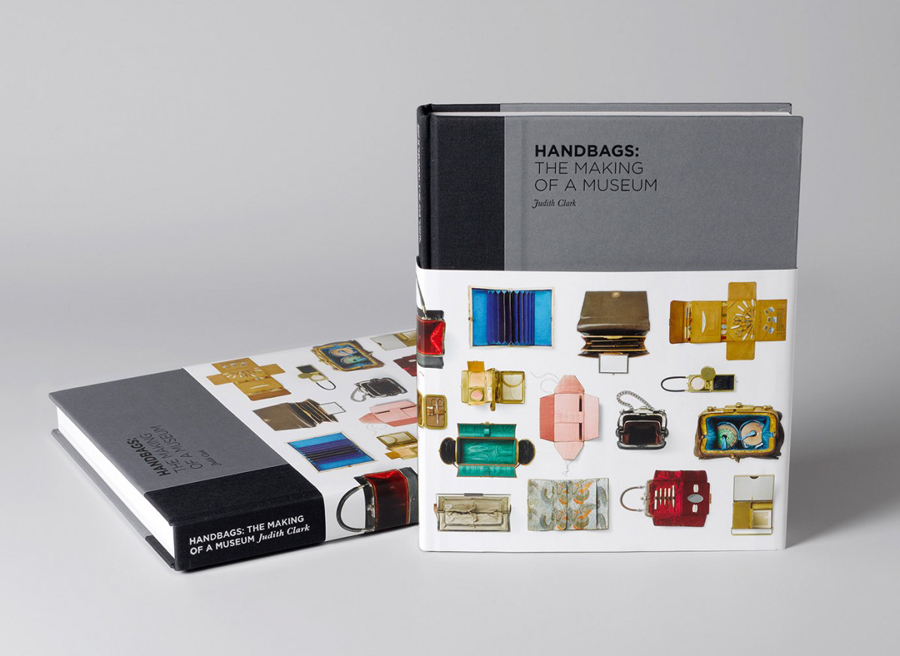
Simone Handbag Museum is dedicated to the history of handbags with ‘international significance’ and provides its visitors with a curated, contemporary and historical collection to explore over two floors at the centre of the South Korean city of Seoul. London based Charlie Smith Design were recently commissioned to develop a brand identity for the museum that would resonate with and unite its diverse collection across exhibition graphics, gallery guide, merchandise, posters, book, website, newsletters and temporary exhibition promotional material.
See more of the project here
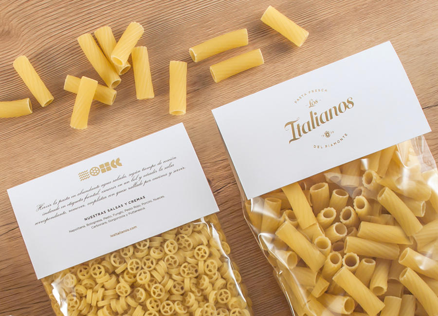
Los Italianos is a traditional Italian food producer and retailer with three locations across Barcelona but with roots in the Piamonte region of Italy and a significant heritage that dates back to 1939. Los Italianos recently commissioned Spanish design studio Huaman to develop a new brand identity that would better position them within the gourmet category, retain the heritage of the company and introduce an elegance and modernity. This was achieved through the simple leveraging of familiar, high quality and traditional design cues such as script, shield and foil, and fusing these with the contemporary distinction of bold geometric shapes informed by the diversity of Italian pastas.
See more of the project here
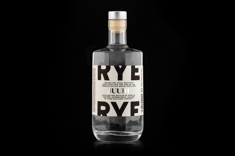
Kyrö is a Finnish distillery, housed in a former dairy in the region of Isokyrö, that will yield a high quality 100% rye whisky in 2017 for national and international markets and currently batch produces a root variety for cocktails. Design studio Werklig was commissioned by the distillery to create their brand identity, which went on to include a logotype and a custom sans-serif typeface, stationery and packaging designs with inlaid paper and foil detail, that would “reflect whisky culture but also the distillery’s local roots and heritage”.
See more of the project here

