The Best of BP&O — July 2014
Opinion by Richard Baird Posted 1 August 2014

Highlights this month included Anagrama’s brand identity solution for Alberto Senties Catering, Marx’s packaging treatment for Supreme Coffee and Studio Lin’s work for Kid O and Fort Standard. However, there were five projects that really stood out and have made it into BP&O’s top five, a feature that brings together the most interesting of each month for another opportunity to be seen and shared. Projects that make it into the top five display a good balance of graphic design, print finish, material and structural choice, and have a communicative depth and precision.

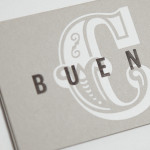
KVGD is a Glasgow based graphic design studio run by Kerr Vernon that works within the fields of brand identity design and print, has a ‘be nice, do good work’ philosophy, and a reputation for producing engaging, thoughtful and crafted projects. The studio’s client base is diverse, local and national, and includes businesses such as gallery, event and creative workspace The Whisky Bond, eco-friendly goods co-op Greencity Wholefoods and the restaurant Ox and Finch. KVGD recently implemented a new visual identity treatment which included logo, duplex business cards, promotional booklets and website that, through brightly coloured papers, type from New Zealand foundry Klim, letterpress print finish and open stitched detail, draws out the crafted nature of the the studio’s work.
See more of this project here

Waffee is an authentic, Australian based, Belgian waffle and coffee chain with locations across Melbourne and Altona. Developed by holistic design practice A Friend Of Mine, Waffee’s brand identity, which included logo and packaging design and a signage system created in collaboration with architects Hecker Guthrie and Foolscap Studio, mixes a typographically adventurous logotype with an illustrated character to establish a rich communicative duality and contrast of literal and subtle narrative detail that binds print and interior space.
See more of this project here

Dadadum is a Swiss contemporary furniture brand created out of respect for and in homage to the functionality, technical expertise and minimalism associated with Swiss design, and that strives to bring out the beauty of each raw material. The brand draws on the ‘talents of local designers who have made an international name for themselves and whose specifications are to re-establish the notion of Gute Forme as espoused by Max Bill’. Developed by design studio and co-founder Demian Conrad Design, Dadadum’s new brand identity uses Swiss sans-serif typography and a grid based approach that plays with letter space to convey the core values of modularity, playfulness and origin.
See more of this project here

Believe In recently published images of their print and brand identity work created for the Mall Galleries’ exhibition Colours Of The Kalahari, the first major display and sale of southern African Bushman art ever to be held in London. The exhibition represents the latest generation of contemporary San artists from an unbroken line that stretches back 20,000 years, and includes 150 pieces from 30 leading artists, each honouring their ancestors and their ancestor’s way of life through oil, lino cut, intaglio, embroidery, print, Xhosa or photographic approaches.
See more of this project here

Scotland Can Make It! is a limited edition collection of souvenirs, created by leading Scottish designers and artists in collaboration with manufacturers from across the country, for the Glasgow 2014 Commonwealth Games. The souvenirs are described by Graphical House, the design studio behind the collection’s brand identity and website, as being part of a programme of events that celebrate ‘Scotland’s cultural heritage, creative practice, skill and production’, and are available online and from a pop-up shop located on Glasgow’s Osborne Street during the summer.
See more of this project here