BANG PR by RE:
Opinion by Richard Baird Posted 11 September 2014
BANG is a Sydney based public relations business and sub-company within the M&C Saatchi group. It is described by RE:, the design studio behind its brand identity, as being known for infectious ideas, seriously bright storytelling, and acting as a social loud hailer for its clients, generating impact, creating chatter and building excitement.
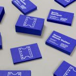
RE:’s identity treatment, which included a dynamic animated logo, a variety of printed collateral and soon-to-launch responsive website, visualises the energy, explosive potential and the impact BANG has on its clients’ businesses, using a bold logotype that frames a variety of brand expressions that are conveyed through a good mix of type, illustration, language, photography, static image and motion.
The logotype’s stacked and well spaced uppercase characters, absence of flourish and of significant weight, manages to balance a typographical restraint with a subtle sense of bulging containment that, when expanded, works well to frame and unite a plethora of ideas with an aesthetic and communicative diversity and contrast under the concept of cause and effect. These includes a mix of all-uppercase and all-lowercase sans-serif type and script, illustration with a loose hand-drawn quality, emoticon, and emotive language that use alliteration and social media vernacular. Some of these are stylistically not as tight as others but together effectively resolve themes such as technology, multi-media contexts, individuality, informality, energy, playful and youthful character and verbal dexterity with plenty of room to grow and be defined. A lot of these are familiar but clear, ideal for a PR business.

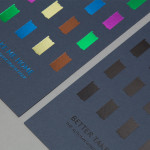
The use of photography provides an intelligent counterpoint to the type and illustration whilst retaining energy and a sense of surprise. While there is only one example, the way it is shot, how the model is dressed and her facial expression introduces a more editorial and sophisticated sensibility. It really shows off the potential for the concept to move between different communicative styles, contexts and media opportunities, but which are are still bound by cause, effect and an immediacy.
Although the framing device is not new, it is appropriately leveraged here, well executed and includes some interesting applications. There is a good relationship between the name and the concept within the context of a PR business and manages a cohesive variety well. Although there are only a few potential ideas explored here, the opportunity to broaden the aesthetic and communicative impact, and its ability to reach across a variety of still and dynamic media applications, is vast.
Design: RE:
More from RE: Ridley & The Confidante
Opinion: Richard Baird
Fonts Used: Flama