Collective by Hey
Opinion by Richard Baird Posted 26 September 2014

Collective is a new Istanbul based agency that is described loosely by Hey, the design studio behind its brand identity, as producing content, communication and design work. Its has an ideology, like the name suggests, based around a collaborative approach, developing projects with an extended network of people with a variety of skills. Hey recently created an visual identity treatment for the agency that draws its distinctive character and impact from a contrast of type detail, type size and colour, as well as good quality materials and print finishes.

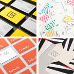
Informed by the collective, collaborative and networked nature of the agency, Hey’s logotype treatment takes the ample detail and flourish of Klim’s Domaine and adds more personality by pulling the characters in, adding ligatures, contact points, and cutting away some of the T. The intention and concept is evident, however, the result appears awkward and perhaps as a slight mistreatment of what is a lovely character set. Some of the elegance ascribed to such a choice is unfortunately lost on customisation that is underpinned by a familiar and ambiguous idea that may well have been better served elsewhere. It is great to see Domain across the business cards and handling a lot of information well.
The large sans-serif letters of LL Brown introduce a bold, functional contrast to the logotype and the finer detail of Domain. Its statement “A thousand heads. One mind.” is a welcome and more explicit approach to conveying the core principles of collective and communication, and has a subtle publisher-like sensibility in its oversized placement across the sleeve of the notebook.


It is clear from Hey’s updated site and their recent lecture at Colour in Context, that they love to play with colour, and coloured papers. Here, rather than drawing on the concept of diversity united, or the studio’s love for variety, have favoured a black, white and yellow uniformity and restraint. Hey describe this as mixing sobriety with the collaborative nature of Collective but to this reviewer is more in service of visual impact rather than a well founded communicative agenda or at a stretch, corporate warmth.

The papers, print finishes, notepad, triplex business cards and dipped pencils are clearly of a high quality, well shot and make for a compelling aesthetic like much of Hey’s portfolio. While perhaps not as conceptually driven or as communicative as you might expect from a project that can afford such a high polish, it is rationalised and well-executed in print. It is difficult not to be drawn to such work, it is bright, bold and effectively uses contrast, and while low on concept, and uncomfortable around the logotype, is distinctive.
Design: Hey
Photography: Roc Canals
Fonts Used: Domaine & Brown
Opinion: Richard Baird