The Best of BP&O — October 2014
Opinion by Richard Baird Posted 31 October 2014
October’s highlights included Karoshi’s brand identity solution for charity event Reachin’, NB Studio’s packaging treatment for cyder and vinegar brand Aspall, Cast Iron’s logotype, stationery and press pack for online seasonal food advisor Huckle & Goose and Bloks’s brand identity work for Coalition for Engaged Education. However, there were five projects that really stood out and have made it into BP&O’s top five, a feature that brings together the most interesting of each month for another opportunity to be seen and shared.

Bear Paws designed by B&B Studio
Bear Paws is a baked and shaped pure fruit snack range available in four distinct flavour combinations and produced by the British health food brand Bear Nibbles. To draw attention to endangered species such as pandas, polar and sun bears, the brand recently launched a limited edition pack design alongside a pledge to donate 5p per sale to the WWF. This limited edition packaging, which features illustrated character detail and Bear’s distinctive colour palette, was developed by B&B, a London-based design studio who have worked with Bear Nibble since its inception, establishing naming, developing identity and creating packaging treatments for its cereals and baked fruit products.
See more of this project here


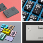
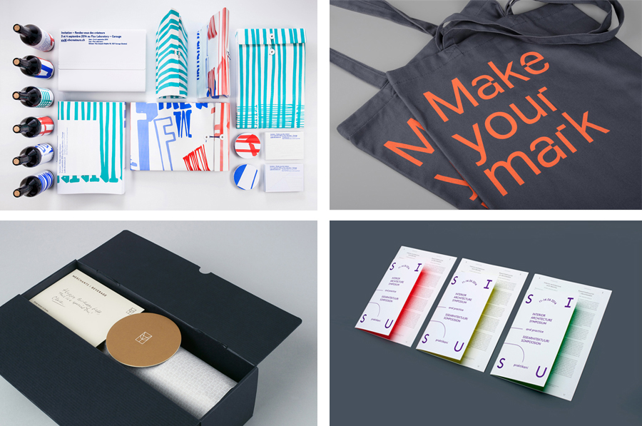
SISU designed by AKU
SISU was a symposium that took place in the summer of 2014 in the city of Tallinn. Organised by The Estonian Society of Interior Architects it was a place were recognised theoreticians and practitioners from Europe, Australia and Estonia met to discuss Dynamics of Theory and Practice within the field of interior architecture. The symposium’s identity, designed by AKU, leverages many of the familiar and communicative conventions of the industry and the visual identities that have come to represent it, but uses light and the interior walls of the venue to give these a unique and distinctive quality.
See more of this project here

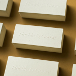
Merchants of Beverage designed by Manual
Merchants of Beverage is an online service that aims to make buying and gifting luxury items easy. Products include wines, spirits and Champagne’s, as well as hand-blown crystal stemware and professional barware. Each item has been handpicked and curated by a team of experts and sourced from a variety of international artisans. The service’s new brand identity, which included monogram, logotype, stationery and packaging design, art direction and e-commerce website, and features photography from Doron Gild and illustration by Sharon Hwang, was managed by San Francisco based Manual.
See more of this project here

Here East designed by dn&co.
Here East is a 1.2 million sq ft commercial space developed by Delancey and housed within the former Olympic Press and Broadcast Centre near Hackney Wick in East London. Here East is described as an ecosystem looking to attract businesses from the design, technology and modern manufacturing sectors who are looking to scale, and those of scale looking to behave more creatively. So far BT Sport, Lougborough University, Infinity and Hackney Community College have all signed up for space.
Here East’s brand identity, developed by dn&co., reflects its intentions of bringing together specific business types and the connected nature of its space through a contrast of digital generative elements and physical handcrafted detail. The studio was also responsible for Here East’s broader brand strategy alongside Poke, who designed the website, and architects Hawkins\Brown.
See more of this project here

Rendez-vous des créateurs 2014 designed by Marks
Rendez-vous des créateurs 2014 was an event that took place in September at experimental meeting, performance and exhibit space Flux Laboratory in the Swiss town of Carouge. The exhibition was an opportunity for those servicing the graphic design chain to show off finishes, materials and techniques under the title “onomatopoeia of printing”. Participants included silk screen printer Atelier Fuerm, binder Bubu, hot stamper H+M, material manufacturer Winter & Company and electro-static flocking specialist Bastcolor amongst others. The exhibition’s brand identity, which extended across invitations, flyers, posters, brochures, coasters, wine labels, shopping bags, signage and website, was developed by graphic design studio Marks.
See more of this project here