Neat Confections by Anagrama
Opinion by Richard Baird Posted 12 November 2014

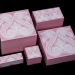
Neat Confections is a San Pedro-based pastry shop creating handmade biscuits and cakes using organic spices and fruits, are absent decoration and specifically developed as a wine or tea accompaniment. Neat Confectionery’s brand identity and packaging solution, designed by Anagrama, draws its inspiration from the theme of perfection and craft, which is then visualised through what the studio describe as a “pureness” of their structural design solution and material choice. A mirrored card box, the standout choice and defining quality of the project, was selected to emphasise the detail of the confectionery while pastel inks across white stickers add a warmth and functionality that divide varieties.
Like their work for Bermellón, Anagrama is bold and confident in their appropriation of an aesthetic that has lost its communicative value or specificity. Where once these mirrored cards may have been associated with space travel, technology and innovation are now, due to widespread adoption through lowering cost, more likely to be associated with cheap perfumes and pharmaceuticals. This appropriation and subsequent change in context, one likely to be unfamiliar and read as new, perhaps at a stretch, innovative, gives new life to an old material. As intended, it does appear to draw out the fine detail of the confectionery, works well to distinguish itself as new and different, and contributes to perceived value.


The rest of the identity, unsurprisingly, plays a more conventional supporting role. One designed clearly to build on the aesthetic impact of the structural design with more familiar communicative detail. Craft, quality and the absence of decoration is represented in the ways Anagrama is very familiar with, that being pastel colours, block foil, die cut, a contrast of serif flourish and sans-serif reduction, and a monogram that, on this occasion, is a touch dull in its resolution of characters and their rendering. Within the context of Anagrama’s portfolio, these remain a little underwhelming, however, outside, amongst loose hand drawn scripts, are likely to appear sharp and compelling in the same way that the mirrored card will against unbleached papers.

There is a very fine line between communicating “pureness” and being perceived as sterile, the typography, name and packaging are right on that line and in that sense it is an untested and experimental approach. As a product first experience over the counter rather than an off-the-shelf experience the risk is limited. As a design exercise it is good to see old aesthetics reinvigorated and their use well founded.
Design: Anagrama
Opinion: Richard Baird