Gras & Groves-Raines Architects by Graphical House
Opinion by Richard Baird Posted 19 December 2014

Gras and Groves-Raines Architects are Edinburgh-based architecture practices, and two branches of the same organisation. Gras explores experimental routes and works within commercial, public and private developments as well as exhibitions, while Groves-Raines Architects takes a more traditional approach, specialising in the conservation and restoration of existing buildings. Although their fields of expertise differ, both are bound by the shared values of a high quality holistic approach from design through to execution, and favour craftsmanship and fine detail. These values informed the development of a new cohesive brand identity for both practices, managed by design studio Graphical House, and which included logotypes, stationery, business cards and brand guidelines.
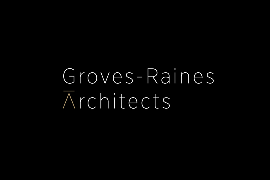
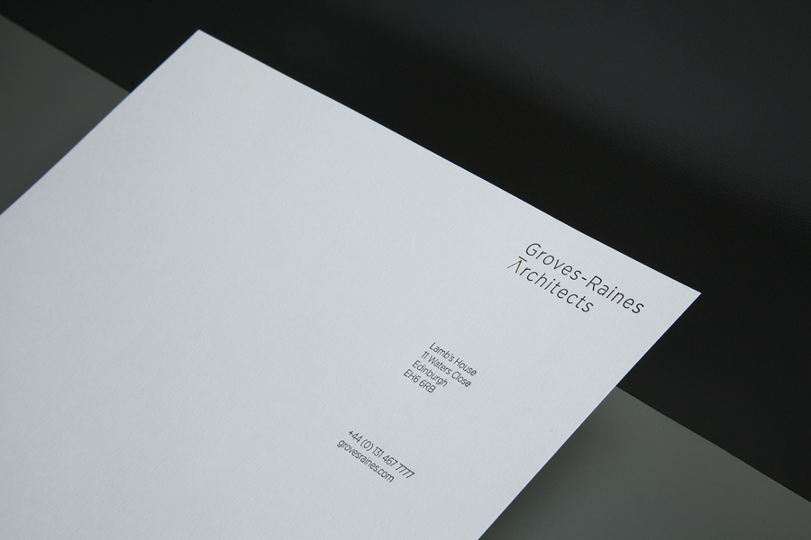
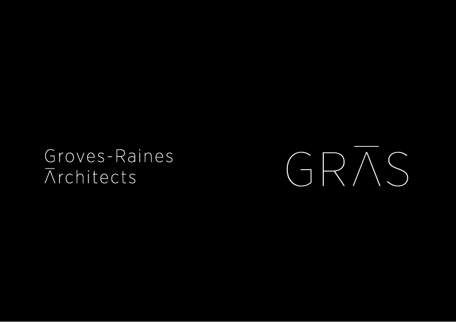
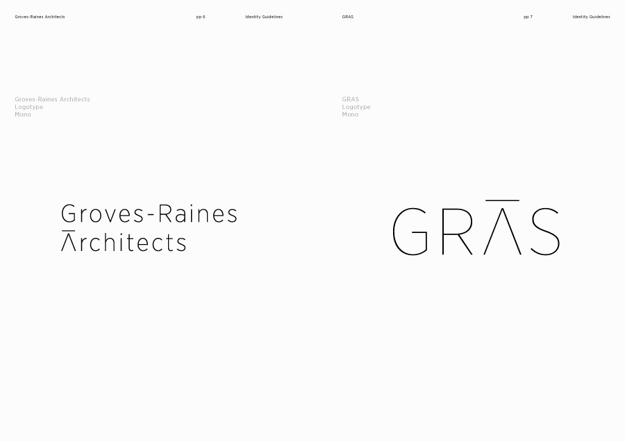
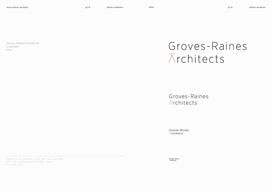
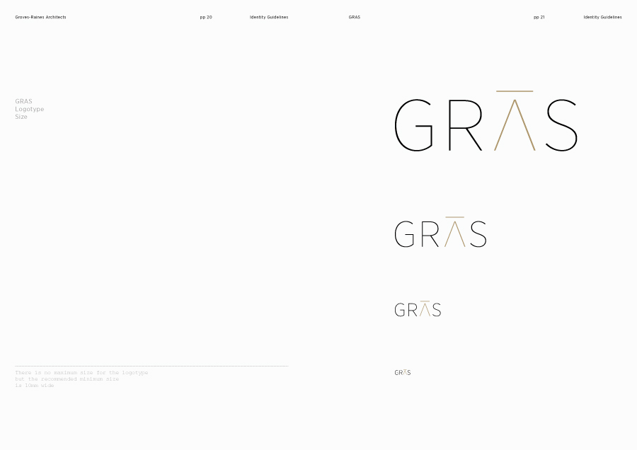
Where many of the architectural brand identities reviewed on BP&O are often bold and robust, Graphical House’s work for Gras and Groves-Raines Architects is light. Built from Gotham Narrow – a font itself informed by architecture – and generously spaced, the logotypes are distinctly finer and slimmer than those heavier and tightly tracked sans-serifs that continue to proliferate the industry with the intention of conveying sharpness and clarity.
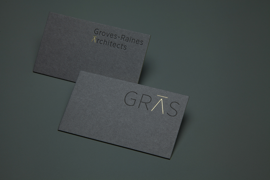
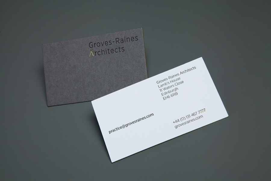
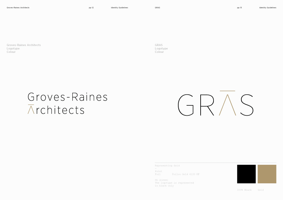
Although Gotham is frequently cited as being a ubiquitous and safe choice, its origins, absent stroke contrast, geometry, structural qualities and the selection of narrower and lighter letterforms is a well-founded choice, counter to one convention yet sensitive to others, communicating a delicate, detail orientated and practical approach. Both logotypes have been well executed, and although they share the same weight and character set, uppercase and sentence case typesetting functions well to divide the two, hinting at the statement structures of Gras and the more traditional approach to renovation undertaken by Groves-Raines Architects.
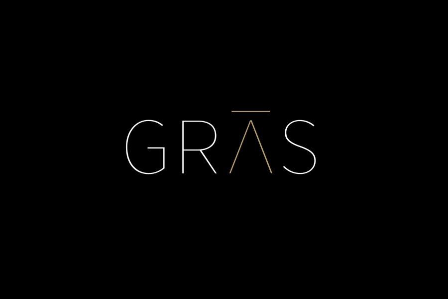
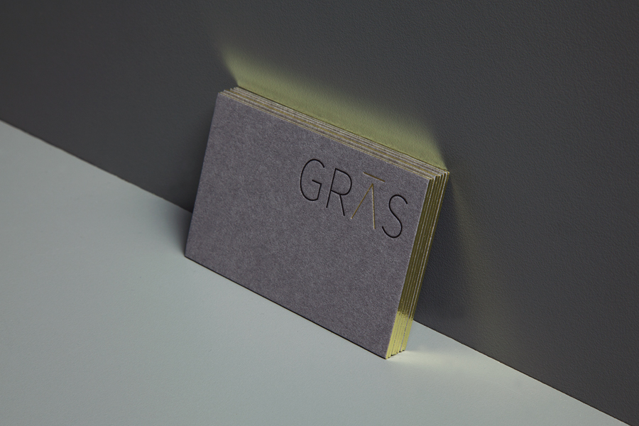
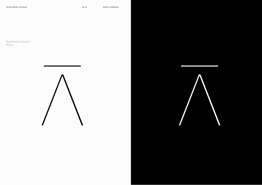
The crossbar of the A, raised above its apex, and inspired by the stonemason’s benchmark, much like the choice of Gotham, has its roots in architecture, functioning as a symbol that guided orientation and placement in stone masonry. It is a very simple modification, bringing a contemporary reduction to the A in an original way and drawing out basic structural form and practice, and lending a more obvious proprietary quality to the characters of Gotham.
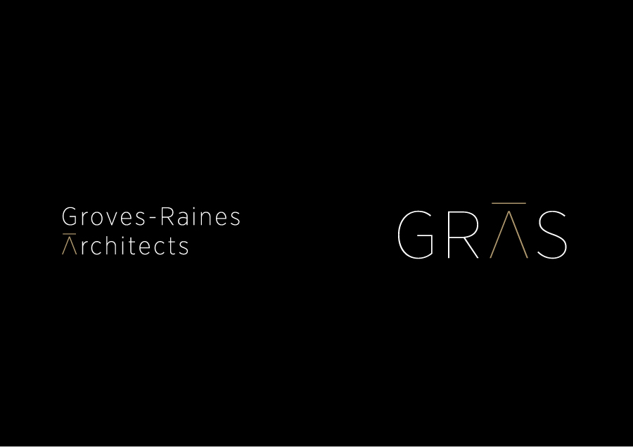
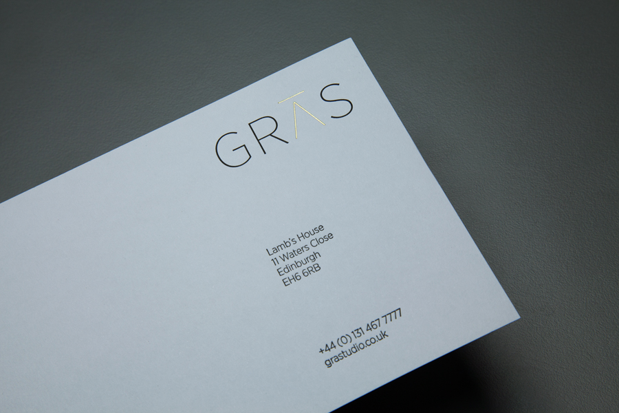
Dark inks, tactile, uncoated concrete grey boards and grid based layouts live up to industry convention, familiar in a way that can be reassuring, while edge-foiled detail, duplexing, letterpressing and foil embossing effectively leverage the very current perceptions of high quality, yet are unusual flourishes for the industry. This contrast of matt grey board alongside the gloss and radiant light of a gold foil makes for a striking aesthetic but also neatly references what Graphical House describe as the shared physicality, craft and high quality of both Gras and Groves-Raines Architects’ work.
Design: Graphical House
Opinion: Richard Baird
Fonts Used: Gotham
