Brass Union by Oat
Opinion by Richard Baird Posted 26 January 2015
Located in the Union Square neighbourhood of Somerville, Massachusetts, Brass Union is a pub and cocktail bar with a small plate dinner menu. It takes over the space formerly occupied by the restaurant and music venue Precinct, both of which incorporated the historic nature of the building as a former police station into their names. To British readers, Brass Union would comfortably sit within the gastro-pub category, incorporating seasonal ingredients grown in its own gardens into dishes prepared using modern techniques.
Designed by Oat, Brass Union’s brand identity takes advantage of the venue’s history and its transformation from what Oat describe as the bureaucratic and administrative into subterranean hide-away, and draws this out using type choice, paper selection, shape, ink and layout across menus, coasters, business cards and stationery.

Where the brand identities featured on BP&O can often be reductive, Oat’s work for Brass Union favours an abundance drawn from the unique history of the venue and the community it looked to serve. It is an interesting appropriation of the building’s original intentions that plays out well in print – and presumably interior. Effectively leveraging the administrative utility and officialdom of the past and the way that the aesthetics associated with this might now be perceived as contemporary, crafty and on-trend.
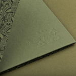
This manifests itself in a number of ways throughout the identity. From the mechanical monospaced nature of Pica, grid-based layouts and shaded alternate rows, to the period qualities of Engravers Gothic, the hand finished detail of stamps, blind embosses and embossed stickers, the quality of dyed paper and metallic ink, as well as the subtle use of form across the coasters – die cut into the shape of police shields – and the brass button-like quality of the symbol.


The copywriting is described by Oat as imbuing the project with a firm sense of place, celebrating Somerville and its proud ‘Villens’. This is perhaps the least successful aspect of the identity. The intention and tone of voice is clear but Helvetica Neue’s repetitive character shapes and line weight uniformity, as well as its typesetting and colour, while clearly influenced by the overall concept and introducing further regional detail, strips away the personality of the statements and the creativity in their writing.

Each asset is informed, but not overwhelmed by, an obvious yet relevant concept and benefits from the craft and community subtexts. Such a pervasive theme could have easily moved into the gimmicky, however, the way some of the type is cropped – making the menus and business cards appear as though they have been printed on reclaimed police station materials – as well as some good paper and font choices, appear, to some degree, authentic to the period, essentially keeping it from appearing overtly themed.
I would prefer to avoid repeating myself but Oat’s treatment, like a lot of the projects published on BP&O – check out Perky Bros work for Woodland Wine Merchant – manages to extract a good amount of proprietary character from what was meant to be utilitarian. This can often be a product of a simple desire to appear on-trend, yet here it is appropriately anchored by the shared community knowledge of the history of the building and the intention to continue serving the local area, be it in a completely different way.
Design: Oat
Opinion: Richard Baird
Fonts Used: Helvetica Neue, Engravers Gothic & Pica