The Best of BP&O — January 2015
Opinion by Richard Baird Posted 2 February 2015
January’s highlights included Pentagram’s brand identity and interior design treatment for property development Ten Trinity Square, Strategy’s work for Bryan Pearson, Studio8585’s work for architectural photographer Luka Žanić, and lg2 boutique’s brand identity and packaging solution for Léon Courville Vigneron. However, there were five projects that really stood out and have made it into BP&O’s Best Of Series, a feature that brings together the most interesting and unusual projects published on the site each month for another opportunity to be seen and shared.

Theatre Royal Plymouth designed by Spy
Theatre Royal Plymouth (TRP) is the largest and best attended regional producing theatre in the UK and leading promoter of theatre in the South West. It runs a diverse programme of performances, activities and events, and has a 1300 seat auditorium capable of delivering West End musicals, opera and ballet, as well as a smaller 175 seat theatre for experimental productions. The building, located on Plymouth’s Royal Parade, also houses a café, restaurant and community performance space.
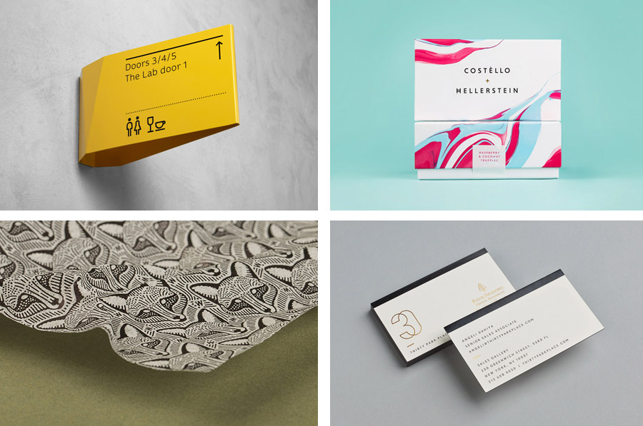
In response to increased competition TRP looked to diversify its audience, retain current visitors and to improve the uptake of its outreach programmes through a new visual identity system as part of a wider regeneration project. Developed by London based Spy, the visual identity system was created to reflect the dynamic nature and joy of experiencing live performance and to connect with a broader audience. This was achieved through a vibrant colour palette of shifting planes, patterns and light, and a holistic approach that, alongside logo and print, included animation, signage and wayfinding.
See more of this project here


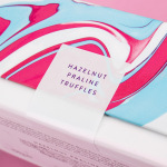
Costèllo + Hellerstein designed by Robot Food
Yvonne Costello and Ori Hellerstein are a husband and wife team making artisanal chocolate truffles using high quality ingredients and the processes acquired by Ori working as a pastry chef at well-respected restaurants. These skills were then refined whilst running his business The Artisan Bakery creating and supplying fine patisserie and chocolates to trade. Costello + Hellerstein’s philosophy is built around the complete sensory experience, one that goes beyond taste to include aroma, touch and visual appeal. This extends to their brand identity and packaging treatment, designed by Leeds based Robot Food, which went on to help them secure a spot at London department store Harrods.
See more of this project here

Brass Union designed by Oat
Located in the Union Square neighbourhood of Somerville, Massachusetts, Brass Union is a pub and cocktail bar with a small plate dinner menu. It takes over the space formerly occupied by the restaurant and music venue Precinct, both of which incorporated the historic nature of the building as a former police station into their names. To British readers, Brass Union would comfortably sit within the gastro-pub category, incorporating seasonal ingredients grown in its own gardens into dishes prepared using modern techniques.
Designed by Oat, Brass Union’s brand identity takes advantage of the venue’s history and its transformation from what Oat describe as the bureaucratic and administrative into subterranean hide-away, and draws this out using type choice, paper selection, shape, ink and layout across menus, coasters and stationery.
See more of this project here

30 Park Place New York designed by Mother
30 Park Place is a private residence with 82 floors and 157 apartments created by the internationally renowned luxury hotel and resort management chain Four Seasons. Located in Tribeca, New York, the residences are described as having breathtaking views, soaring ceilings, multiple exposures, and warm details, as well as five-star hotel level services and amenities that include swimming pool, fitness centre, private dinning experience and children’s playroom. The brand identity for 30 Park Place, which included symbol, stationery, brochure and insiders guide, was developed by design studio Mother.
Read more of this article here

Woodland Wine Merchant designed by Perky Bros
Woodland Wine Merchant is described by Perky Bros, the design studio behind its new brand identity, as a tidy and eclectic wine store in Nashville, Tennessee that carefully curates wines from artisan producers practicing natural and sustainable methods, and hunts for and gathers the best value wines from around the world.
Perky Bros’ identity solution was inspired by the collision of two worlds – the natural, and the store’s unadorned and modern 1960’s qualities. This manifests itself as a red fox logo – an animal indigenous to the area – a woodland green paper choice, the utility of type selection and its typesetting, gridless mid-century layouts and the robust and practical wood of the interior.
See more of this project here