Mona De Castellarnau by Anagrama
Opinion by Richard Baird Posted 11 March 2015

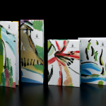
Mona De Castellarnau is a US based luxury lifestyle brand that creates and retails a unique collection of crafted and meaningful objects that are said to reflect timeless beauty, simplicity and authenticity. Objects include home furnishings, accessories, bags and throws. Each are designed with an appreciation for tradition and provenance, an understanding of artisanal disciplines, and utilise simple forms, prints, patterns and colors.
Mona De Castellarnau’s visual identity, designed by Mexican graphic design studio Anagrama, communicates its values and aesthetic sensitivities through a clear contrast of modernity and tradition, craft detail, minimalism and functionality delivered through monogram, logotype, business cards, tag, label and packaging design treatments.

Anagrama’s favour for dyed paper and block foils fits comfortably within the context of Mona De Castellarnau. Pastel green, pink, plenty of white and a blind emboss print finish alongside a copper block foil mixes the simple, current and crafty with a universal and familiar sense of tradition and high-quality.


This convergence of past and present also runs throughout the monogram, a well-balanced and classically straightforward resolution of characters and serif detail, a more recent sans-serif logotype with some nice individual character shapes, and a very simple grid-based component. Its simplicity and abstraction could well have its origins in any number of reference points, however, it is the backing of transparent self-adhesive film that really comes to mind. Unusually for Anagrama, the grid appears a touch superfluous and absent aesthetic value or underpinned by anything particularly meaningful or well-rationalised in comparison to other assets.

Small details such as the tag’s slight utility in layout but quality in the use of black ribbon and a neat contrast of material colour and card size, and the embroidered labels introduces a little more variety, interest and detail. It is a small project with few assets, and although there are a couple of issues with regards to the proportion of the logotype across the packaging, the logotype not appearing sharp online and an overall poor web experience, it is largely well-handled, stylistically compelling, and communicatively forthright. More from Anagrama on BP&O.
Design: Anagrama. Opinion: Richard Baird.