Background Bars by Campbell Hay
Opinion by Richard Baird Posted 20 March 2015

Background Bars provides bar, bar staff and equipment hire, pop-up and permanent bar design services, seasonal cocktail creation, bar management for corporate occasions, festivals, weddings and private parties, and income and report analysis. Alongside these, Background Bars also functions as a creative agency, helping brands to deliver compelling live events. Its visual identity, inspired by the name and which included website, art direction and business cards that feature white ink and a blind emboss detail, was developed by the London based graphic design studio Campbell Hay.
Communication is concentrated into a current continuously scrolling website. Although content appears sparse, and the quality of the images low but colourful, perhaps in service of speed, a series of patterns, brakes these up with a distinctive proprietary detail and fine texture amongst panels of white and black. These move from the disordered and random to the structured and dynamic, often appearing generative in nature. These are not accompanied by a heavy rationale, just grounded by a loose association with the name.


When choosing work for BP&O I am often looking for points of interest. These can frequently be found within complex projects with multiple touch points or as the single defining characteristic of something quite simple. While there is a preference for the visually rich and communicatively diverse, as a platform looking to publish a variety of approaches, there are also moments to appreciate aesthetic over communicative agenda, treatments in service of distinction and the perception of quality rather than anything layered with intention.
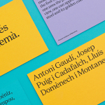
The point of interest here, a series of black board business cards with a white ink and blind embossed surface treatment, although limited in the extent to which they can offer any insight into the business, are interesting and stylistically pleasant, high quality with solid and recent typographical layouts and a distinctive mix of material, ink and print finish. The embossed surface treatment, drawing on the patterns of the website, and alongside type and colour, work well to establish a small continuity between a meeting of people and digital experience.


The sans-serif logotype, built from Colorphon’s Value Sans Black, reproduces well as text online, is straightforward and well-spaced, and benefits from some small character details and a current favour for the geometric drawn out using a black and white colour palette and the finer detail of the patterns. More from Campbell Hay on BP&O.
Design: Campbell Hay. Opinion: Richard Baird. Fonts Used: Value.