Latin American Design Festival by IS Creative Studio
Opinion by Richard Baird Posted 24 March 2015

The Latin American Design Festival is an organisation that promotes Latin American Design internationally and looks to highlight the social potential of design using lectures, workshops, exhibitions and complementary activities. This year’s festival took place in the Peruvian city of Lima with guest speaks that included Jessica Walsh, Brandlab and Anagrama.
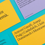
LAD’s visual identity, developed by IS Creative Studio and extending across posters, lanyards, programmes, flyers, presentation graphics and signage, leverages the universal ISO A series paper standard, a diverse and bright colour palette and an economy in print, as a way to represent different countries and cultures, and the graphic language, standards and creativity that connects them.

The varied and high impact colour palette is a solid metaphor for contemporary creativity and cultural diversity whilst also securing a bold and identifiable aesthetic. The lightening logo and fluorescent inks appear as an unusual fusion of metal iconography and 90’s club / rave culture that, when presented here together, has an intensity and energy suitable for a festival occasion. Presumably, when disseminated across events, the visual identity functions more as a bright but moderate highlight, tempered by environment yet punctuating it and connecting a mix of activities. The ISO standard as a unifying device, one also but less successfully attributed the qualities of a geometric map, is simple and universally understandable within the context of graphic design and translates well across digital experience, print and signage.


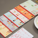
Underpinning the more obvious themes of unity, diversity and creativity, is the underlying concept of resourcefulness, something that IS Creative Studio attributes to those of Latin America. Unlike those from wealthy countries in Europe or North America, those in Latin American are described as being distinguished by their ability to optimise, drawing creative opportunity from an absence of wealth. This manifests itself through the perforated, multipurpose panels of the poster which doubles up as programme, guide and flyer, the consistency of the identity but its significant impact, and the methods of production. All the banners and signage were made by the same artist using traditional skills that combine silkscreen, hand painted fabric and neon colours.
While type and form appear as secondary considerations, it is the mix of visual impact, production economy and the universality of its graphic language that really gives this project a distinctive and thoughtful quality.
Design: IS Creative Studio
Opinion: Richard Baird