The Assembly by Bravo
Opinion by Richard Baird Posted 18 May 2015

The Assembly and The Assembly Ground are a men’s retail destination and coffee shop in Singapore. The store stocks a variety of lifestyle labels for the “fun and spontaneous gentlemen who appreciate quality” while the coffee shop is a space for like-minded individuals to get together. Graphic design studio Bravo was responsible for creating a cohesive interior design and visual identity for both experiences.
Described as classic, versatile and playful, Bravo’s treatment mixes familiar fashion patterns with hand drawn illustrative flourishes and practical sans-serif typography across menus, business cards, bags and tags, and sets these within the context of an interior of robust, industrial and earthy material textures, surfaces and furniture. The project also included neon signage and menu design.

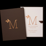
Drawing on the name, the intention of creating a space where people can meet, and the base of the campfire, the logo is suitably modern in its reduction, perhaps a bit far in its abstraction but well-founded. The logotype’s geometric characters are familiar, but condensed, a little unusual, existing somewhere between current, distinctive and practical in its communicative intention.


An interior of exposed utilities and brick, dark treated and light untreated woods, concrete structure, modular spotlighting and the surfaces you might associate with shipping containers, are universal in their sense of robustness and hardwearing utility whilst also managing to secure moments of distinction.
The impersonal and industrial qualities of the interior are tempered by colour and patterns delivered across tags, bags and bunting. These make the most of established and classic patterns of the fashion industry and draw an element of uniqueness through colour combination and a new context.
These assets contribute to brand identity of duality and communicative substance that while perhaps not hugely original, works well to emphasise, through an acute juxtaposition, the store’s meeting of style and utility.


The coffee shop builds on the tone set by the store but introduces a variety of hand drawn components. These come in the form of blackboard illustration, typographic detail and motorbike imagery. Again, these leverage the familiar, drawing on stereotypically masculine iconography, an element of craft frequently seen within coffee shops but underpins these with the robustness utilised throughout the retail space. These can been seen in the paper, rivets and clips of the menu. More from Bravo on BP&O.
Design: Bravo. Opinion: Richard Baird