Libertine Liquor Bar by CODO
Opinion by Richard Baird Posted 10 June 2015

Libertine is a bar and restaurant, located on Indianapolis’ Mass Avenue, that celebrates the pioneering American spirit with an emphasis on classic cocktails, craft distillers, boutique wines and an evolving menu. It is recognised as one of the best restaurants and bars in the country, and as being instrumental in the city’s growing and continued support of local food and independent restaurants.
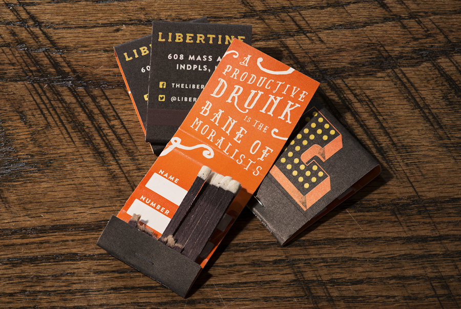
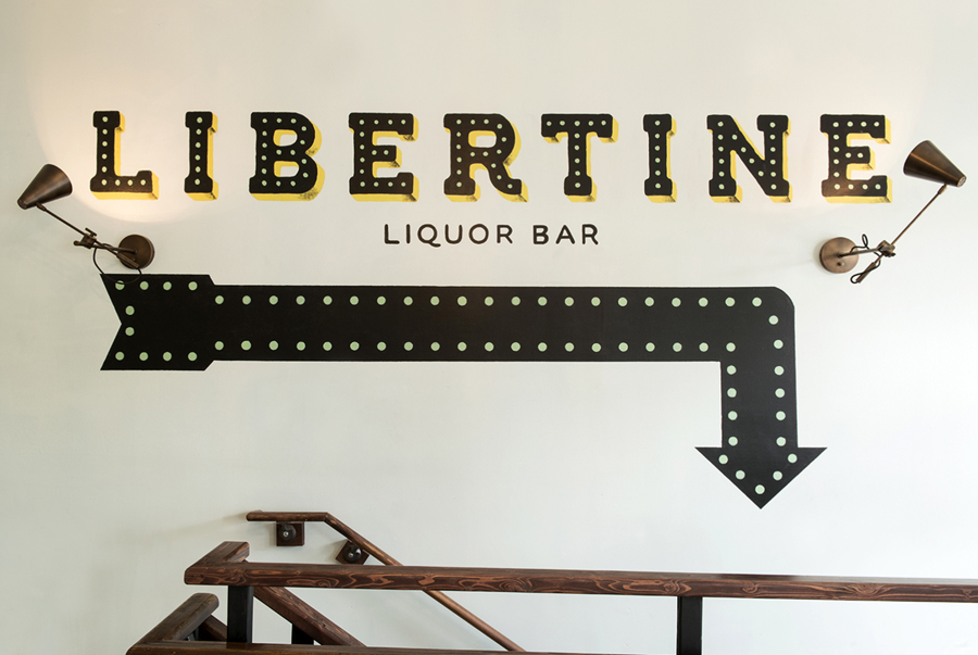
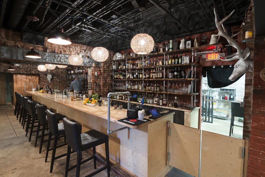
A light wood bar, steel rails, exposed utilities, red brick walls and I beam, comfortably sit alongside the ornament of crafted lamp shades, cast deer head, uncovered floor and the retrospective character of vintage jugs and jars. This contrast of utility and flourish, retrospection and a current favour for the crafted also make its way into Libertine’s visual identity, developed by design studio CODO and including menus, branded matches and hand painted signage.
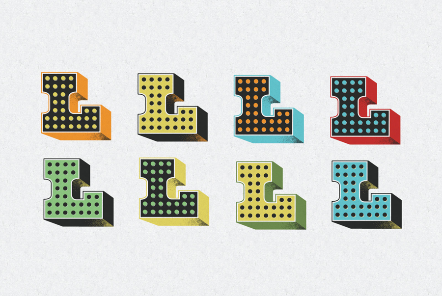
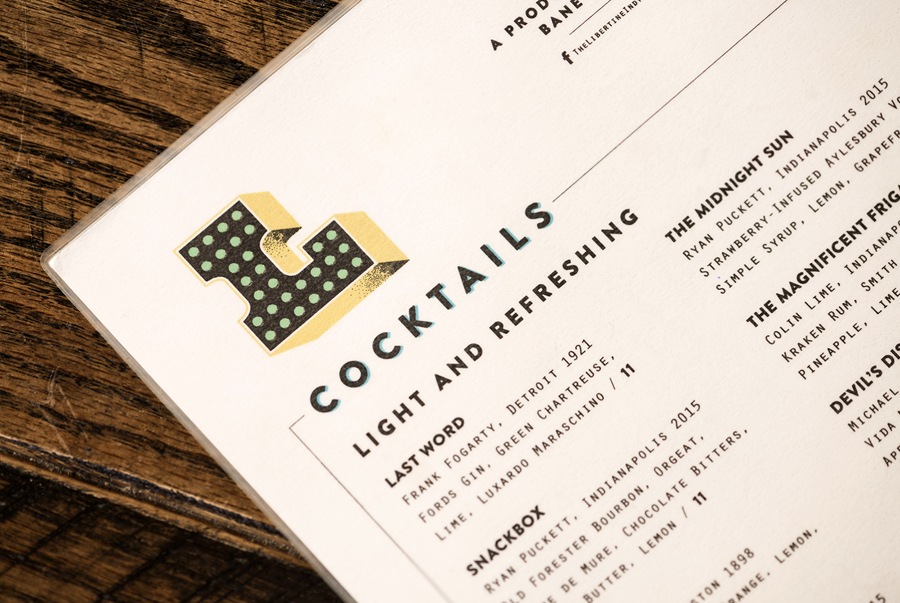
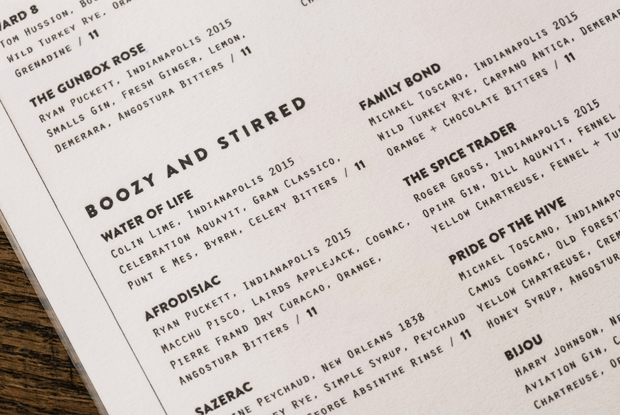
CODO, who were responsible for developing Libertine’s original identity back in 2011, return the project this year with a new visual identity that coincides with a revised bar concept and a second location. The project, based around a flexible wordmark, L icon and hand-painted interior detail went on to include refined menus, a responsive single page website and branded matchbooks.
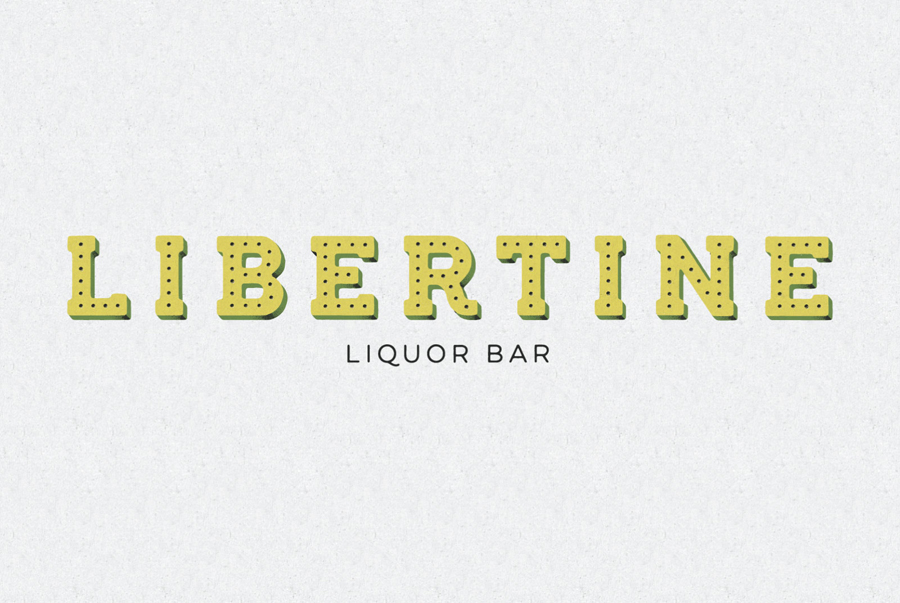
CODO describe their approach as one that explores historic cocktail artistry, dressed down with a carnival-esque aesthetic. It is one that clearly resonates with interior design, confidently playing with retrospective, industrial and handcrafted references.
This appears in the bold, robust and chiseled industrial form language of extruded typography, much like the I beam, its shading, the circular inline detail similar to the panels of the bar, use of ink texture, and the personality and conviviality of a bright and worn colour palette. It continues in the hand drawn signs throughout the interior, the juxtaposition of bold geometric shapes alongside the mechanical origins of a light monospaced font across the menus, and the script typography of the matchbook.
The visual identity draws on and compliments interior and concept well yet has personality of its own, one that can exist within the context of the bar and restaurant and function as a memorable identity in external situations both in print and online.
Design: CODO
Opinion: Richard Baird
Fonts Used: Orator
