Hidraulik by Huaman
Opinion by Richard Baird Posted 18 June 2015

Hidraulik is a Barcelona based business producing rugs for contemporary spaces. These are inspired by cement panels hydraulically pressed, rather than fired, with a layer of coloured pigment.
Hydraulic panels originated in the 1850’s and experienced a resurgence in the mid 20th century, these would often feature brightly coloured and detailed patterns, and were popular during an era of personalisation and interior expression. Hydraulic brings these into the present, by applying a similar aesthetic qualitiy to a thin, flexible and moveable surface.
The range includes a variety of Art Nouveau prints produced in house, and modernist inspired designs developed by Huaman, the graphic design studio also responsible for Hidraulik’s brand identity, business card and package design.

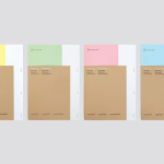
Huaman described their brand identity and packaging solution as being based around neutrality. This manifests itself as bold sans-serif characters, a black and concrete grey colour palette, plenty of space, grid-based layouts and what looks like a telescoping, one design fits all packaging solution, a neat idea that ties in well with the Hidraulik name. This is also explored, perhaps a little less successfully, within the animated underline of the logotype, which also doubles up as tiles being laid.


The approach draws out and frames both the traditional colour and flourish of the classic rugs, and the geometry and pastels of the modern, positioning them as an integral visual and communicative part of the identity, and making good use of contrast. Alongside a practical utilitarian structural component, the treatment appears well-suited to a product of both ornament and durability, and leverages a current favour for revisiting and reinterpreting the past, and conveniently packaging it up for the present. More from Huaman on BP&O.
Design: Huaman
Photography: Roc Canals
Opinion: Richard Baird
Fonts Used: Circular