The Best of BP&O — June 2015
Opinion by Richard Baird Posted 29 June 2015

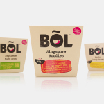
June’s highlights have included Horse’s packaging work for mineral water Nongfu, B&B Studio’s brand identity and packaging design treatment for new veg pot brand BOL and Huaman’s work for modernist rug specialist Hidraulik. However, there were six projects that stood out and have made it into BP&O’s Best of Series, a feature that brings together the most interesting and unusual projects published on the site each month for another opportunity to be seen and shared.

From Babies With Love designed by Paul Belford Ltd.
From Babies With Love is an organisation that sells organic baby clothes, blankets and accessories, as well as a range of greetings cards online. The money raised from the sale of these goes to SOS Children’s Villages, a scheme that supports babies who have lost parents to war, famine, disease or poverty, by placing them with families and within communities that are safe and stable.
Paul Belford Ltd. worked with From Babies With Love to develop a brand identity treatment that, through a simple postmark device and a series of animal collages created from recycled postal materials, finds a way to bridge online shopping and the aid sent abroad, and draws a playful and distinctive character from utility.
See more of this project here


Poseidon designed by Kokoro & Moi
Poseidon Helsinki centralises the tasks of architect and builder with the intention of delivering higher quality construction projects based around visionary and uncompromising design solutions. Poseidon’s values are deeply rooted in a love for Helsinki, a belief in aesthetically ambitious architecture and expansive urban spaces, and improving the capacity and quality of the city through sensitive renovation and attic conversions.
Poseidon’s visual identity, inspired by the colors, grids and shapes of modernism, and the architecture and art of Le Corbusier and the masters of geometric abstraction, was developed by design studio Kokoro & Moi, and went on to include stationery, posters and website.
See more of this project here

Melba at The Savoy designed by Pentagram
Melba is a pâtisserie and cafe, located on the corner of The Strand and Savoy Place in London’s North Bank, and is one of nine places to eat and drink at The Savoy hotel. The patisserie is described as offering a glimpse into the exclusive world of The Savoy, and is the first time that the hotel, accessed via private road, will have a presence on the high street. Melba features a distinctive interior of black and white tiles, white marble alongside dark stained woods, cornicing, a curved glass counter and gold chandelier. It also features a distinctive visual identity treatment developed by Pentagram partner John Rushworth.
See more of this project here

O designed by Folch
O is a Barcelona based studio made up of, and representing, a collective of uniquely talented illustrators, photographers, directors and producers creating visual and editorial content. The studio supports the singularity of each artist by avoiding a homogeneous style and granting each a production capacity that does not make a distinction between personal projects and commercial jobs. While providing insight into each of these, O’s website also functions as a regularly updated platform for debate and enquiry into the communications industry.
Director Luis Cerveró worked with design studio Folch to develop a visual identity system for O. Based around spray-painted graphic device, responsive grid-based layouts and Monotype’s Neue Haas Unica across digital and print environments, Folch’s approach establishes an adaptable framework from which to bring together changeable and diverse content online.
Read more of this article here

UAL ’15 designed by Spy
The University of the Arts London is Europe’s largest specialist arts and design university. It is made up of six colleges, each with its own unique character and programme, yet unified in their effort to deliver a high quality creative eduction. This united position is expressed through a visual identity system developed by Pentagram partner Domenic Lippa. Based around a robust, black and white typographic system, UAL’s visual identity affords each college the opportunity to experiment with its own approach to visual communication.
This month sees the launch of the UAL 2015 campaign, developed by London based design studio Spy, for Camberwell, Chelsea and Wimbledon. Spy were commissioned to develop a vibrant, engaging brand campaign to launch in the summer that would drive student recruitment and brand awareness. The campaign included ads, posters, digital banners, prospectus, e-flyers and way finding around each campus.
Read more of this article here

FS Silas designed by Believe In
FS Silas is a new sans-serif and slab-serif font family from British type foundry Fontsmith, each available in five weights and an italic. The family is described as having a squareness of rounded forms with dynamically angles terminals and slabs capable of offering contemporary brands the opportunity to employ different voices with one typographic system.
Fontsmith worked with design studio Believe In to develop a name and launch campaign. This included type specimen, social media strategy and a number of short videos created in collaboration with The Space Between. These digital and print artefacts were united by the title FS Silas – The Enigmatic Type, and a concept that draws its inspiration from the dossiers and secret files of espionage, as well as type specimens of the 50’s and 60’s.
See more of this project here