Flora by P.A.R
Opinion by Richard Baird Posted 15 July 2015

Flora is a Barcelona based business that looks to provide an alternative to caring for live plants, and describes itself as having an interest in bringing nature indoors in a new way and offering an antidote to the frantic pace, dark rooms and concrete of the city. Flora essentially sell, from their online shop, framed prints of plants shot on a variety of bright single colour backgrounds. While clearly having a distinctive character of their own, Flora’s products are also united by a brand identity treatment developed by graphic design studio P.A.R which included logo, packaging, business cards, postcards, posters and stationery set.

As someone with a bunch of potted plants on the windowsill it is difficult to really imagine a picture ever replacing the aesthetic qualities or experience of nurturing of a plant, however, as a poster series, it is rather novel. Each appears well-shot, effectively uses flat panels of floral colour to draw out organic texture, is playful in its use of proportion, especially with the smaller plants and, as a collection, feature a nice mix of decorative, earthy and utilitarian pots, simple leaves and complex flowers. While mostly bright and modern there is an element of retrospection in the types of plants and the choices of colours — check out Collins’ work for Room Essentials. Flora appears very much as a service of its time, both in its concept and execution. This also resonates throughout P.A.R’s approach to brand identity.


P.A.R draws on the visual vernacular of flower shops and mixes it with components you might associate with contemporary craft businesses and limited run designer items. This manifests itself as a handwritten note and envelope component, a neutral sans-serif logotype with a small custom flourish, a current and retrospective colour palette, white ink over uncoated and unbleached boards, and a typographic contrast of serif detail and sans-serif reduction.


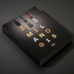
The ornate yet practical duality that underpins the aesthetic and philosophy of Flora’s products clearly informs identity. This continues through to a packaging choice that leverages the robust functionality of a corrugated board, its custom shape and the flourish of a white screen printed detail.

Pinterest and Instagram are ideally suited Flora’s market and the aesthetic of its images, however, product shots rather than the images themselves on Pinterest, and what feels like a inconsistency and irregularity within Instagram (a mix of close up and cropped plant images, framed product shots and brand identity detail), means that these tools are largely under-utilised.


A copywriting component expresses proposition and the philosophies of the business across postcards, flyers and website. In some ways it paints the present as homogenous, utilitarian and inorganic, which of course is not really the case, but lacks a commitment to crafting a story that intentionally exaggerates this as a way to emphasise the value of the product. Language is straightforward with little in the way of character. Small moments of playfulness, enthusiasm and individuality are lost in the reductive aesthetic of type.


The aesthetic and/or relevance of Flora is likely to divide opinion and, as a fair and appropriate reflection of product and service, so is its visual identity. Although unmistakably current, there is a longevity in the identity’s minimal expression, the way it sits comfortably around and takes a back seat to what is a distinctive product with a potential seasonality, and is well-aligned with the business, its ideation and its intended market. More from P.A.R on BP&O.
Design: P.A.R. Opinion: Richard Baird. Fonts Used: Futura & Garamond