Bibelot by A Friend Of Mine
Opinion by Richard Baird Posted 17 July 2015

Bibelot is a luxury European-inspired dessert boutique in Melbourne with a coffee bar, chocolate shop, high tea salon, gelaterie and artisinal patisserie. It features an interior of long marble counters, a light spotted stone floor, spot lighting, cornicing, black and white walls, as well as bronze and tiled detailing.
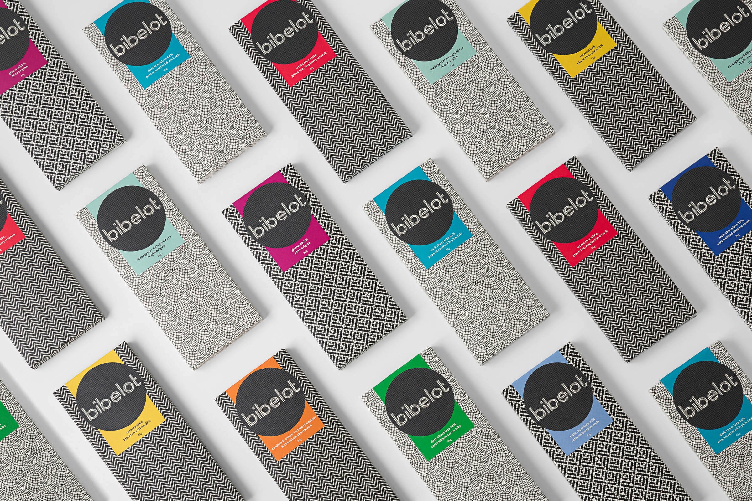
Informed by the sense of place and the permanence that underpins Bibelot’s concept, reflected in its classic interior flourishes, graphic design studio A Friend Of Mine developed a brand identity that links interior, signage and packaging, makes a connection with craft, through traditional monochromatic mosaics and a geometric sans-serif logotype, and draws out, using bright spot colour panels, the colourful detail, distinctive flavour and variety of its confectionery.
The robust and permanent nature of the materials, black and white panels, classic detailing and elements of geometry across the interior design, juxtaposed alongside the transient, organic and brightly coloured qualities of Bibelot’s confectionery, manifest themselves well throughout A Friend Of Mine’s brand identity and packaging design work.


The mosaic panels are a neat idea, linking the flexible and mobile necessity of contemporary identity with the immovable physical environment, and its associated experience. The traditional quality of this mosaic aesthetic, its use as wall panels, its ornate nature, and the hand laid process of its implementation, effectively leverage a sense of permanence and make a subtle connection with the skill and art of a confectioner. Although fine in detail, these also deliver impact and distinction from a distance, are well drawn, cohesive and interesting in their variety.


The full bleed, uninterrupted and consistent application of the patterns across a variety of packaging shapes and sizes appears thoroughly contemporary. This modernity is drawn out further using a custom geometric sans-serif, and by punctuating a off-white and black colour palette with bright spots in print, a simple and effective nod to flavour. Weighty black boards and a gold block foil print finish layer this with a familiar but effective sense of quality and luxury.

The contrast between bold typography and small mosaic tiles, monochromatic geometric patterns and organic brightly coloured confectionery, manages to find a comfortable and distinctive intersection of past and present, clearly share a crafted quality, bind identity and interior, and, as described by A Friend Of Mine, avoids pastiche. More from A Friend Of Mine on BP&O.
Design: A Friend Of Mine
Designers: Suzy Tuxen, Cassie Brock and Emily Fitts
Artworking: Mim Kennish
Photography: Sarah Anderson Photography
Opinion: Richard Baird