Wine Fandango by Moruba
Opinion by Richard Baird Posted 21 July 2015

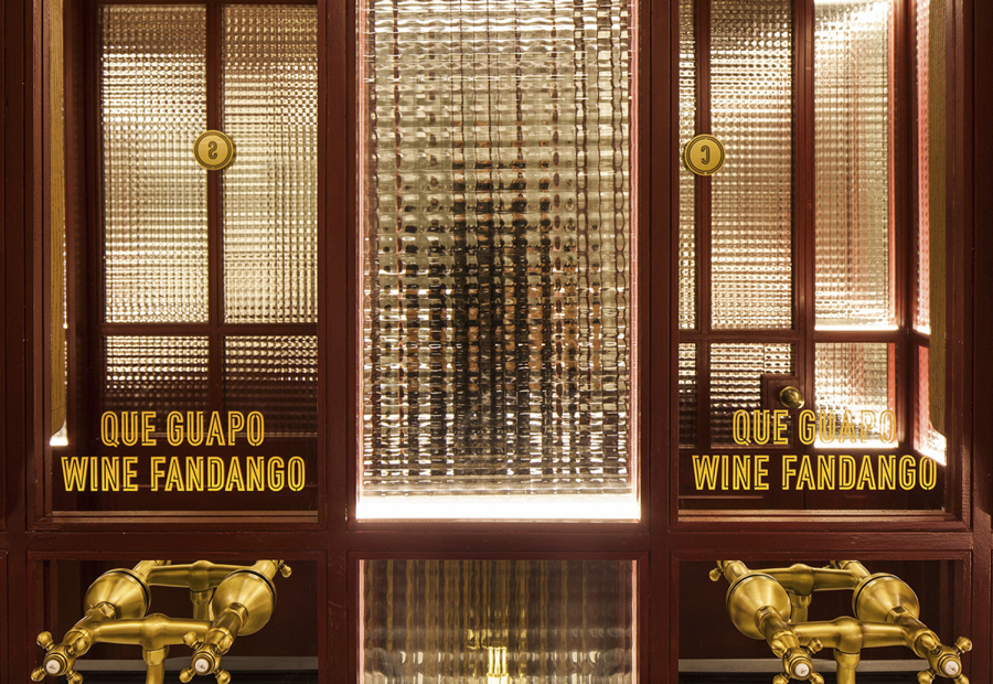
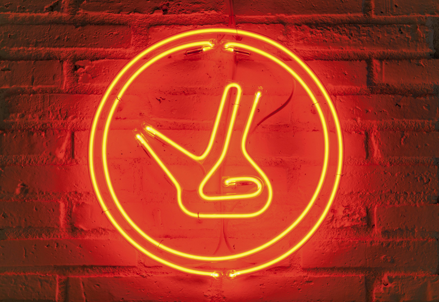
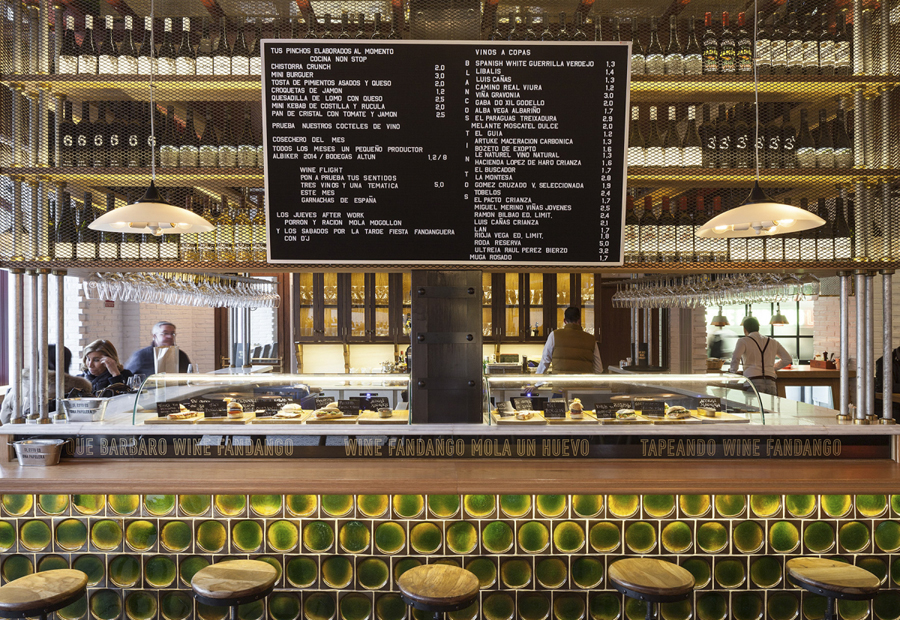
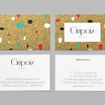
Drawing inspiration from New York neon, and its show business associations, graphic design studio Moruba have developed a new brand identity treatment for Wine Fandango, a restaurant and wine bar, located in the Spanish city of Logroño, that features a rich interior design of textured glass, wood floors and furniture, ceramic tiles, exposed brick and gold fixtures. Wine Fandango’s identity is made up of custom typography and logotype, patterns, business cards, menus and neon signage.

By contrasting a custom condensed sans-serif character set—extracting unique character from the physical constraints and ubiquity of neon signage—alongside the ornament of a serif, set within the context of provincial imagery as patterns, a deep colour palette and gold block foil, Moruba’s treatment does a good job of communicating Wine Fandango’s Iberian and cosmopolitan spirit, authentic, traditional and sophisticated menu, and some of its interior flourish. More from Moruba on BP&O.
Design: Moruba. Opinion: Richard Baird