The University of Sydney by Maud
Opinion by Richard Baird Posted 12 August 2015

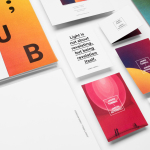
Although The University of Sydney is recognised as the oldest university in Australia, one steeped in history, it has, more recently, suffered from a decline in its rank and the perception that it is unwilling to adapt to a changing, increasingly competitive and well-branded educational landscape. In response to this the university worked with Surry Hills based graphic design studio Maud to reposition it in a way that would better reflect its forward thinking nature and pioneering spirit. This was achieved through a diverse typographical approach to communication, bound by a limited colour palette and applied to undergraduate guides, posters, brochures and website.

“Inside its walls the University teems with life, as leading international minds collaborate on life-changing research in world-class facilities, and students challenge assumptions and become catalysts for change. By revealing the real workings of the University, we are creating a more transparent and progressive brand, as well as rousing contemporary public debate using an informed and provocative editorial approach. As we engage people in the true culture of the University, former negative perceptions are beginning to shift.” – Maud


Maud’s approach is an interesting external expression of modern internal change and energy, especially within the context of what is perceived to be a staid and historic institution and its structure. Maud leverage this tension through typographic diversity, united by colour, and photography of the university’s neo-gothic buildings and contemporary interior spaces.
Collectively, and alongside colour and within the context of layout, type appears thoroughly contemporary and impactful, yet individually touches upon heritage and a diverse program of study, with both a political and playful dimension within the copy that gives this aesthetic impact substance.
Maud’s font choices confidently move between the awkward, quirky and sober, those with significant character and those with a little more restraint, the on trend and those firmly rooted in the traditional. It makes the most of what might be considered good typographical standards and something that intentionally borders on the obnoxious and provocative, chosen to counter unwanted preconceptions.

Cohesion is achieved through structure and a limited but impactful red, white and black combination that picks the campaign out from a concrete grey landscape. Flat colour and the implementation of type also introduces contrast to, and emphasises, some well-shot interior and external details of the university and the heraldic flourishes of its logo. These mix light, modern, geometric architectural forms with the sandstone of neo-gothic structure and the ornament carved wood work. A more conventional approach to prospectus layouts retain some of the typographical nuance present in the posters, while cropped images which run off the page and small type detail that frames body copy draws on the current.

Past and present collide in both type and in image, and although Maud’s treatment across the posters feels like an extreme response to a staid and elitist perception, straightforward but compelling in its communication of diversity, accessibility and the leveraging of current affairs, it appears as an appropriate acknowledgement of the need to move forward, to react appropriately to the present whilst also being sensitive to but not overemphasising the past. More from Maud on BP&O.
Design: Maud
Photography: Irenaeus Herok
Opinion: Richard Baird
Fonts Used: GT Spectra, GT Haptik, Aperçu Pro & Antwerp