Google 2015
Opinion by Richard Baird Posted 1 September 2015
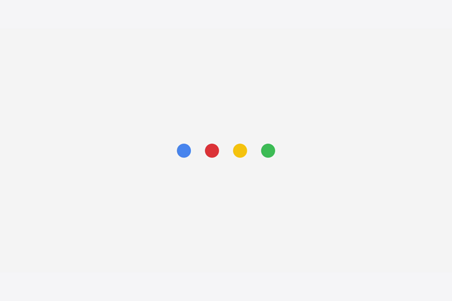
The search engine and tech giant Google has just launched the latest version of its logotype, alongside a set of brand assets which include an icon and dot animations. The change sees a move away from serif flourishes and embracing the current favour for the reductive qualities of a geometric, monolinear sans-serif. It also features some better letter spacing, an improved x-height, single story g, and heavier characters whilst carrying over its distinctive and convivial colour palette and tilted e.
This change brings Google’s logotype more in line with its new parent company Alphabet, which shares a similar typographical style, and acknowledges Google’s material design philosophy. The update appears current, continues to embrace Google’s iterative approach to identity, does a good job of signalling change and reflects the company’s continued relevance. It also feels far more practical in its reduction of shape and increase in weight, but perhaps at the expense of a little character, and is still absent a degree of maturity.


“The Google logotype benefits from whitespace between letterforms, but when colors are adjacent—as in the case of the Google G—they optically blend and can result in a darkening and dimming of the original value. We adjusted and pushed the vibrancy of the red, green, and yellow to maintain saturation and pop.” – Google

The logotype is complimented by the custom typeface Product Sans, tying it further to Alphabet and adding a little more character. Google describes this taking its cues from a schoolbook letter-printing style yet adopting the neutral consistency of a geometric sans-serif.
Design: Google
Opinion: Richard Baird
Fonts Used: Product Sans