Clay by Studio Claus Due
Opinion by Richard Baird Posted 1 October 2015

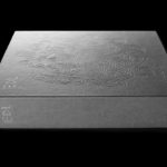
Clay is a museum of ceramic arts and crafts, located in the Danish town of Middelfart, west of the capital. Exhibits range from a 235 year old plate to more recent and experimental pieces from contemporary artists. The museum worked with Studio Claus Due to develop a new visual identity system. This included business cards, stationery, signage, packaging, print communication and website, unified by an earthy colour palette and custom typography, punctuated by shots of blue and yellow, and featuring uncoated materials.

The colour palette does a good job of drawing on and emphasising the base material that unites both the old and new exhibits of the museum, while its gradation, reminiscent of drying clay, and shots of yellow and blue, perhaps tied to glaze and decoration, work well to break up this heavy colour.
A bold, uppercase and geometric custom typeface—breaking slightly from inline convention with a single exit point—again, much like the colour palette, does a good job of referencing the basic and robust nature of clay (and perhaps the architecture of the museum), and features some nice letter shapes, particularly across the numbers.


The inline detail, and its single exit, could be attributed to a number of different ceramic making processes. The cavity necessary for firing and slip casting come to mind, and make for a good balance between aesthetic distinction rooted in a relevant concept.
It is distinctive in its departure from what might be described as the lighter and nuanced qualities you might associate with museums and galleries, and secures memorable character, not only in form but in its opposition to the delicate detailing and crafting of ceramics.

Museum and gallery convention does manifest itself within the finer lines of an accompanying sans-serif, however, alongside the bold characters of Clay, begin to suggest a refinement of, and the sophistication draw out from such a material by artists. There is also a neat connection made between the weight of the logotype’s inline and the monolinear lines of the secondary typeface.
Design: Studio Claus Due. Opinion: Richard Baird.