Tina Frey Designs by Mucho
Opinion by Richard Baird Posted 7 October 2015

Tina Frey is an American homeware designer with a studio in San Francisco. She is inspired by the fluid lines of the sea, the curves and contours of nature, objects picked up while traveling, and the translucent colour of ice lollies and jelly beans. The design of each of her products—which include plates, bowls and utensils—is rooted in simplicity and functionality. These are sculpted by hand in clay, cast in colour in small batches, then sanded and finished by hand. This process gives each object a high-quality and uniquely crafted character.
Drawing on the organic shapes and hand crafted nature of the range, graphic design studio Mucho created a new visual identity for Tina Frey with a soft and sculpted quality—in form, colour and texture—and a contemporary restraint, while the use of brighter colour introduces contrast, a conviviality and communicative breadth. This links brochure, note cards, business cards and posters.

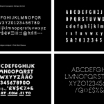
The monogram’s constant single line weight, recurring curves, parallel lines, ligature and rounded terminals successfully draw on the simple forms of Tina’s work, whilest also leveraging a little of the individuality and craft origins of the traditional monogram. It has a simplicity rooted in the ability to draw it with a single finger in clay but also in a current favour for reduction and the monolinear.

Heavy and uncoated white board and a pillow emboss make a connection with the material texture and three-dimensionality of Tina’s objects, while a light clay ink, the curves of the monogram’s container, the use of space, and the layouts of the business cards draw on simplicity, natural form and functionality, and Tina’s penchant for uninterrupted surfaces.
Although subtle, the changing shape of the monogram’s container offers a variety without being superfluous or contradictory, and places product at the heart of brand identity.


The brochure, note cards and posters are bound by a top down look at Tina’s portfolio, the first with photography and the others with illustration. The connection is clear but the tone set is different. Here there is a contrast that matches conviviality and play against modernity and restraint, keeping the identity visually interesting and cohesive whilst also securing a communicative breadth. More from Mucho on BP&O.
Design: Mucho. Photography: Roc Canals. Opinion: Richard Baird.