Tapped Birch Water by Horse
Opinion by Richard Baird Posted 27 October 2015
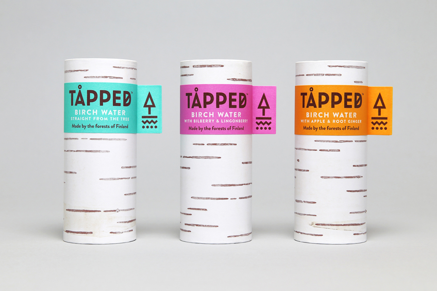
Tapped is an organic birch water, drawn straight from trees growing in Finland, and available in Bilberry & Lingonberry, Apple & Root Ginger and unflavoured varieties in the UK from Whole Foods Market, Planet Organic and online.
Birch water is a traditional spring time drink and medicinal ingredient in Finland, tapped from birch trees which filter ground water up through their roots and trunk acquiring minerals, vitamins and manganese, an antioxidant, in the process.
Tapped worked with UK based graphic design studio Horse to develop a brand identity and package design that would communicate the Nordic and birch tree origin of the water, distinguish it from other waters, be compelling to a market unfamiliar with the product and also be environmentally conscientious.
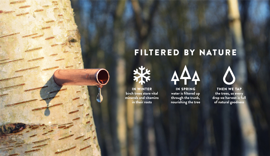
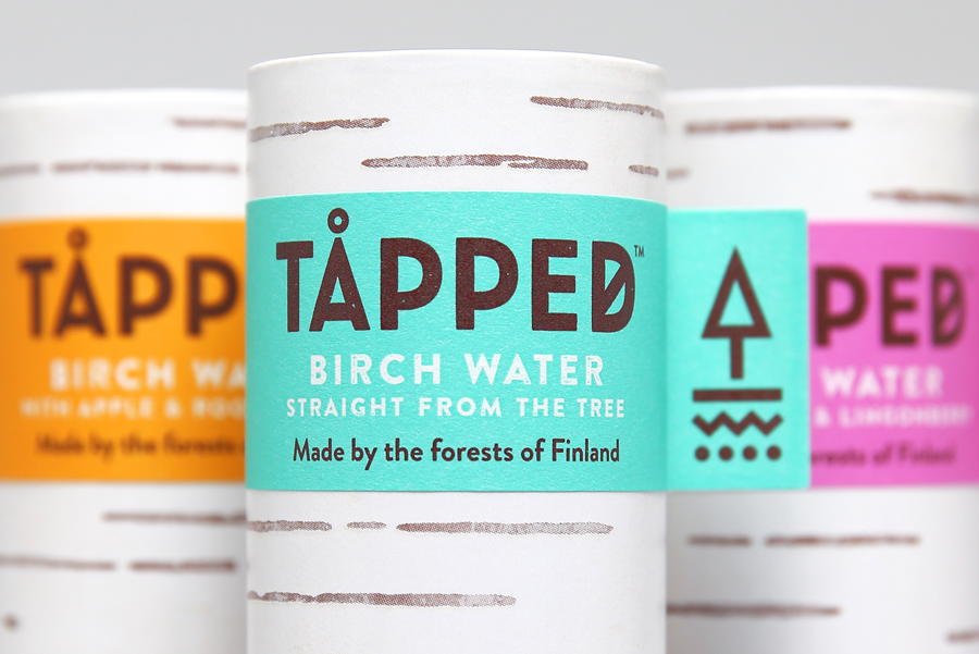
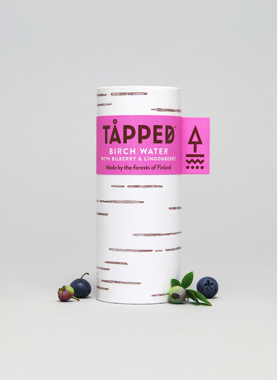
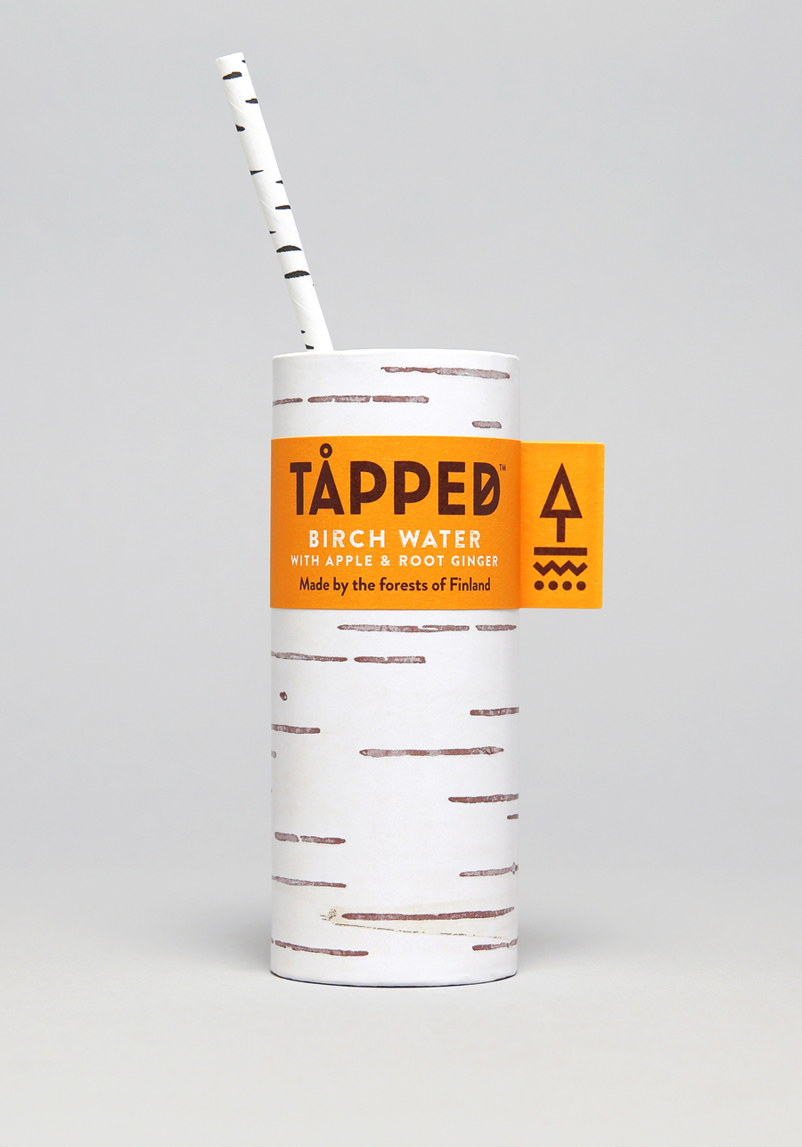
Horse manage to find a balance between communicative clarity, distinctive aesthetic and simplicity by leveraging the unique horizontal lines of birch tree bark and effectively translating this into a simple and recognisable graphic asset, tied to the unique quality of the product.
From a distance, packaging remains impactful through the high contrast of a bright white surface and the fluorescent spot colours of the labels, which were inspired by the tagging of young saplings.
Although birch water maybe a new product, the colour palette draws on the conventions established by other categories. Perception of freshness (white), energy, modernity (neons) and youth (the tagging of saplings) are all successfully touched upon. This is reassuring in its familiarity but also compelling in its differences.
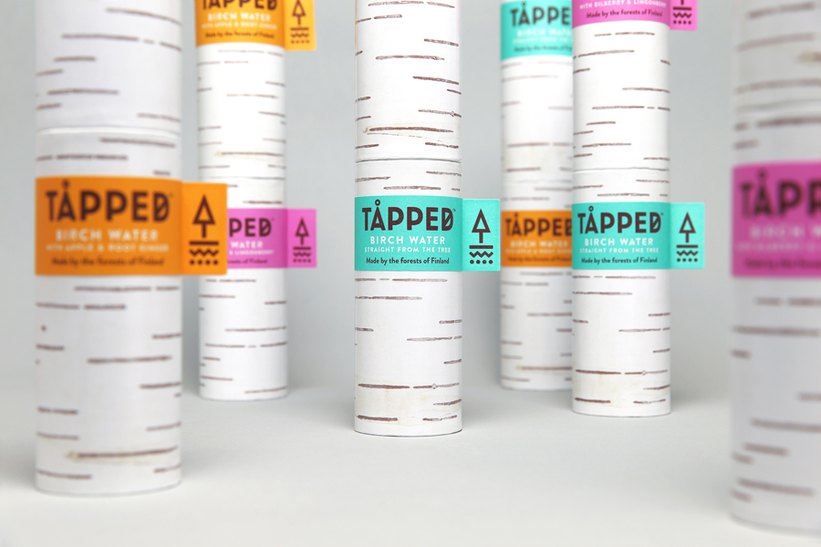
A low-carbon, fully recyclable, and a mostly renewable structural design of 75% wood-based paperboard, its cylindrical shape and straw does a good job of making a connection with trees, both visually and in material composition, while an uncoated tactile surface texture makes the most of its associations with craft, small-scale, low-volume products and an environmentally conscientiousness positioning.
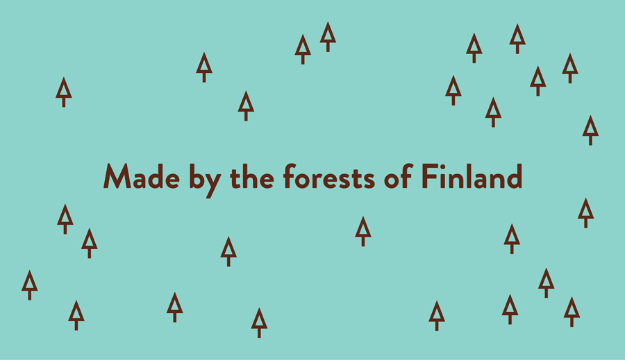
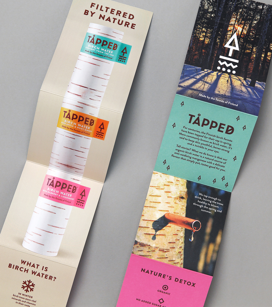
The water’s origin is effectively conveyed through the diacritic above the A and the line across the D in the logotype, implicitly through a Scandinavian simplicity and explicitly using concise language and a very detailed but slightly busy back-of-pack. It is worth noting that the typographical flourishes are playful visual cues rather than linguistically or literary accurate, which is fine for the market and the playful tone of the brand. It is a long way from what might be considered or confused with an authentic Finnish brand.
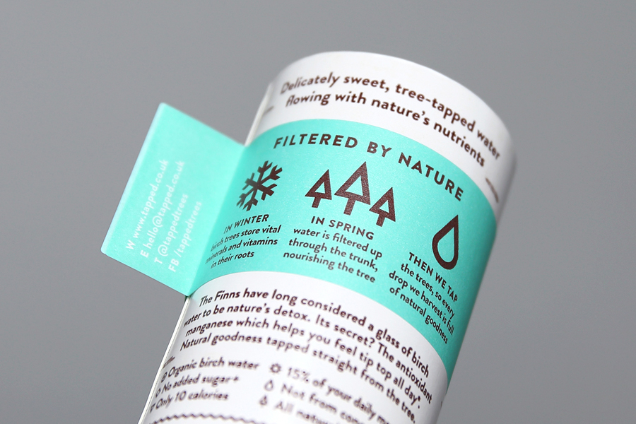
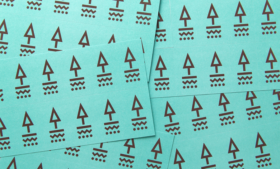
The logo is rich in communicative intention, aesthetically simple yet distinctive. It makes a reference to surface and subsurface layers, process—with the tree doubling as an upwards arrow—and is said to reference Norse iconography. Although perhaps not as obvious and as literal as the packaging, the logo is certainly well-founded, contemporary in its geometric monolinear rendering, and thoughtful in its ideation.
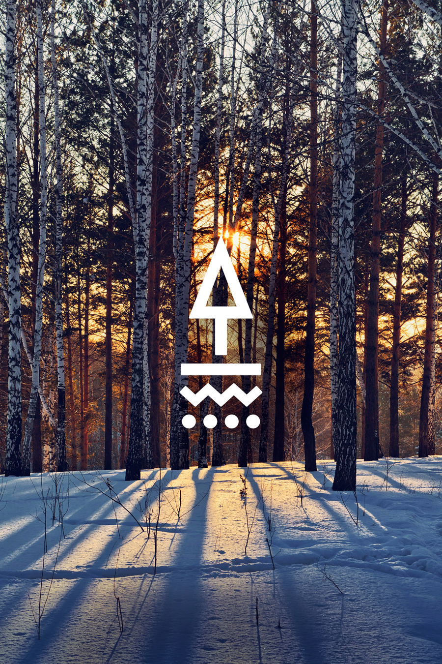
The geometric and reductive qualities of the logo also runs throughout the characters of Brandon Grotesque. It is a solid and well-drawn typeface. Its rounded corners give it a personable quality and although taking its inspirations from the past is thoroughly current. It is, however, cropping up more frequently, particularly within UK packaging projects that share similar consumer groups, and within digital products. It is certainly not widespread, and does secure a modernity, but is potentially undermined by an increasing saturation.
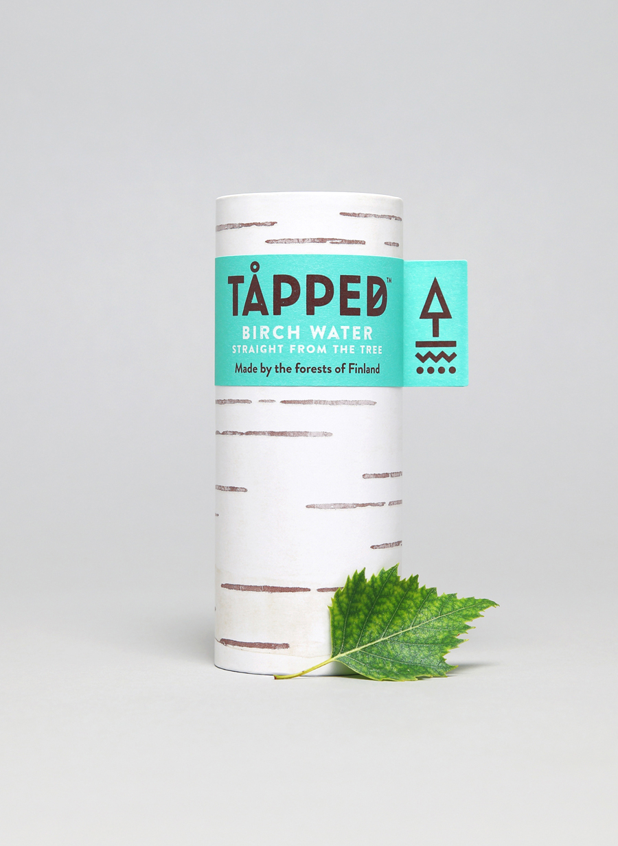
Brand identity effectively reaches across every aspect of the project, from structure and material choice, to naming to type to colour. These feel well-resolved, distinctive and well-founded, playful in its literal qualities, and communicatively successful in the connections made between product, its origin, and brand values whilst also keeping it well away from being perceived as gimmicky. More from Horse on BP&O.
Design: Horse. Opinion: Richard Baird. Fonts Used: Brandon Grotesque.
