Moomin & Moomin Shop by Bond, Finland
Opinion by Richard Baird Posted 10 November 2015

The Moomins are characters from a book, picture book and comic book series created by Swedish-speaking Finnish illustrator and writer Tove Jansson. These were published in Sweden and Finland between 1945 and 1993. Alongside the comic strip, the characters have also featured in their own television series and film, and populate the theme park, Moomin World, on the Finnish island of Kailo. Today, the Moomins are an established brand with an international reach and an increasing license-based product portfolio that exists across a variety of categories.
Finnish graphic design studio Bond, who are fans of the Moomins, were hired t0 develop packaging for Moomin Shops across Finland, and establish brand guidelines for licensees and licensed products within the international fast moving consumer goods market.

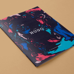
Although one property, there a two distinct aspects to the project. The brand guidelines and packaging direction for Moomin licensed products and packaging for the Moomin Shop. The difference is characterised by full colour illustration and bright neon spots, and black ink illustration across unbleached and uncoated paper, respectively.
The Moomin Shop plays well with heritage, drawing on the intricate fine line detail and shading of Tove Jansson’s illustrations, with a sticker, wrapping and ribbon adding a bright contemporary shot of colour and a personal flourish and finish that add further value. The choice of illustration, they way that these have been handled, the choice of ink, board, and structural design together feel sensitive to, and emphasises the original comic book art form, with a story contained within each panel.


In contrast to the Moomin Shop, the packaging that emerges from the new licensee brand guidelines, is one of high impact, and clearly a product of a competitive, volume driven market.
Pen-based custom typograph (above), share some of the qualities of the Moomin logotype and associated character sets (below)—also designed by Bond and referencing the typography used in the early Moomin comic strips—but introduce a youthful and more contemporary energy.


Where the Moomin Shop draws on the original black and white comic, the FMCGs leverage colour versions, and what is perhaps more familiar to a wider audience, and pairs these with panels of bright spot colour.
Distinctive typography, character style and illustration, alongside the panel-based storytelling, make a clear connection between the Moomin Shop and licensed products. Both sit comfortably within the Moomin brand, and for the most part make good use of the Moomin property. These are successfully pitched in a way that is sensitive to the expectations and pressures of the two markets whilst bringing focus back to Tove Jansson’s original artwork. More from Bond on BP&O.
Design: Bond. Opinion: Richard Baird.