Bronuts by One Plus One Design
Opinion by Richard Baird Posted 11 November 2015

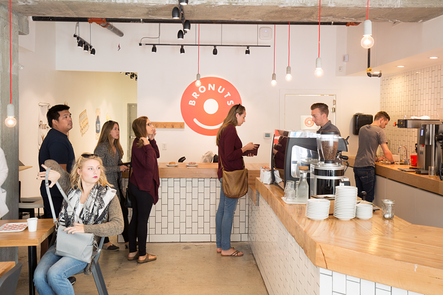
Bronuts sells handmade donuts and freshly brewed coffee to the local community of the Exchange District in Winnipeg, Canada, and, as the name suggests, is run by two brothers. Bronuts’ location draws a variety of customers, from young professionals and corporate offices to college students. It has a warm interior of light wood, white tiles, exposed architectural surfaces and low-hanging bulbs.
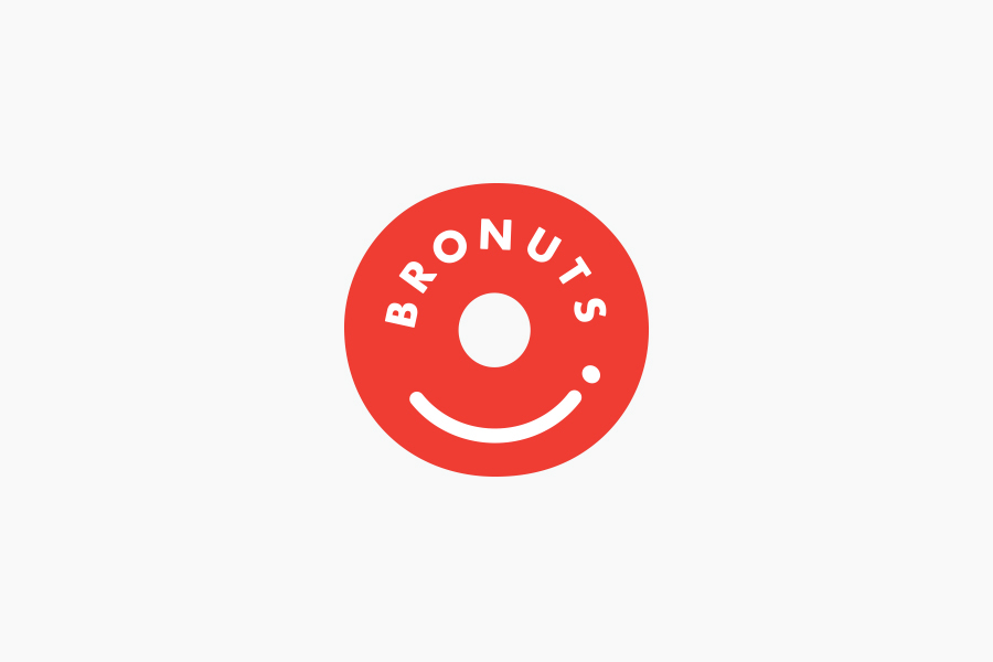
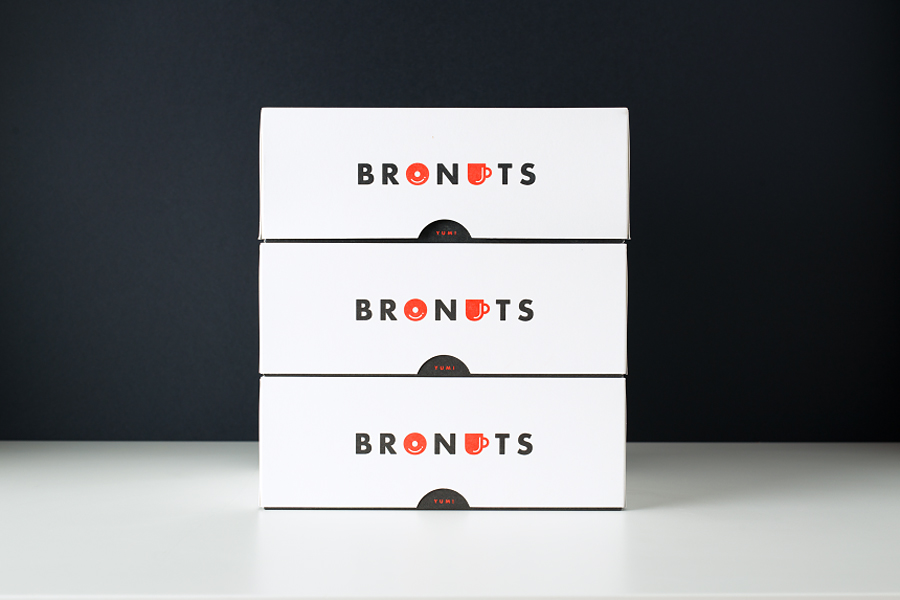
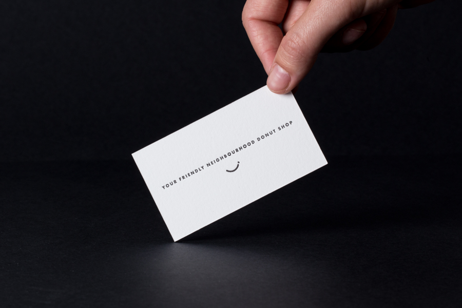
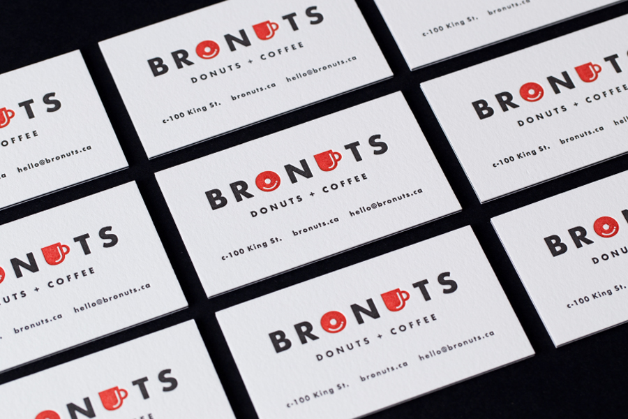
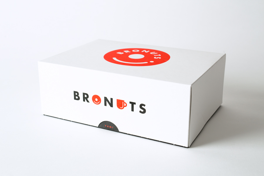
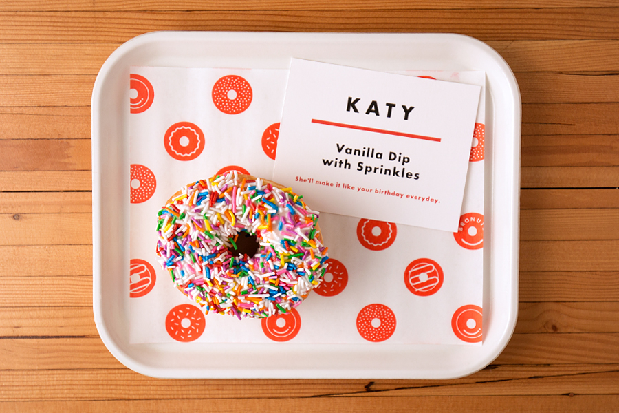
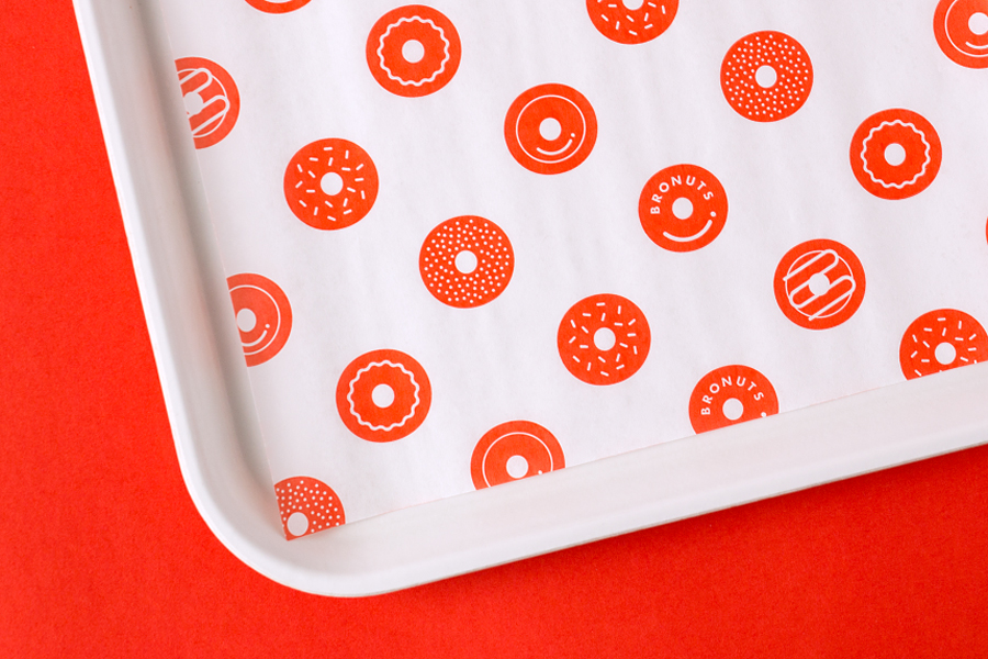
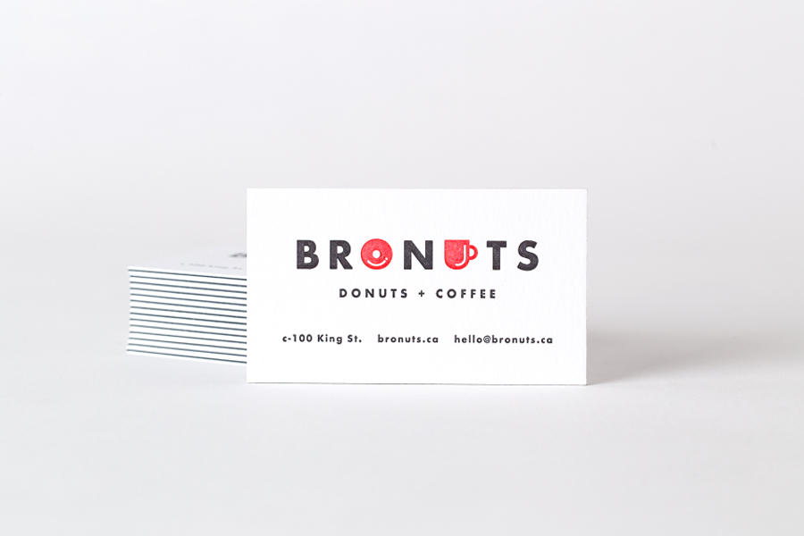
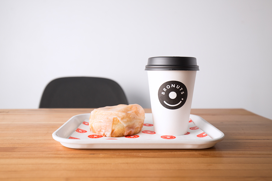
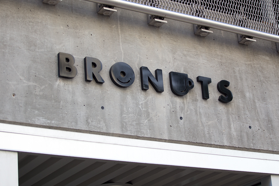
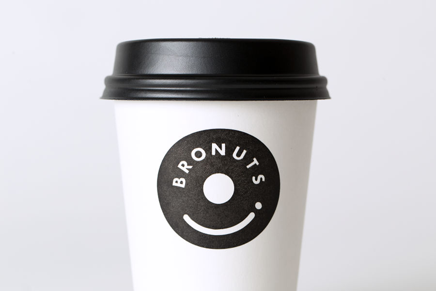
Much like its interior, Bronuts’ brand identity, created by graphic design studio One Plus One Design and which including stationery, packaging and signage, comfortably sits between hipness and accessibility, and is thoroughly current. This is reflected within the geometric sans-serif characters of the logotype, the simple, playful and communicatively clear donut and coffee cup iconography, the cleverness of a logo with a glaze that doubles as a smile, doughnut patterns and the straightforward application of these assets across interior and packaging. This also extends to a limited colour palette and the uncoated and debossed surface and three-ply weight of a letterpress business card.
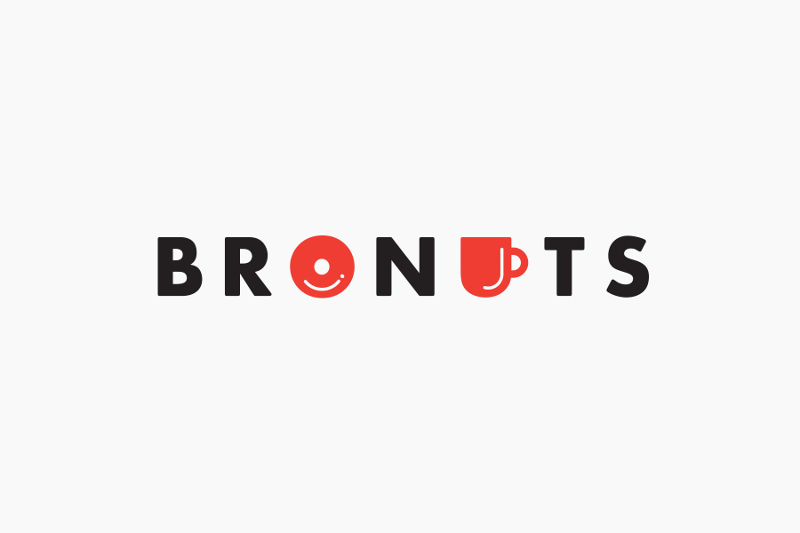
“A simple product offering called for a simple solution. Better yet, a clever solution. Taking a step back from our initial concepts we quickly realized the opportunity the name held, which was not immediately obvious — coffee + donuts are located right in the middle of the company name. Running with this discovery, we engineered a crisp brand identity with a tongue in cheek personality, carefully considering each brand extension. Exterior and interior signage, menu design, individual and group donut packaging were all consistently designed for engaging customer experience.” – One Plus One Design
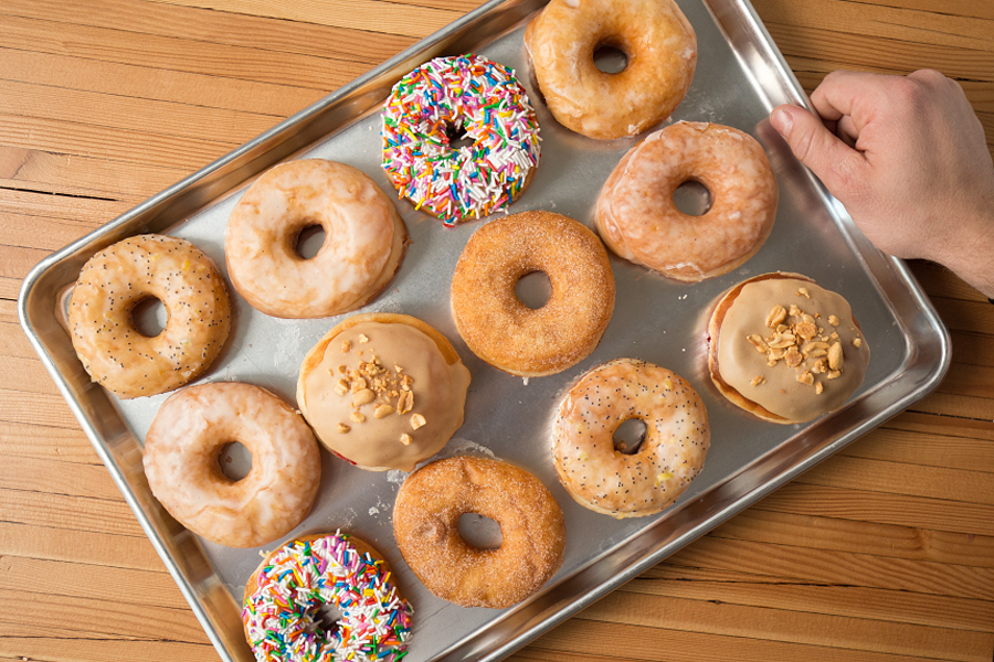
Within the context of the interior, brand identity is nicely weight. The logotype is playful but not childish, current, well-spaced and well-balanced, the colour palette is impactful but economical, and the doughnut illustrations, which draw on the variety of toppings, adds a bit of variety.
Design: One Plus One Design. Opinion: Richard Baird. Fonts Used: Futura ND
