Arrels by Hey
Opinion by Richard Baird Posted 16 November 2015
Arrels (roots in English) is a Spanish shoe brand, established by cousins, friends and partners Javier & Pepe Llaudet, and inspired by the Mediterranean, its traditions, rhythm, colour and creative atmosphere. Javier & Pepe also draw on the city of Barcelona (the place they want to be), the countryside (where they are from), and their passion for music.
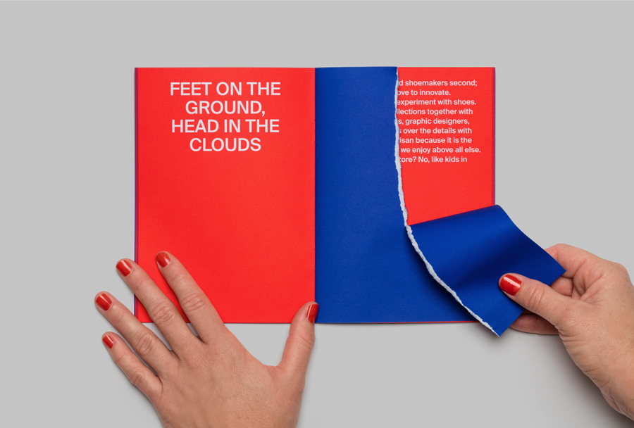
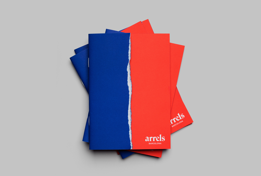
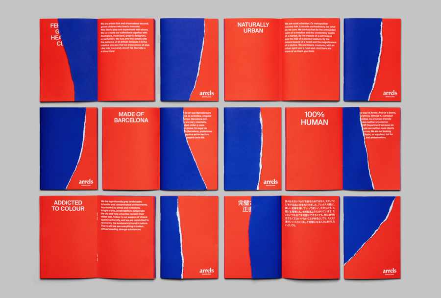
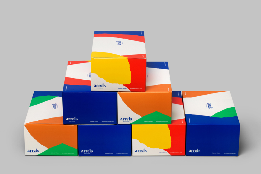
These inspirations make their way into Arrels’ new brand identity, created by graphic design studio Hey, through colour contrast, the irregular texture of torn paper, the traditional flourishes of a serif and the modernity of a sans-serif. This new identity links brochures, packaging, business cards and website.
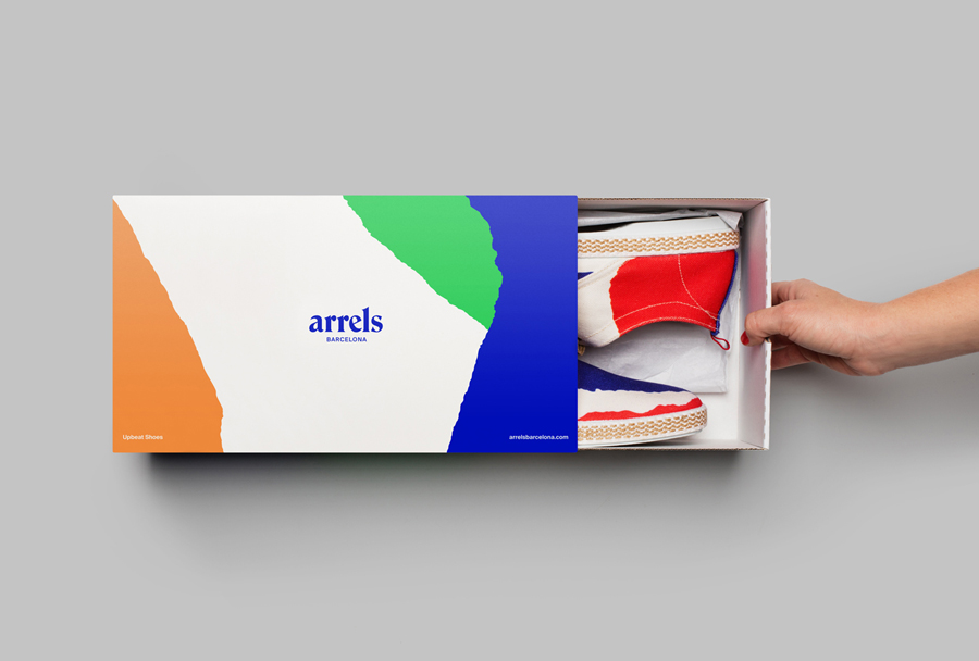
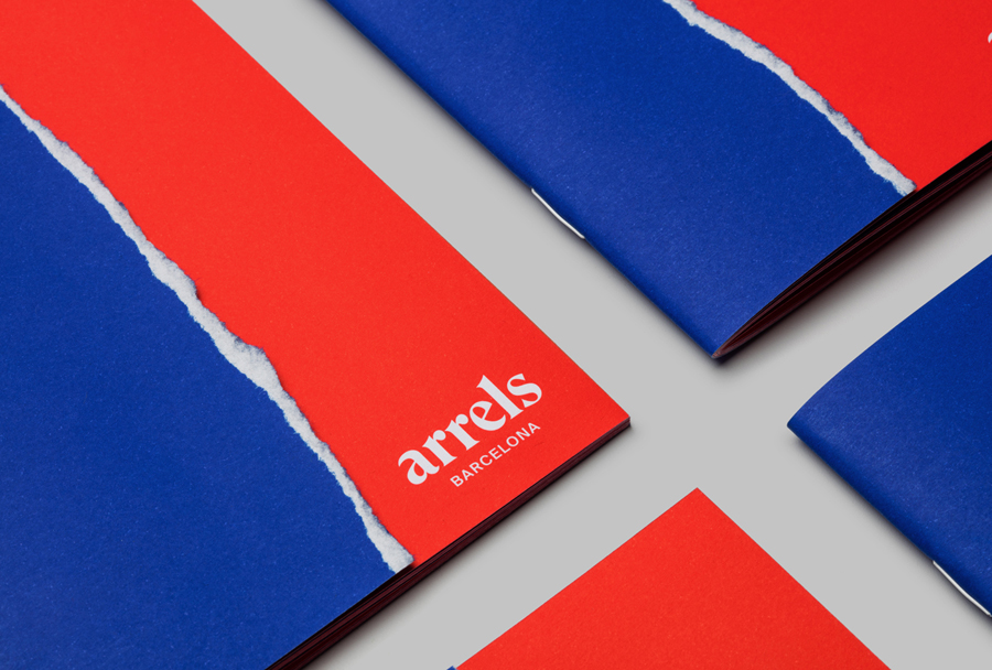
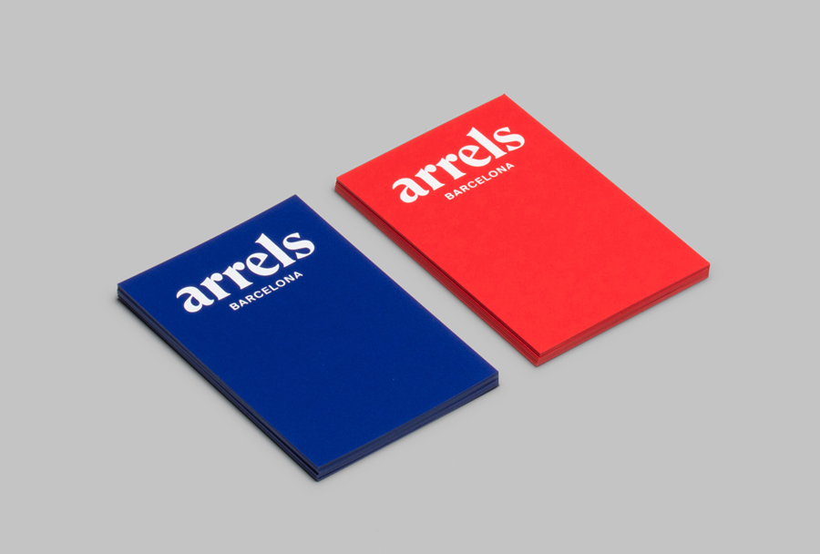
Hey looked to find a balance between Arrels’ urban aesthetic and rural roots, and the tension that exists between being handmade and mass produced. This duality effectively plays out through the rough, organic and individually hand torn edges of the brochures and the consistent patterns of the boxes, the reductive, repetitive and monolinear forms of a sans-serif, set alongside the character and crafted origins of a logotype with a high stroke contrast and carved serifs.
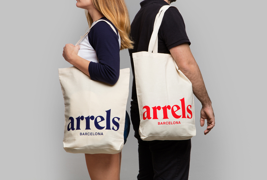
This duality continues, although more generally, through the red and blue of the brochures, the proportion of logotype in relation to pattern and its context (rather small on boxes but huge across tote bags), and a sense of contrast throughout.
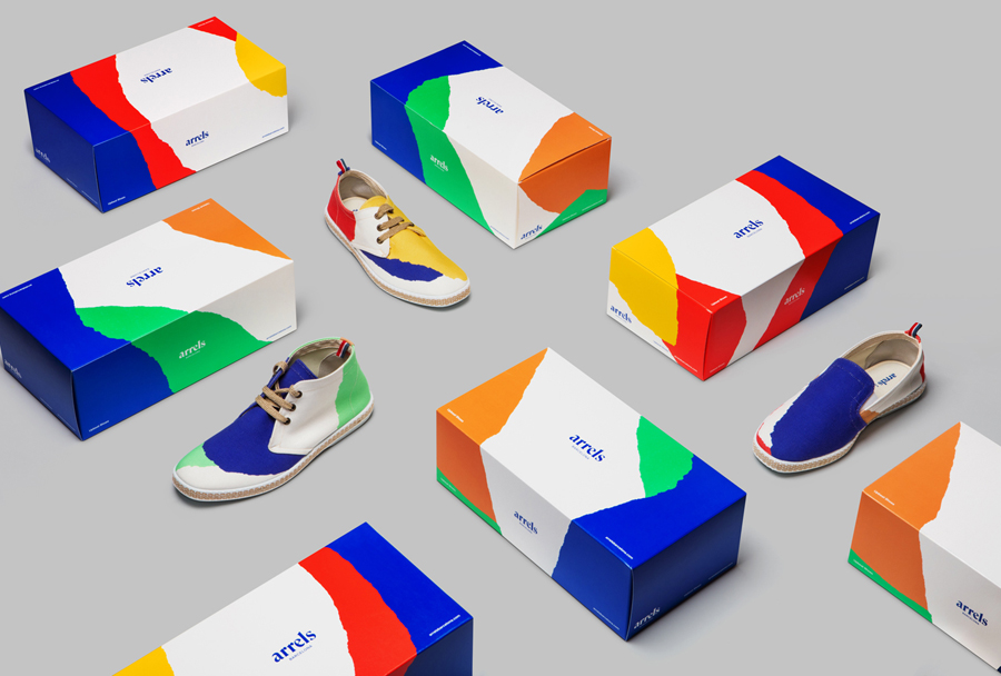
Arrels’ Mediterranean influences emerge in the colour palette of the boxes, and the almost topographical quality of rough edges meeting sea blue. A Spotify applet online makes a direct and personable connection with the brand’s passion for music.
Hey describe the torn texture as being rooted in the idea that if you were to rip up the layers of concrete that proliferate and characterise the modern urban landscape, underneath you would find the original, natural surface of the earth. It is a nice idea that, although abstract and a touch wasteful, gives a little more depth to what is clearly going to be associated with individuality and the hand finished. The result is visually striking and distinctive, grounded in some specific brand values, which are then expanded upon online. More from Hey on BP&O.
Design: Hey. Photography: Roc Canals. Opinion: Richard Baird. Fonts: ITC Bernase Roman & Suisse Int’l.
