Åhléns Hem by Twenty-five Art House
Opinion by Richard Baird Posted 23 November 2015

Åhléns is a department store and one of Sweden’s leading retailers. It has locations in many of the cities across the country, with 18 in Stockholm alone, and also trades in neighbouring Norway. Åhléns has a significant history, beginning life as a mail-order business in 1899, and moving into low-cost retail in 1964. It now stocks up-market products across the beauty, fashion, home and media markets.
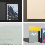
Scandinavian design studio Twenty-five Art House was commissioned to develop a new concept for Åhléns’ in-store communication and wayfinding across its Home department, and delivered a solution based around signage, patterns and custom typography with the intention of both guiding and inspiring.

BP&O takes a break from reviewing new visual identity or rebrand work, and instead, looks at a “sub-branded” environment, one that exists within the context of an established brand, but with its own distinctive character.
25AH appears to take their cues from contemporary high-quality homeware—robust and functional but also sensitive to current style—and many of the store’s interior details. These includes thin powder-coated steel frames, glass, exposed utilities and trusses, and a strong sense of the linear throughout.


Functionality and robustness is effectively expressed through environment, but is also emphasised through typography, signage and colour. There is an interesting and compelling connection made between physical interior detail, structure and print.
This is perhaps most clearly seen in the use of neon signage, and the way that its physical limitations gives character to a condensed sans-serif in print, and how its single line weight and consistent forms sit comfortably within an interior made up of geometric and monolinear frames and shelving. The shot below does a good job of really highlighting this relationship.

This monolinear and geometric architectural quality, which can be seen in the trusses, frames and gantries of the interior, also makes its way into a series of simple patterns. The functional and structural becomes the ornamental, occasionally playful, much like homeware, and is expanded upon typographically through the exaggerated flourishes and stroke contrast of a serif with large ball terminals.

The tension between functionality and style also runs throughout a colour palette that exists somewhere between a current favour for pastels, the timelessness of black and white, and the muted, robust and hard-wearing finish of powder-coated steel. The red of the cash desk sign, a bright compelling detail and the only coloured neon in the department, functions well to draw the eye.
Other details of note include stencil cut typography that plays well with the perception of longevity and robustness, stencil cut serif typography which is more literal in its union of classic ornament, practicality and the current, and product photography that draws out machined and handmade product finishes. Much like the patterns, the functional (bulbs in particular) become products with stylistic value, which is made the most of as large backdrops to the interior.


Contrast is used to good effect, typographically and in the juxtaposition of product detail and the utilitarian qualities of powder-coated steel sign holders. This looks particularly good along grey book shelves which hold publications that mix colour, image, print finish, type and texture.

25AH’s approach finds a balance between style and utility, explicitly and simplicity expressed, and like any good retail environment, draws out and frames products, plays with association and appears visually interesting, consistent and underpinned by the basic requirement to inform and direct.
Design: 25AH. Photography: Charlie Drevstam. Opinion: Richard Baird.