Helsinki Philharmonic Orchestra by Bond
Opinion by Richard Baird Posted 26 November 2015
Helsinki Philharmonic Orchestra is a 102 strong ensemble, currently led by chief conductor John Storgårds, with its primary venue being the Helsinki Music Centre. It has a significant history, beginning as the Helsinki Orchestral Society in 1882 and acquiring its current name following a merger with the Helsinki Symphony Orchestra in 1914. In 2016 the orchestra will have its first female chief conductor following the appointment of Susanna Mälkki.
With a desire to strengthen its image and consolidate its overall brand experience, the orchestra worked with Finnish graphic design studio Bond, who in turn collaborated with photographer Marko Rantanen, to create a new visual identity that would communicate the energy and power of its 102 musicians, and that would extended across programmes, stationery, business cards, campaigns and signage.
Bond looked to bring alive Helsinki Philharmonic Orchestra’s core, its 102 ensemble. It touches upon the collective in an ambitious logo treatment, and the individual, through Marko Rantanen’s portraits. Both are united by a sense of musical power and a dynamic quality creatively drawn out of static type and image.
The logo, a waveform built from the names of each of the ensemble, draws a thoughtful, inclusive and creative concept from what could have been perceived as the low-hanging fruit of music related brand identities, and uses it as the basis for a couple of other neat ideas. It appropriates the familiar, and gives it a unique twist, tying it to the very heart of what makes an orchestra, its members. The approach also displays a confidence in these individuals, as it is potentially undermined, or will at least incur expense, by exits and new arrivals.
In instances where logo application is small, members are represented by monolinear bars. It is a practical alteration but the connection and representation remains, and the aesthetic is expanded upon through the very current favour for monolinear iconography. There are occasions, however, where this device becomes a little distracting in its detail, drawing attention away from image and content.


The build of the logo—horizontal name and vertical ensemble—also informs the layout of programs. Headlines become centre lines and content something close to amplitude. It is interesting and unusual to see logo influencing structure but a choice that imprints content with a proprietary quality. There is a restraint in the use of this layout, implemented only in occasions where it feels like a natural fit, and functions to divide content, alongside typographic size and weight. Check out the profile pages above.


Type plays with the contemporary and the classical, the loud and the quiet, the bold and the nuanced through weight, size, typographic reduction and detail. It appears busy at times but the combined tone, contrast and communicative intentions of Founders Grotesque and Typonine Stencil are clear and distinctive in their combination.
The uppercase characters of Founders Grotesque adhere tightly to baseline and cap height which, alongside good spacing, make them ideally suited to the forming bars of the waveform.

While the logo and its applications are creative, grounded in the uniqueness of the ensemble, and works well to link content, it is the work of Marko Rantanen that really stands out, in the movement, energy and detail caught by time-lapse photography. These do a fantastic job of conveying rhythm and sound within a static image and the diversity of the ensemble. The extent to which so many musicians have been captured, and the variety this provides within the context of print and outdoor campaign is fantastic.
Where type is bold and robust, photography is light and full of energy. This contrast provides visual impact and communicative depth, and works well to convey musical performance absent sound.


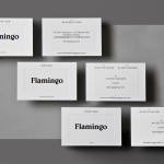
Other highlights include the stacking of the address across the envelopes, and the use of few colours which, much like type, plays with the classic and contemporary through white boards and black ink, black and white photography, and a shot of bright red. A blind emboss and uncoated boards give a tactile quality to the logo throughout the stationery. Although this could be seen as an unnecessary flourish, a case could be made that Bond are making sure that every sense, except sound, has been thought about prior to experiencing the orchestra.
Design: Bond.
Photography: Marko Rantanen.
Opinion: Richard Baird.
Fonts Used: Founders Grotesk & Typonine Stencil.