Smokovik by Studio8585
Opinion by Richard Baird Posted 4 January 2016

Smokovik is an exclusive property development, located on the Croatian Island of Krk, designed by renowned local architect Idis Turato. The development will be made up of both residential and commercial buildings that share a functional and sustainable build practice, a favour for modernity, flat surfaces and Mediterranean sea views. Smokovik’s brand identity, created by Studio8585 now working from Copenhagen, included logotype, brochure and website design, a copywriting component and art direction.
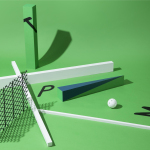
Studio8585’s brand identity appears as fair and appropriate distillation of the spacious interiors, straight lines, modern architectural structure and high quality detail that make up the Smokovik development, as well as the natural beauty of its surroundings. This is achieved through an abundance of white space, grid based layouts, windows of green, bright photography of Mediterranean vegetation and the flourishes of coloured paper, die cuts, areas of varnish, foil and open stitching.
These finishes introduce moments of detail that hint at an interior quality within the context of a largely reductive approach and exterior structure, and to a type choice, Greta Sans, that lends the project a light and technical aspect that is rooted, much like the properties, in a desire for clarity.
There are moments where it falters slightly. Blurs to architectural renderings appear to be in opposition to a sense of precision, and the type choice, while high quality, does not stand up as well when used oversized across the brochure’s envelope, a result of its text, rather than display origins.


There is continuity between brochure spreads and website. The use of blocks of black text and bright image, punctuating areas of white space, much like windows of a building, and the way that these have been structured, appear contemporary, drawing on some of the qualities associated with slow living and current lifestyle magazines. Both the website and brochure effectively weaves together technical specifications, the reputation of architect Idis Turato and the quality of the area through copy, illustration and image. More from Studio8585 on BP&O.
Design: Studio8585. Copywriting: Maja Benčić. Opinion: Richard Baird. Fonts Used: Greta Sans.