Fox Real Estate by Parallax
Opinion by Richard Baird Posted 7 January 2016

Fox is described by Parallax Design, the Australian graphic design studio behind its new brand identity, as one of Adelaide’s most respected boutique real estate agencies. Established in 2005 by Andrew Fox, Fox Real Estate specialises in the selling of high-end properties. Following business growth and to coincide with a move to larger premises, Fox worked with Parallax to develop a new brand identity, which extended across brochure, business card and signage, with the intention of strengthening its market position.
The revisions to the logo address the awkward proportions of the original by resizing the O, opening up the spacing between the leaping fox and type, removing Real Estate whilst retaining the monolinear and geometric qualities of the sans-serif, which is now a little lighter. These are small changes but make for a more concise, well-balanced logo that acknowledges that the fox illustration of the previous design, which has a nice sense of motion and detail, still holds up well.


Based around a new strapline, The Hunt Is Over, and drawing inspiration from the fashion and style of the hunt, Parallax developed a series of patterns that reference herringbone, tartan and houndstooth, and a colour palette of navy, red, cream and gold.
Together with a high contrast serif, these effectively make the most of the current favour for balancing a bold and contemporary impact with more traditional detail. It is a combination that works well to deliver memorable brand impact where there are constraints, especially within the context of newspaper and magazine spreads where space is at a premium, but also leverages those details typically associated with heritage and experience.
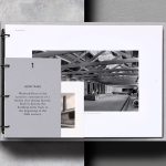
The brochure makes good use of the high-quality nature of the properties being sold by Fox through well-shot photography, its implementation across the front of the brochure, and a good balance of image, type and layout inside. Unfortunately, this does not extend to the Fox Real Estate website, which really needs an overhaul.

It is perhaps worth acknowledging that some may find the fox hunting reference a touch unseemly, but also the difference in cultural sensitivities, particularly where the red fox is said to pose a serious conservation problem in Australia and where hunting is still legal. It is potentially a political statement, so naturally divisive, but presumably pitched right for Fox and its clients.

Other details such as dyed and uncoated boards and papers, die cut logo, a metallic gold ink rather than foil, the variety of patterns, some good property photography, some neat brochure layouts and personalised presentation folders lend the project a sense of high-quality alongside the distinction of logo and pattern. The signage is a highlight, providing an interior snapshot at the front of the property, and making a connection with the design of the brochure.
Design: Parallax Design. Opinion: Richard Baird.