Wenford Dries by ico Design
Opinion by Richard Baird Posted 12 January 2016

Wenford Dries is a new property development in the scenic area of North Cornwall. It will be made up of loft-style homes, artist studios, allotments and wild gardens, set on the site, and within the structure of, a former clay drying factory that dates back to the beginning of the 20th century. This is said to have been sensitively restored. The development is billed as an urban-style regeneration and retreat in an area of significant natural beauty.
London based design studio ico Design created a brand identity for the development that would communicate the vision of the project and evoke a sense of place to investors and off-plan buyers. This dual market was addressed through two key assets, an architects pack and a lifestyle magazine bound by a diverse but cohesive visual language of type, clay grey boards, colourful photography and emotive language.

ico Design had plenty to work with, effectively drawing on and weaving together the clay drying heritage of the site, the modernity of its development, the significant natural beauty that surrounds it, space for artists and the intention of offering refuge from city life through a smart and compelling balance of illustration and photography, type, material texture, colour, print finish and language.
The architects pack is, unsurprisingly but appropriately, characterised by a sense of robustness and utility. This comes across in the weight and reclaimed mixed fibres of the board, blind emboss and the modular nature of ring bound sheets. It balances technical insight, modernity, site heritage, and opportunity through architectural elevation, shots of interior finish, postcards with sepia site photography and artist impressions.


Grey papers and boards find a good meeting point between concrete structure and clay, cream plays with retrospection, while different sheet sizes function to break up content, add a moment of visual interest and act as a vehicle for compelling use of language and drawing out key details.
Contrast is used well throughout. Technical drawings are juxtaposed alongside artist impressions, pre-build images are set alongside interior finishes, and heritage is placed next to a contemporary polish. These are also distilled down to and reflected across a type combination that mixes uppercase sans-serif, traditional serif and typewriter choices.


The small cream postcard with a loosely rendered artist impression, set on top of a larger site map printed on white, is a particular neat use of contrast, as an aesthetic detail but also in its clear communicative intention.

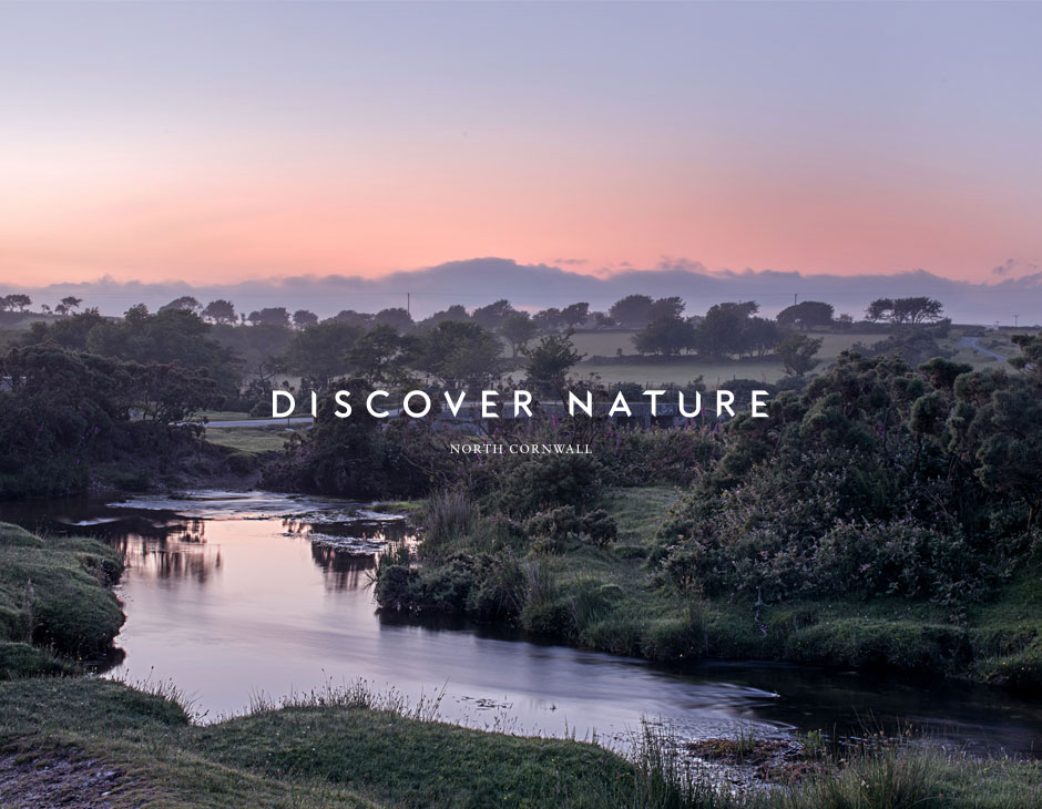
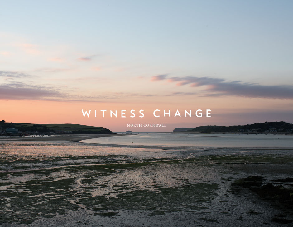
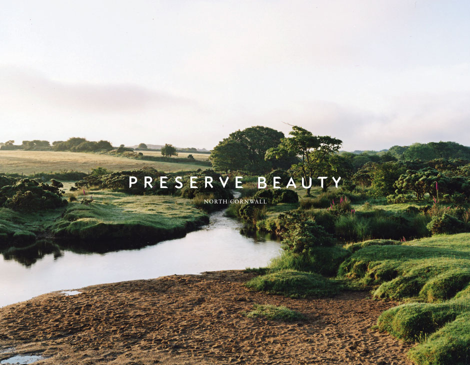
Photography, shot by artist Harry Cory Wright, brings together the distinctive qualities of the area with a warmth of colour and a richness of detail. These function well to highlight the diversity of the area, vistas unbroken by urban structures and areas of tranquility, absent people. Their time of day provides these with a fairy-tale like quality.
The use of language is straightforward. Where image is visceral, the choice of type is explicit in its connection to the development and its modernity through architectural angles and a sense of dimension in the cuts. Type and image are disparate, and clearly in opposition, but this works in their favour, really emphasising the qualities and communicative intentions of each.

Print for the off-site buyer plays with all of the components of the architecture pack, yet remixes these into a lifestyle magazine, clearly taking its cues from the current and popular slow-living publications. Area photography becomes more prominent, typewriter and uppercase sans-serif make way for serif body copy and large serif headlines. Language is more generous in its lexicon, favouring less of a utility and more of the emotional.
Like the architect pack, the magazine also utilises clay grey and material texture (Colorplan, Real Grey, Granular Emboss) to touch upon the site’s former use, cropped pages that divide content and draw attention to key information, and plenty of white space to frame image. There are moments of play in the non-format approach to type across the cover that, in conjunction with words, feels distinctly poetic.


There is a clear continuity between architects pack and lifestyle magazine, dialing up or down assets depending on the tone that needs setting and the expectations and requirements of the two groups of people. These do a fine job of showcasing the ambition of the architecture and interior design, the diversity of the North Cornish landscape, effectively plays with the imagination and touches upon the site’s history. Each asset is well-suited to its communicative intention and brought together in a way that is visually compelling, tactile, cohesive and distinctive.
Design: ico Design. Photography: Harry Cory Wright. Opinion: Richard Baird. Fonts Used: Larish Neue, Akzidenz Grotesk & Sabon.