Absolut Botanik by Bold Inc.
Opinion by Richard Baird Posted 13 January 2016

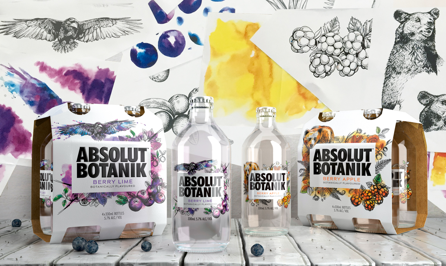
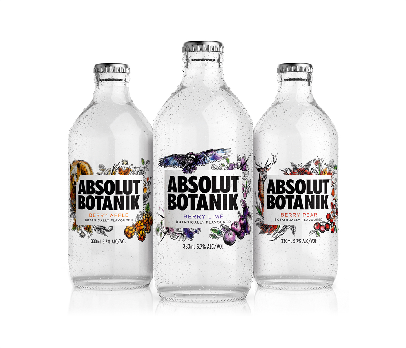
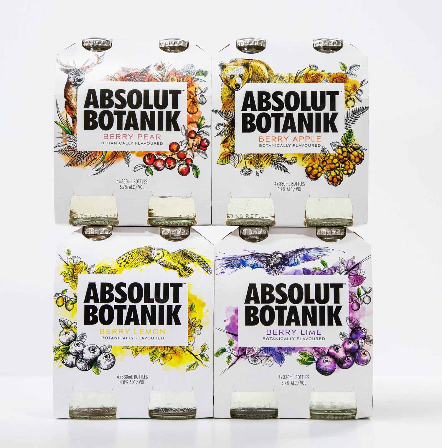
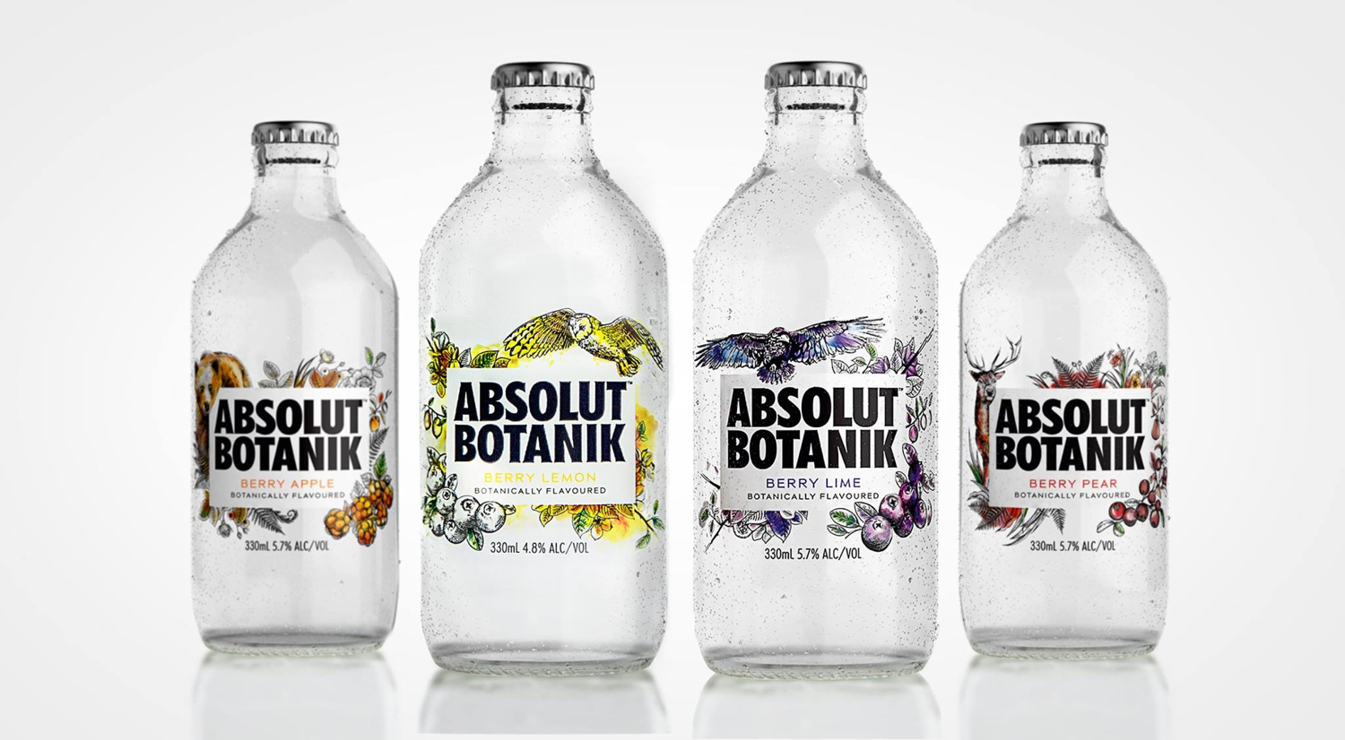
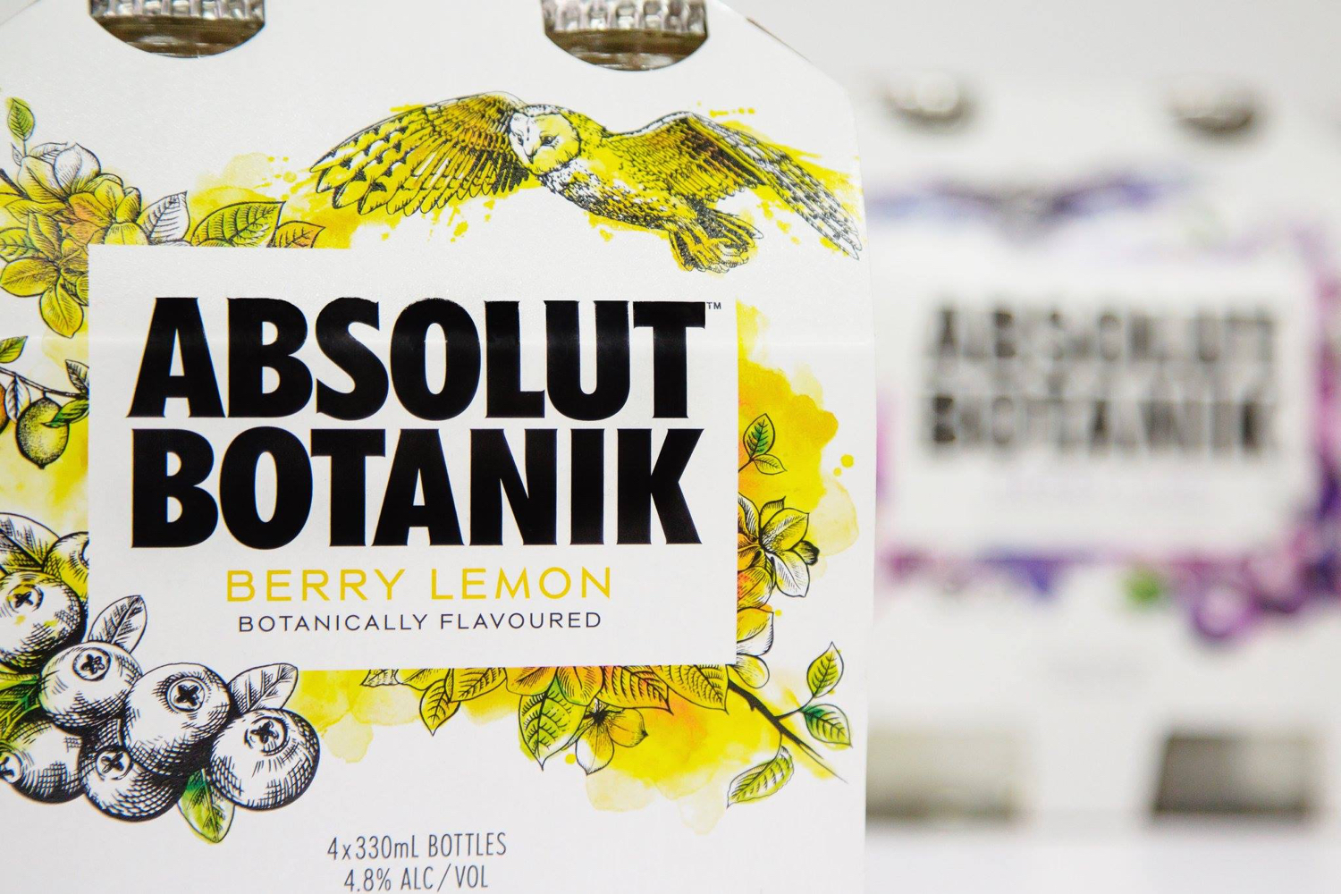
Absolut Botanik is a new ready to drink, pre-mixed, single-source vodka range from distiller Absolut, flavoured with Scandinavian lingonberries, cloudberries and blueberries, blended with either pear, apple or lime. The range features a distinctive and bespoke single-serve bottle with a silver crown cap, and the Absolut logotype framed by rich illustrative detail. This mixes bold watercolour strokes with finer pen and ink work. The packaging design, created by Bold Inc., looks to engage the market with a strong character and story, and to convey a sense of craft and playfulness. This post was updated October 2017 with images of Berry Lemon, a new addition to the range.
Bold Inc. make good use of the Absolut logotype, its recognisability and associations through proportion on pack, and in the preference for continuity in the rendering of Botanik. A pass of white effectively frames its black letters across a clear bottle, and provides significant contrast to the rich illustrative detail that gives this range its unique personality.
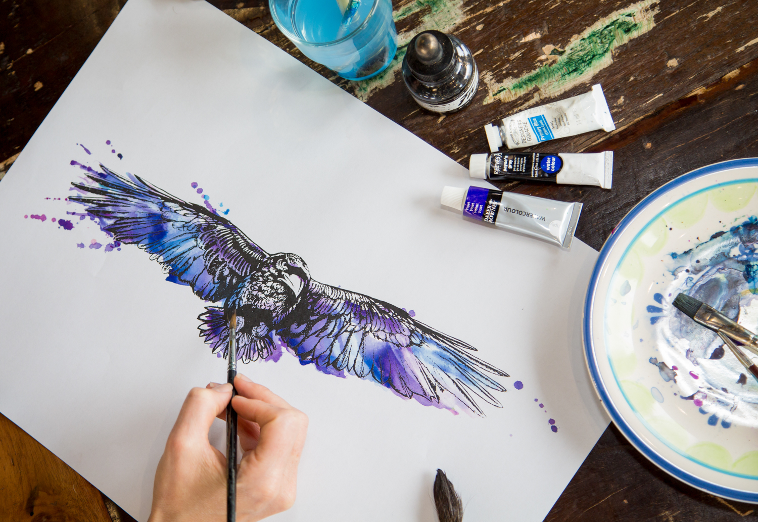
Where the bold letters of the Absolut brand feel permanent, the illustration of Absolut Botanik, much like Absolut’s Limited Edition ranges, are of the moment, and effectively (and appropriately) leverage a continued favour for the compelling and now fairly universal communicative nature of botanical illustration in the drinks industry.
A blend of ink, watercolour and a slight etched quality in shading plays with craft, ingredient quality and to some degree a sense of legacy, while content and concept, which resolves around animals wanting their fruit back, and characterised by some aggressive faces and postures, feels thoroughly contemporary.
This layers Absolut Botanik with a subtle story component, presumably to be expanded upon throughout campaign work, and draws a more unique and adult personality from the often light and playful qualities associated with watercolour.
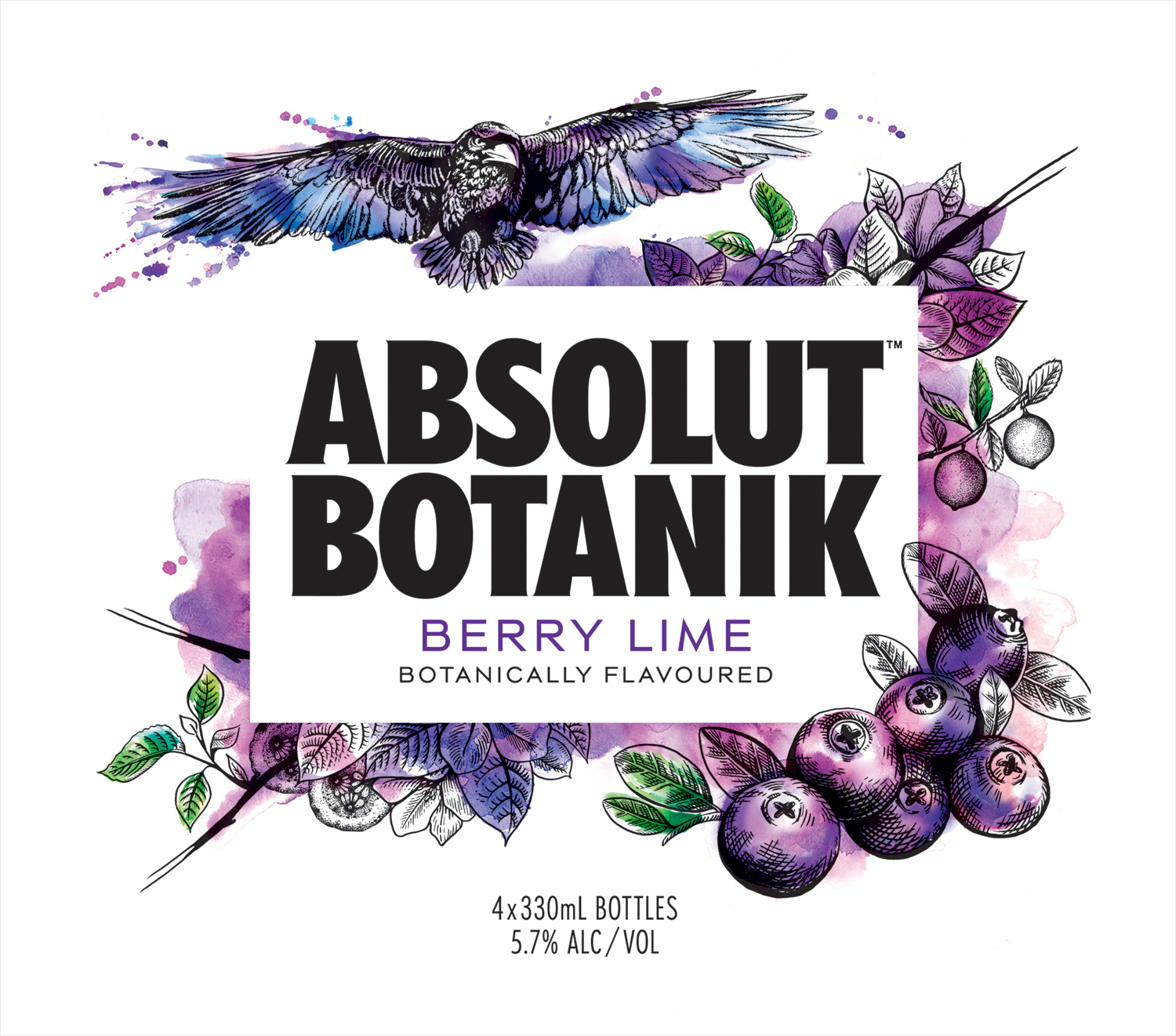
The illustrations are well-rendered with some good pen and ink shading, and a lovely use of bright but earthy watercolour and texture. These share a concept, are aesthetically pleasing and grounded by clear communicative intentions. They appear to take some of their cues from Absolut’s popular and fleeting limited edition ranges, but makes a clear connection with the craft, quality and permanence associated with Absolut Vodka through type and its proportions, the use of space, bottle shape and its clear glass.
Design: Bold Inc. Opinion: Richard Baird.
