Bombonería Pons by Mucho
Opinion by Richard Baird Posted 28 January 2016

Bombonería Pons is a family owned Barcelona based business, established in 1960, dedicated to producing the finest handcrafted chocolates. With a desire to engage with a younger consumer Bombonería Pons worked with international graphic design studio Mucho to develop a brand identity that would be sensitive to its traditional values and history yet give it a contemporary appeal. This extended across packaging, brochure, stationery, business cards and print communication.

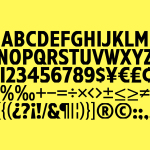
Mucho mange to infuse the traditional values of Bombonería Pons with a light, contemporary and youthful new character. This is achieved through the juxtaposion of a blackletter monogram, drawn from the company’s earlier identity, which establishes a degree of continuity, and placing this alongside the restraint and modernity of a simple geometric sans-serif, and within the context of pastel colours and confectionery imagery.
The monogram’s high-contrast, hand drawn, calligraphic strokes and flourishes feel well-suited to a business founded on traditional values and products that are crafted and with ornamental qualities. The geometric sans-serif, in contrast, is reductive in form, flourish and colour, and is thoroughly current.
A gold foil and ink, black type and plenty of white space continue to play with tradition and flourish, reduction and modernity, and feels largely well-balanced throughout, particularly in the layouts of the print work.

Although the combination of sans-serif and blackletter is both communicative and distinctive, it is the confectionery patterns that are the clear highlight. These provide on-trend colour, a layer of visual texture and detail, and a playful and youthful quality without being childish. These have been used effectively utilised in print, as large panels or bisecting areas of unprinted space.

Where type, monogram, colour and print finish are reassuring and familiar, effectively leveraging industry convention to convey quality and craft, the confectionery patterns appear memorable and intelligent in their balance of function; to showcase some of the many products of Bombonería Pons, but also as a modern and compelling aesthetic.
Other highlights include the monogram as two different patterns, the combination of gold metallic ink and gold foil, the weight and edge painting of the business cards, and cuts that reveal colour through white brochure covers. More from Mucho on BP&O.
Design: Mucho. Photography: Roc Canals. Opinion: Richard Baird. Fonts Used: Agincourt & Verlag.