Obra Blanca by Savvy
Opinion by Richard Baird Posted 29 January 2016

Obra Blanca is an architecture studio, established in 2013, with offices in the Mexican city of Veracruz. The studio looks to transcend Mexico’s architectural landscape, remain independent and resistant to trends, and free to experiment and explore. It attributes a building’s value to its coherence, craftsmanship, materiality, functionality and context.
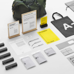
Obra Blanca represents the last step in construction, the stage at which a building stops being just a structure and gains character from, and is an extension and reflection of, its inhabitants. This informed the studio’s new brand identity, created by graphic design studio Savvy, and manifests itself in two parts, in structure and content, which runs across business cards, stationery and brochures.

It is not a huge departure from, and certainly plays with, some of the conventions of the industry, particularly in the selection of robust boards, type and the light of shade of a blind emboss, it does, however, establish and visualise a relationship between structure—its order and clinicality—and the more human component that gives it life.
This sense of structure and functionality comes through in the use of plenty of white space, the use of both underlying and observable grids, bold uppercase letterforms and their consistent point size, and a very simple logo. This logo, while difficult to really own is certainly in keeping with the more brutalist qualities of some of Obra Blanca’s buildings.


Where often you might expect a consistency, adherence to grid, solid colour, geometry and precise typography, the print finish, delivered by hand as a stamp, introduces irregularity, imperfection and organic texture to content. Although rather simplistic, it is clear in its connection to the human contribution to a structure.

Materiality comes through in the weight of the boards, the embossing of the grid, the uncoated surface texture of the boards, the visual texture of ink, different paper sizes, and a blind embossed logo that directly connects identity and material.
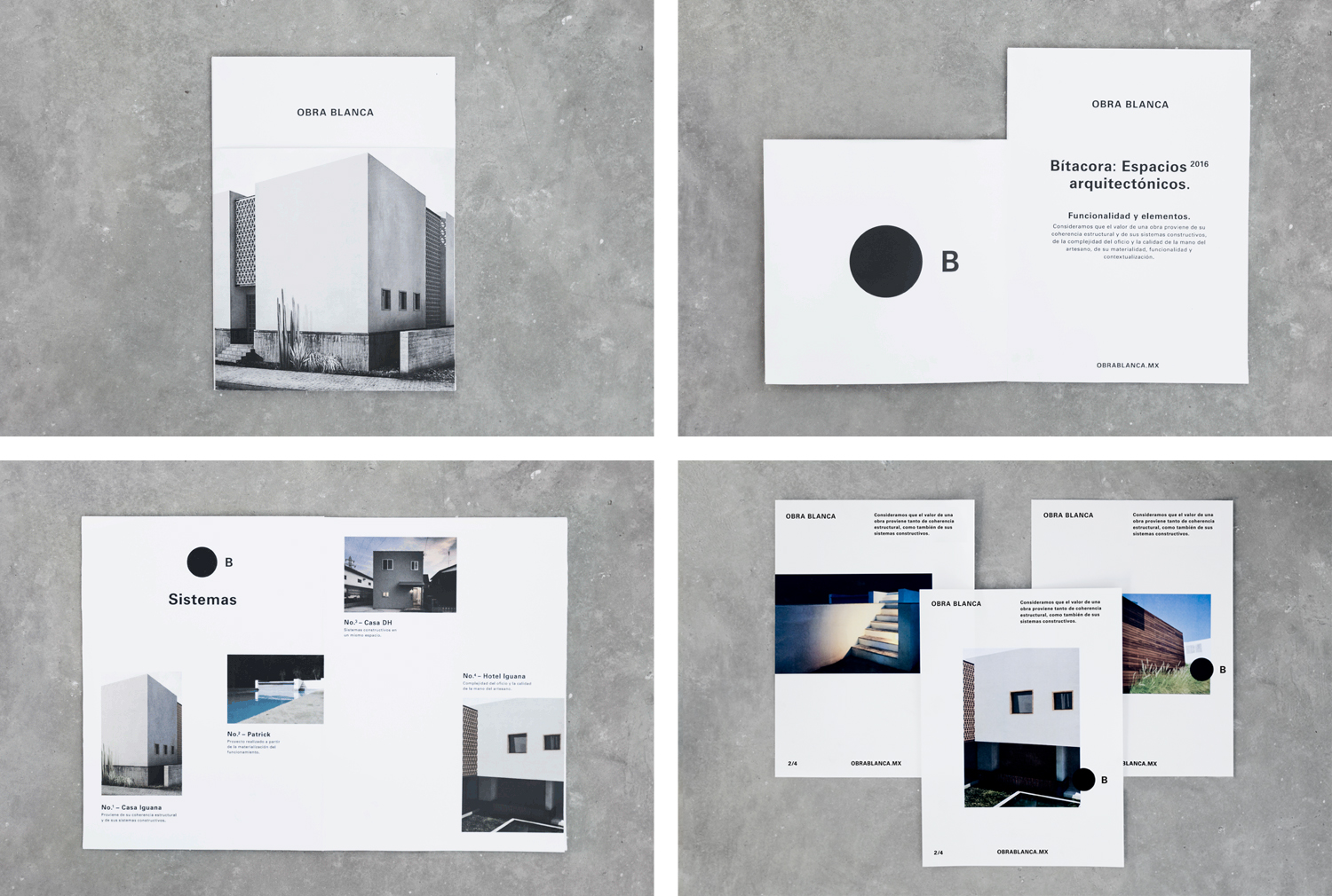
The layouts, proportion and detail of imagery and solid ink of the brochure fall more inline with what you might expect from an architecture studio, but provides a more formalised quality to the looser and immediate nature of hand stamped stationery.
Although it is not overflowing with individual character (that would be said to come from those that reside within Obra Blanca’s structures), the direction feels thoughtful, rooted in a concept and well-balanced. More from Savvy on BP&O.
Design: Savvy. Opinion: Richard Baird. Fonts Used: Univers.